Disclaimer: The works mentioned in this article are solely to facilitate discussion on the topic. The capabilities of the designers are in no way being challenged or questioned.
While tapping through Instagram Stories, you might come across a variety of cyberactivism related posts being re-shared. These posts are usually designed in aesthetic ways that are in touch with modern graphic design trends and aim to create awareness for a certain social issue. However, at a second glance, sometimes there is a disconnect between the visuals and the message.
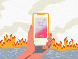
The visuals are bright and bold, while the message is grave and gloomy. This is often described as a way of making the content “digestible” — which simply means designing the content in a way that can be broken down easily and understood by viewers.
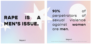
An example can be seen in Figure 1 where the message of sexual assault is being conveyed on a background that appears very soft and cheerful. The visuals and the message don’t match and hence the perception of the issue can become distorted. Whilst it is worth considering the importance of easy to understand content, where do we draw the line between digestible and inappropriate?
There are countless examples of sociopolitical graphic design works that are successful in conveying a message whilst achieving the balance between being implicit or “digestible” yet still impactful. The propaganda posters produced during the Vietnam War are examples. Figure 2 is an example where there is a relevant and appropriate use of visuals unlike Figure 1. The Vietnam War visuals were able to successfully convey the complexities of the war to the audience and also relate to their emotions, which is exactly what good graphic design is about — communication.
During the Vietnam War thousands of propaganda posters, produced by artists, were so powerful that they swayed the opinions of the US public on the conflict. The truth about America’s sinister involvement in the war was shown through designs such as Figure 2. This led most Americans to feel uncomfortable with what was happening in Vietnam. Without the support of the American people, the war eventually ended with the US withdrawing. These posters successfully empathised with the masses and united them with a core purpose, to stop the war.
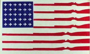
So what makes Figure 2 a strong design? The visual features the American flag made up of guns and warplanes, indicating that the flag that once stood for freedom, now stands for bloodshed and violence. This irony and use of appropriation of the American Flag are what make this a strong design, even without the use of typography. The audience will be intrigued by the design because the familiar visuals of the flag are being disrupted and to create a tension that pulls the audience in, to look further into the design.
The Gestalt law of closure (which states that if there is a break in an object, our mind will fill in the blanks for us and we will perceive the object as complete) was used by substituting the red lines with the red guns to create the illusion that the white stripes of the flag are there, increasing the familiarity of the visual. Using the Gestalt Theory strengthens the design since it helps to introduce the idea that human perception is beyond what we see. It allows for the design to penetrate the subconscious and be more impactful. Additionally, the disruption of familiarity will likely have a strong impact on the audience as it removes the need to have any prior knowledge of the context. With this being said, it is unwise to say that graphic design should not evolve with time and technology. Sociopolitical graphic design has progressed more as technology rapidly advances to give millions of people access to social media where the number of users every day grows. It can reach millions easily. Instagram has become a major platform as it allows multiple photo-sharing in one post to create attention-grabbing “slide show” posts about sociopolitical issues.
However, to keep up with the rapid pace of social media and low attention spans, content has to be made “digestible” and easy to understand. This is a broad spectrum of content creation and to analyse its effectiveness, the opinion of the targeted audience must be gauged. This was done using an online questionnaire featuring Fig.1 and Fig. 3. Some of the findings are discussed below.
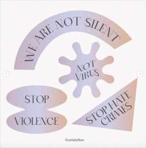
Some respondents of the questionnaire described the visual in Figure 3 as,
“Looks like random phrases.”
“The image is nondescript and doesn’t connect with a specific context.”
“…the other one [Fig. 3] just looks like brainless text.”
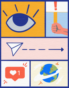
It indicates that the viewers were not able to make the connection to the context of the post. The post doesn’t appeal to them because it doesn’t make sense to them. The visuals are not related to the context and there is no appropriate use of symbols. Symbols are powerful and effective tools in graphic design. They help the audience to understand abstract concepts and ideas. There is a reference to the shape of the COVID-19 Virus in the “Not Virus” graphic but without other relevant visuals, viewers are not sure what the visual communicated.
Figure 1 follows a similar pattern in terms of visuals. At a glance, the graphic elements of the post (star and circle) have nothing to do with the message being publicised. 70% of respondents said that they didn’t really get the meaning behind the visuals. From a design aspect, the use of text alignment on the second slide also seems to take away from the message as the large gaps disrupt the reading pace of the viewer.
The Shillington School of Graphic Design states,
“Alignment creates a sharper, more unified design.”
Unification and alignment in design are essential because they determine the path the eye will follow and help to make it seamless. Hence, poor alignment results in a low-quality reading experience. The viewer has become disinterested in the message, deeming it unimportant. Additionally, the bold font does little to emphasise the jarring statistic and the stacking of the “of” is also quite distracting and appears as if there is a typographic error in the text.
Good typography is extremely important in graphic design. It can be used to create harmony and consistency. Harmonious designs are easy to follow and will be more likely to retain viewers’ interests. If audiences do not stay long enough to get the complete picture, the design fails in conveying the message successfully.
Hence, the ambiguous definition of the term digestible content can easily lead to its misuse. It can result in the work seeming lazy and shallow. Instead, the graphics of the Vietnam War poster are working together to convey the message successfully. From the questionnaire, all 32.2% of the respondents who preferred digestible content specified that it would only work if the visuals are suitably chosen.
Graphic design has been proven to be an essential part of activism throughout history. The example of the Vietnam War shows that through visuals, the status quo can be changed. Additionally, the example also highlights the extreme importance of using suitable and relevant visuals when creating design works for sociopolitical issues. If the visuals used in the Vietnam War weren’t related to the war and the emotion surrounding it, they would not have penetrated through to the audience the way they did. The visuals and their accurate portrayal of the issue are what made the campaign extremely successful.
Moving onto current times, digestible content has a lot of benefits in terms of creating activism-oriented content and often people prefer that type of content on social media because it fits the pace of bite-size Instagram content. With the use of proper design principles, suitable visuals and relevant symbolism, digestible content can be an extremely successful and powerful tool in this day and age of fast-paced mass media. For this style of content to be successful, it needs to be designed meaningfully. Successful deliverance requires that the viewers receive accurate information. If the graphic design is not appropriate, the perception of the message can become distorted, meaning the work fails to fulfill its purpose. If the work misleads the audience or doesn’t portray the issue accurately, it would not be a successful piece of communicative work.