Though I’ve never owned a cat, I enjoy watching cat videos on short video platforms like TikTok. Cats come in various breeds and personalities—some cute, some assertive, some goofy—and I love them all.
Suddenly, the idea struck me: “Why not design a cat typeface?” This could be a fun and unique project!
I decided to craft a cat font specifically for platforms like TikTok or Instagram, where cat videos thrive. Surprisingly, such a font wasn’t readily available on these platforms.
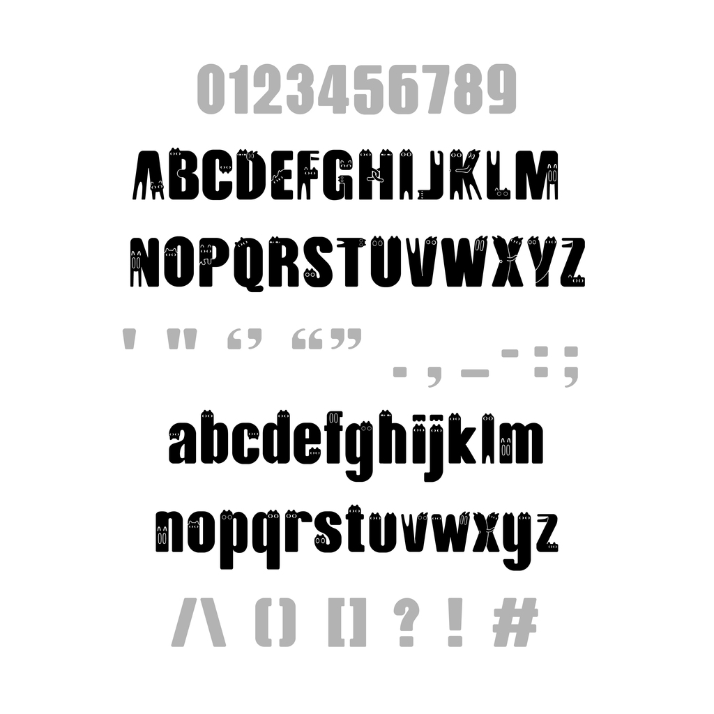
With this concept in mind, I delved into researching more about cats, focusing on their movements and expressions. Using IbisPaint on my iPad, I began sketching uppercase letters. To infuse fun into the font, each letter would depict a cat in various expressions and poses. While some poses defied physics, creating cat-like letters required immense imagination. After brainstorming for two days, I finally completed the first draft.
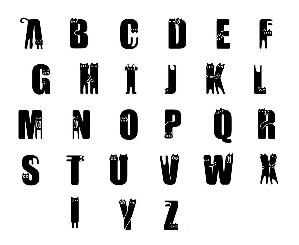
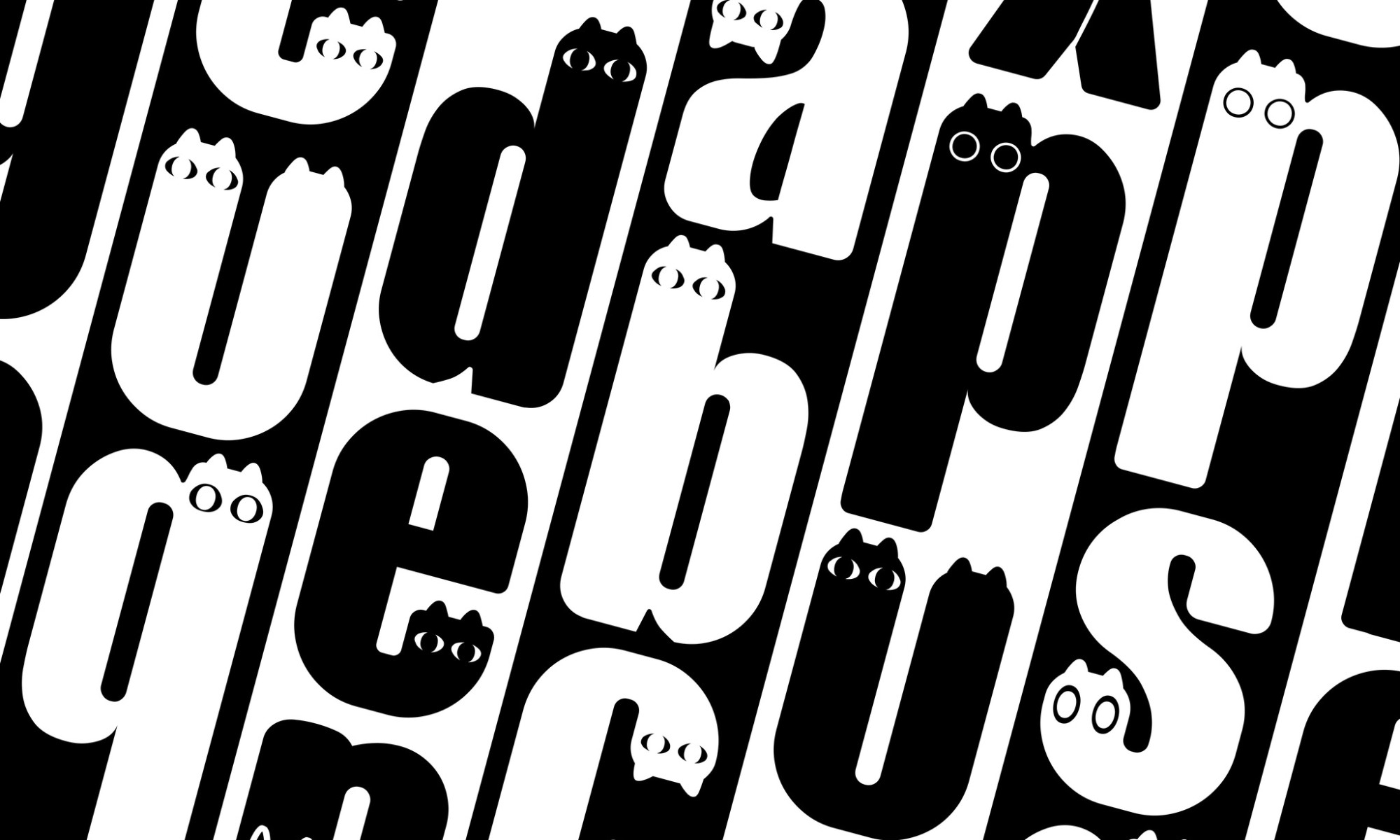
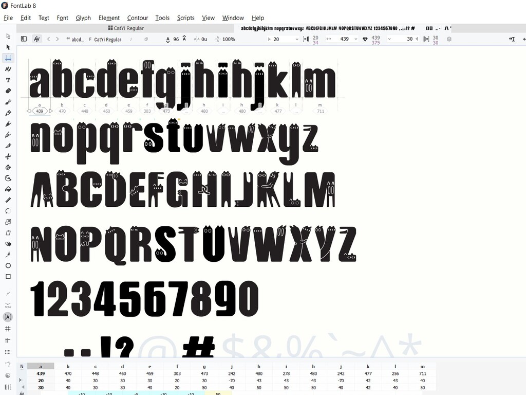
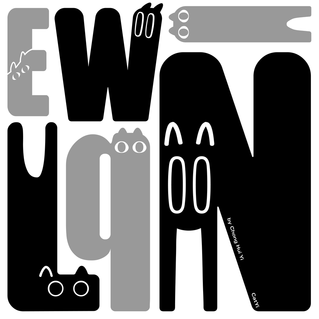
In the sketch, certain letters such as D, H, K, W, X, and Y portrayed paired cats, becoming the central characters of the entire font, adding a playful touch. Although I favoured the designs of H, K, and X, they also happened to be the most challenging to distinguish. At that point, I prioritised aesthetics over readability.
Adobe Illustrator
Following that notion, I needed to digitise my font using Adobe Illustrator. I opted for the Impact font as my reference because, at my current skill level, manipulating this sans-serif typeface is comparatively straightforward. Its bold letterforms are suitable for creating a cat-inspired design that can serve as a unique and cohesive element.
For the design of uppercase letters, I use ellipses or rectangles for their basic shapes, but this was not the final font. Later, I rounded their corners and incorporated cat elements.
I found it very convenient to utilise AI’s grid system for measurements during the design process.
To ensure I don’t forget, I also note the number of grid squares each part of the font occupies in terms of length and width.
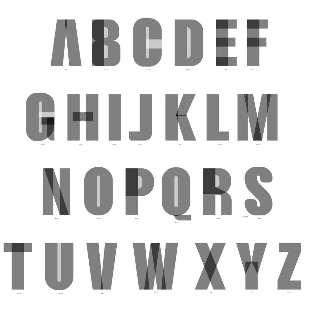
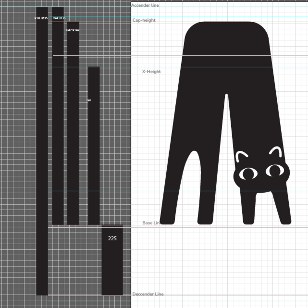
In Adobe Illustrator, I set up an art board with a height of 1000 px and defined key typographic parameters such as the ascender line, cap height, x-height, baseline, and descender line for my font. Furthermore, I integrated guidelines to assist in the creation of circular overshoot elements.
The most enjoyable and my favourite part of the entire design process was undeniably adding the cat elements to the letters!
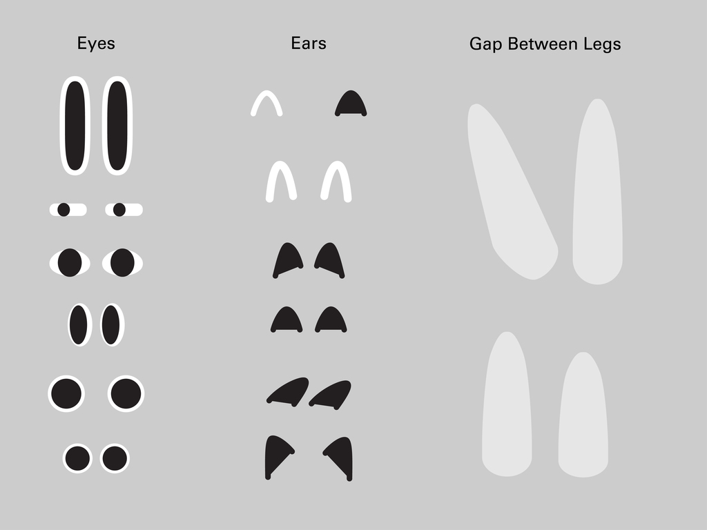
It was like infusing the font with a soul, bringing it to life. While it might make the font more consistent to have uniform eyes and ears for all cat letters, that would make it dull and uninteresting — not the effect I was aiming for. Therefore, I designed various eyes, ears, and different poses for the feet, each expressing different emotions. By observing how different cat eyes convey cuteness, indifference, nervousness, or surprise, paired with different ears, I aimed to better convey the cats’ emotions and to give them more of a storytelling quality.
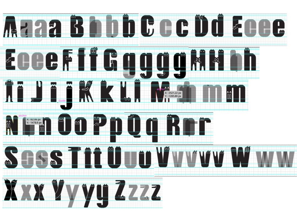
While designing the font, I lowered the opacity to 50% to clearly visualize the overlapping shapes. Once the letter designs were finished, I created outlined strokes for all lines. Using the shape builder tool, I connected or removed necessary parts. Each character was then grouped together for ease of copying into FontLab later.
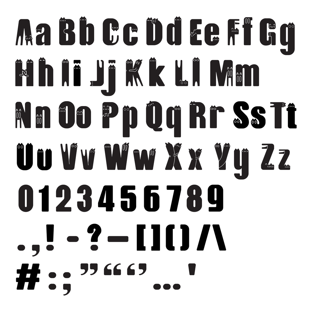
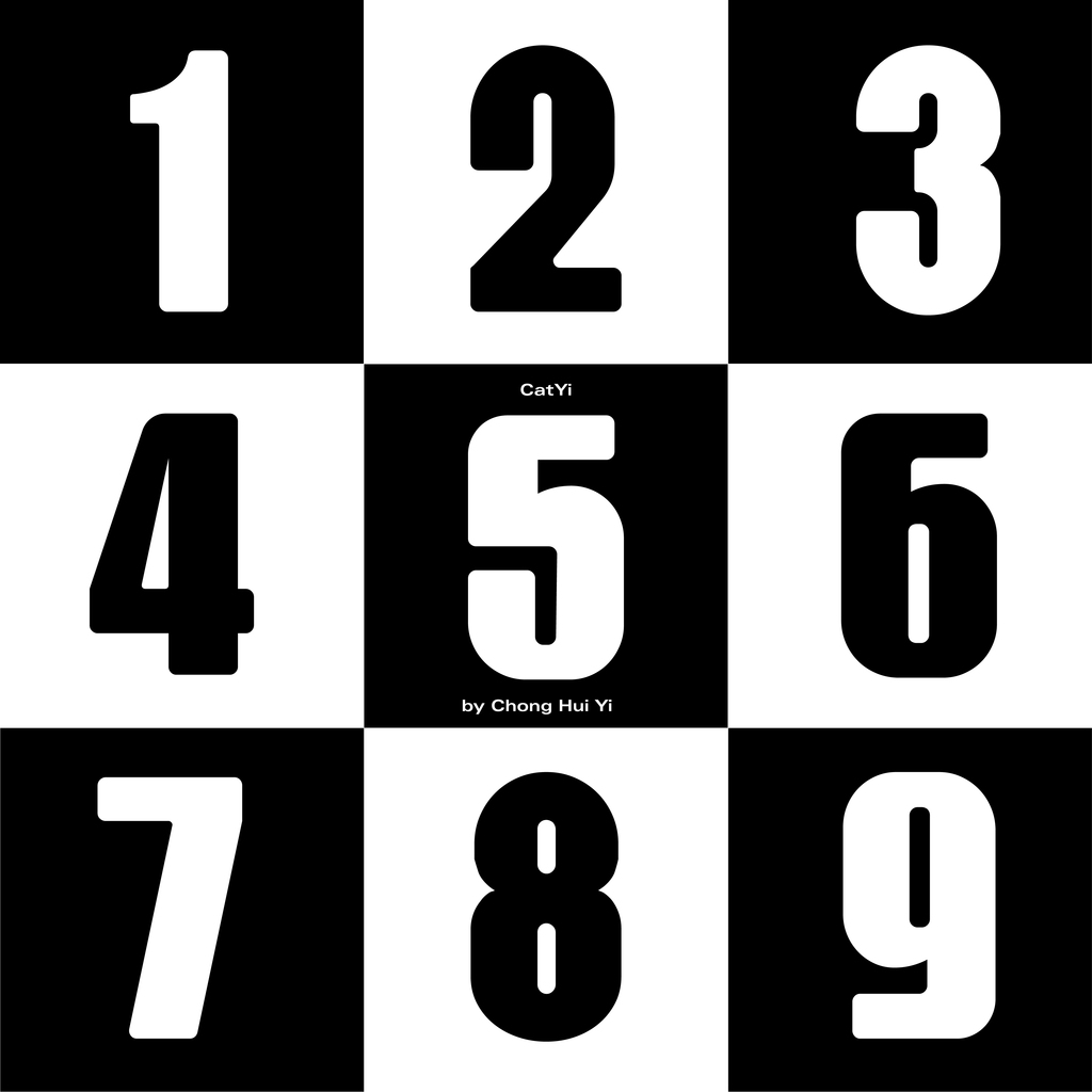
For the numbers and punctuation, I omitted cat elements due to time constraints. Additionally, I aimed for them to show distinctions compared to the letters. For example, despite variations in the width of my ‘O’ and ‘0,’ their lack of cat elements makes them easier to differentiate.
FontLab
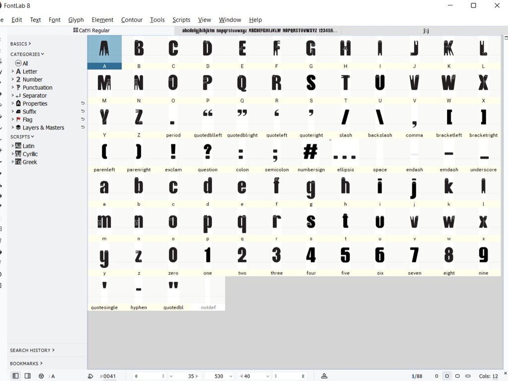
I initially imported the letters into FontForge as my trial period for FontLab 7 had expired. However, I faced challenges in FontForge, particularly in figuring out how to resize my letters. After several attempts, I decided to switch to FontLab 8, even though the trial period was limited to 10 days, which proved to be ample time.
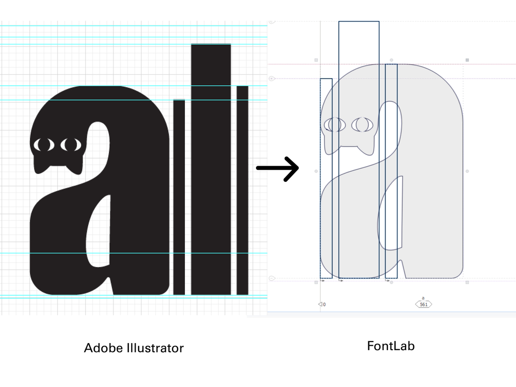
Upon importing the cat font into FontLab 8, a new issue arose. Because I had set ascender lines, descender lines, and other guidelines in Illustrator based on the grid, the positions of these lines were not whole numbers. To resolve this, I drew rectangles in Illustrator, aligning their lengths with x-height, cap height, etc. I then copied these rectangles and the letters into FontLab, determining the position of each guideline through proportional scaling. These difficulties have been resolved, but I needed tonadjust the kerning for the font.
I discovered that in FontLab to automatically kern pairs, you can open the Pairs and Phrases panel.
In Pairs mode, select multiple pairs with shift and click on the ‘diamond’ button in the upper right corner. FontLab will generate kerning for the selected pairs based on the settings on the Preferences > Curve Conversion page. However, the results of the automatic kerning were unsatisfactory, as there was excessive spacing between each letter, creating an overall loose appearance. Alright, no shortcuts for me; I had to put in the work.
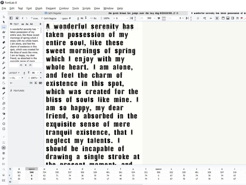
Finally, I manually adjusted the left and right side bearings based on the reference provided by Mr. Vinod. When it comes to ‘spacing by eye’ and determining the ‘minimum possible side bearing,’ I often feel uncertain about the accuracy of my adjustments. Nevertheless, adjusting based on this reference indeed saved me a lot of time. I believe the overall spacing looks more cohesive now. Afterward, I exported it into OpenTT format. My font is named ‘CatYi,’ since ‘Yi’ is my name.
Through this project, I’ve gained a deeper understanding of the challenges involved in font design. Honestly, there were moments when I regretted choosing to design this cat typeface, but I’m grateful that I didn’t give up at that time and fortunately I selected a theme I enjoyed. Despite meeting challenges in the design process, I found more joy than difficulties and am pleased with the outcome. I feel satisfied with the results, and indeed, I have been enjoying the design process, experiencing a sense of accomplishment upon completion.
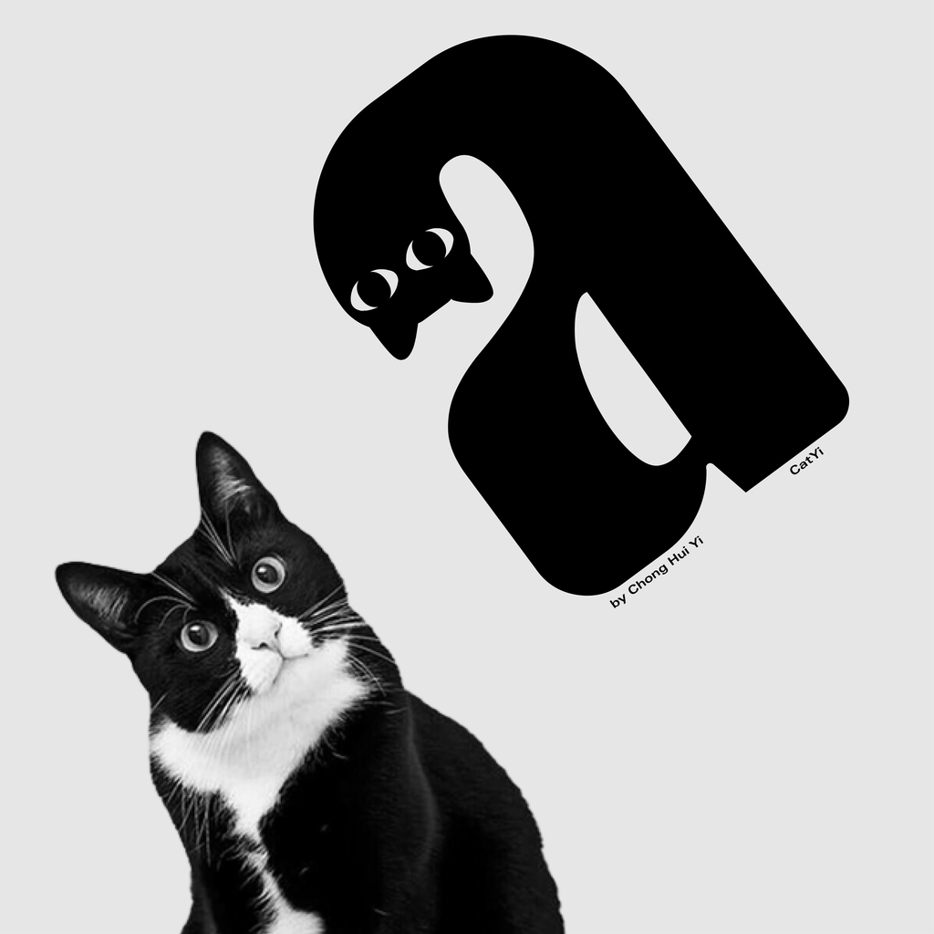
Font Presentation
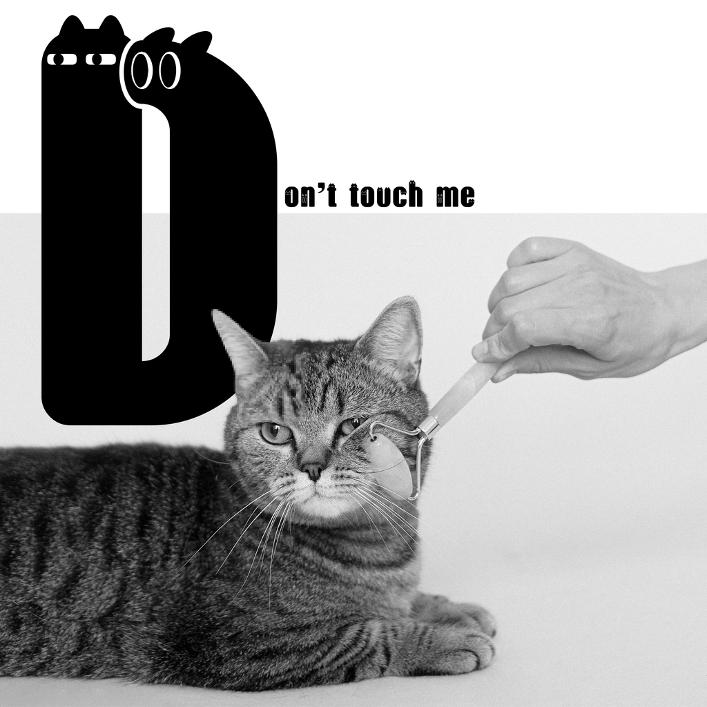
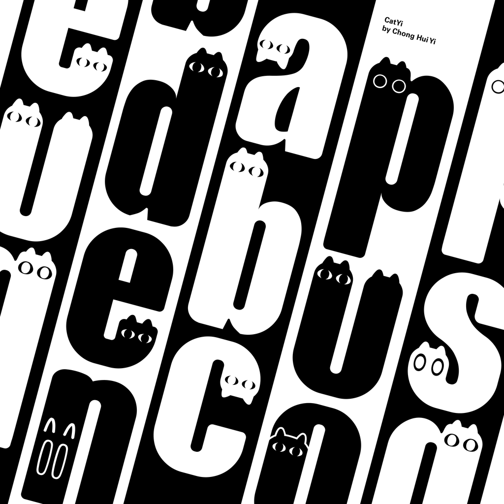
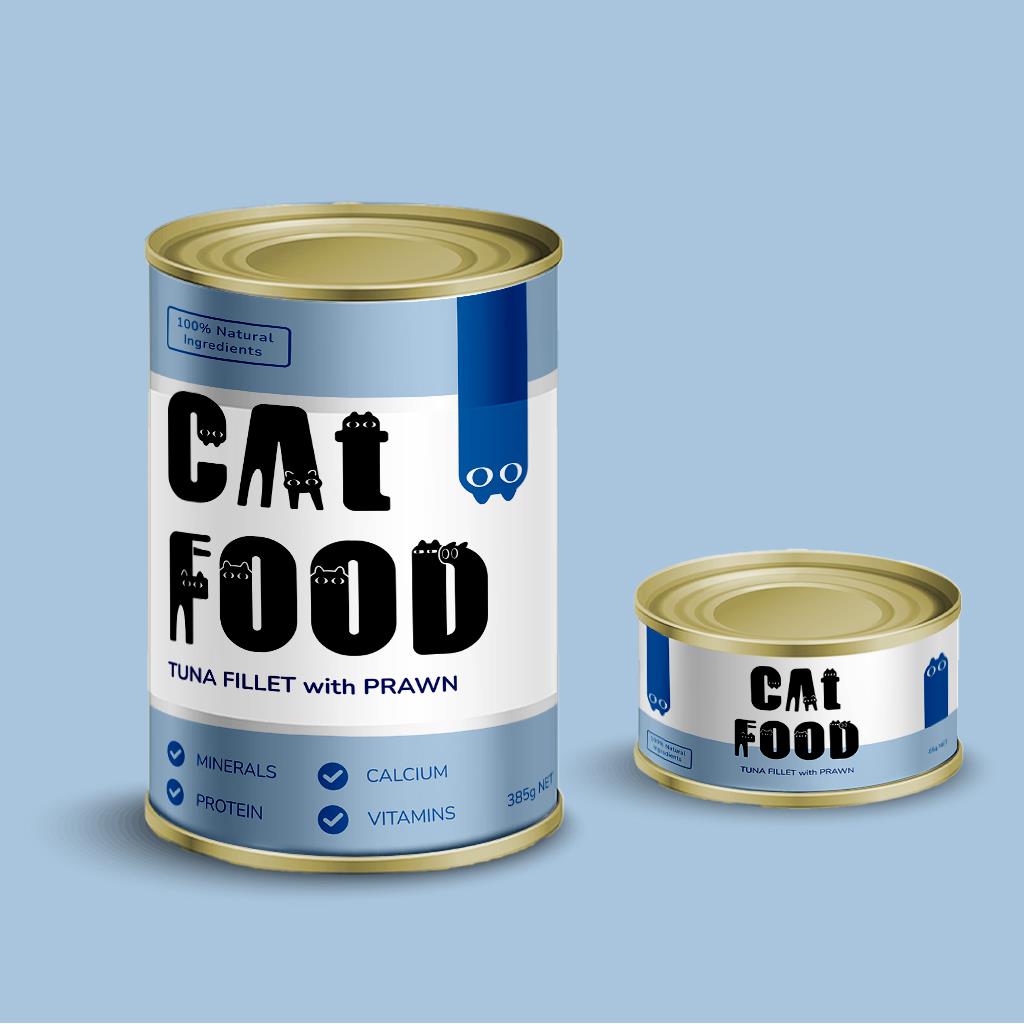
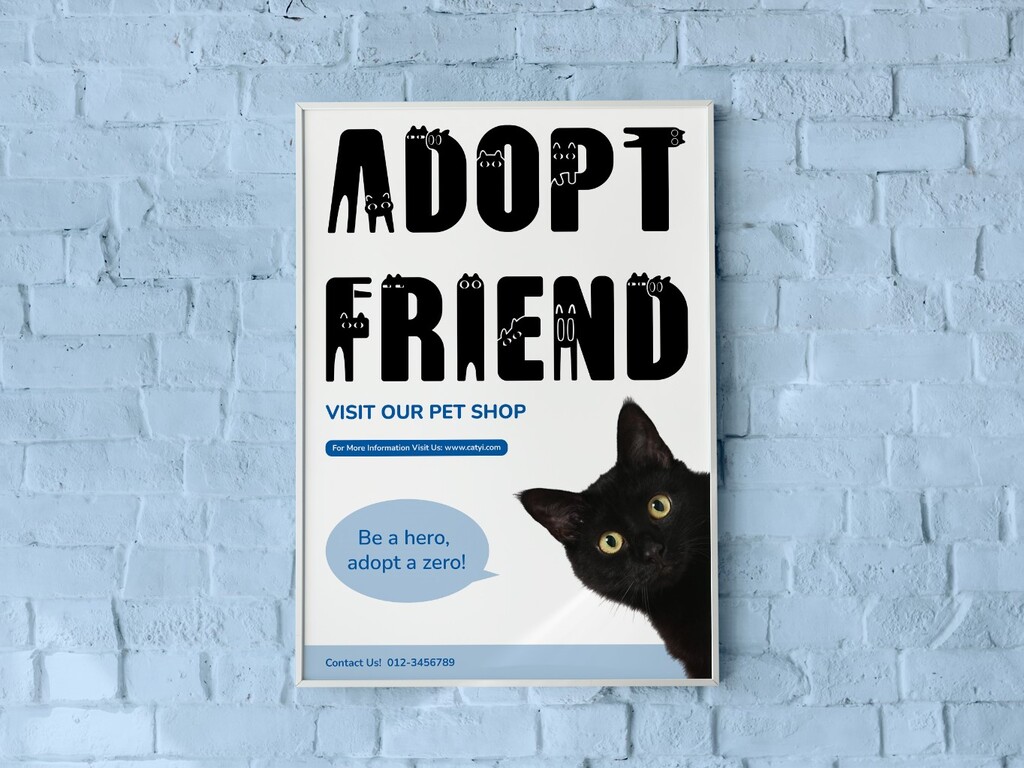
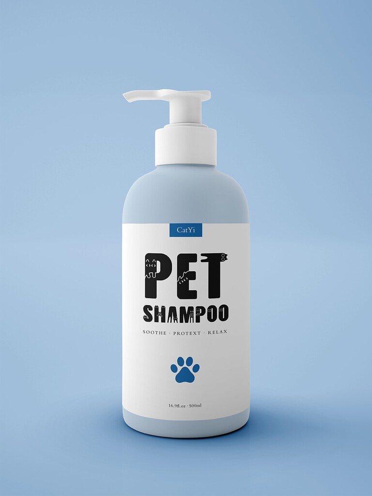
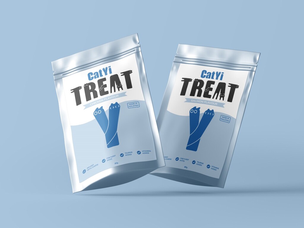
Font Application