

Amid the force and farce of Malaysia’s political culture, a particular Roman alphabet has periodically come to the fore demanding public attention. By a confluence of chances, three disparate subjects, which so happen to share the initial ‘R,’ have become susceptible to ideological abuse. They are the diabolical trio of race, religion, and royalty, collectively known as the 3Rs in Malaysia. Any discussion of the 3Rs seems to have raised a ruckus, leading the ruling government to take a more proactive role in suppressing debates. Administrative departments have even been instructed by the Minister of Communications Fahmi Fadzil to ‘keep track of 3R issues.’
While the 3Rs threaten the integrity of Malaysia’s national imaginary, it is its very sustenance. The union of race-religion-royalty is so thoroughly cemented that it shapes the political makeup of the country. The fact that all three keywords are in the English language is perhaps not an accident, but a direct notation of Malaysia’s residual coloniality.
The ideas of race, religion, and royalty, as we understand them today, are heavily premised on perceptions inherited since colonial times. These ideas came into prominence only in the nineteenth century but have continued to impinge on Malaysia’s political and cultural life.

Perhaps, one could read the coincidence conferred by the rhotic initial R as an analogy for our residual coloniality in Malaysia. The English language has kept us in its thrall. In presenting itself as an untranslatable, supralinguistic marker, the 3Rs transcend linguistic boundaries. Local news media of any language, in any script, has failed to guard against the intrusion of the Roman alphabet R (Figure 2). Never has a nation-state been so utterly paralyzed by an alphabet. How has the Roman R evolved as a typographic glyph? What are the genealogical foundations of race, religion, and royalty?
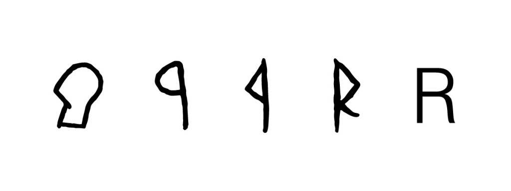
The shapes of the Roman alphabets are a product of an extensive history, many of them originated from a pictorial representation of an object.[1] Centuries of modification eventually result in the abstracting of the initial pictorial index, creating the linear alphabetic system to which we are accustomed today. The same principle applies to the letter R. From the outset, the letter was a left-facing head resembling a reversed, modern-day letter P. The Wadi el-Hol inscriptions, by far the earliest evidence in the alphabetic corpus dated to the end of the Middle Kingdom (c. 1850–1700 BCE), presents a nascent R, which was read as ‘res’ in the Proto-Sinaitic language, meaning ‘head’ (Figure 3).[2] The bowl of the letter is the shape of a rounded head in profile, facing its left and tilting slightly backward while the angular stem outlines its neck.

This early alphabetic R is modeled on both Egyptian hieratic and hieroglyphic writings. During the Iron Age (c. 1200–600 BCE), this symbol assumed a more economical form in the Phoenician script, written as ꟼ.
The Phoenician script was highly widespread and would form the base from which many other alphabetic systems developed. Once the Phoenician ꟼ (resh) was adopted into Greek, the bowl became angular. A tail was sometimes added to the Phoenician adoption in Greek letterform, making the alphabet closer to the present-day R. By about 500 BCE, the alphabet was reversed from ꟼ to P as the writing system was read from left to right. It entered into the Roman writing system and its tail-appendage was retained, explicitly differentiating the R from the P (Figure 4).[3]
Because the Semitic and Roman scripts borrowed from the Phoenician, the R finds itself in a variety of writing systems. Consider the typographic parallels between the Roman R, the Greek Ρ (rho), the Arabic ﺭ (ra), and the Hebrew ר (resh), where the rounded curve of the head or res is preserved and diversely manifested. While the semantic dimension of the consonant R as ‘head’ is generally abandoned, words such as the Arabic رأس (ras) and the Hebrew רֹאשׁ (rosh) still denote ‘head’ or ‘chief,’ with a rhotic initial marking a common Phoenician ancestry.
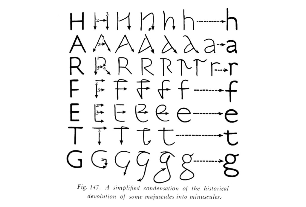
The lowercase ‘r’ emerged from the half-uncial script of ancient Rome as a more efficient way of drawing the present-day capital R. To complete the uncial R, one would need to draw a stem on the left and a bowl and tail on the right; for the half-uncial r, the bowl is only half-completed without touching the stem, hence creating a curled vertical tail that would evolve into a terminal (Figure 5). This new development soon became a staple and reached maturity through the widespread popularity of the Carolingian Minuscule by the late eighty and early ninth centuries.[4]
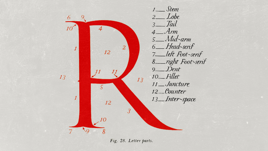
In modern typography, the alphabet R has achieved notoriety for its subtlety. The structural resemblance between the R and two other alphabets, namely the B and P, deceives us into thinking the former as deceptively uncomplicated and whose form is derivative. Yet, these three alphabets are quite dissimilar.
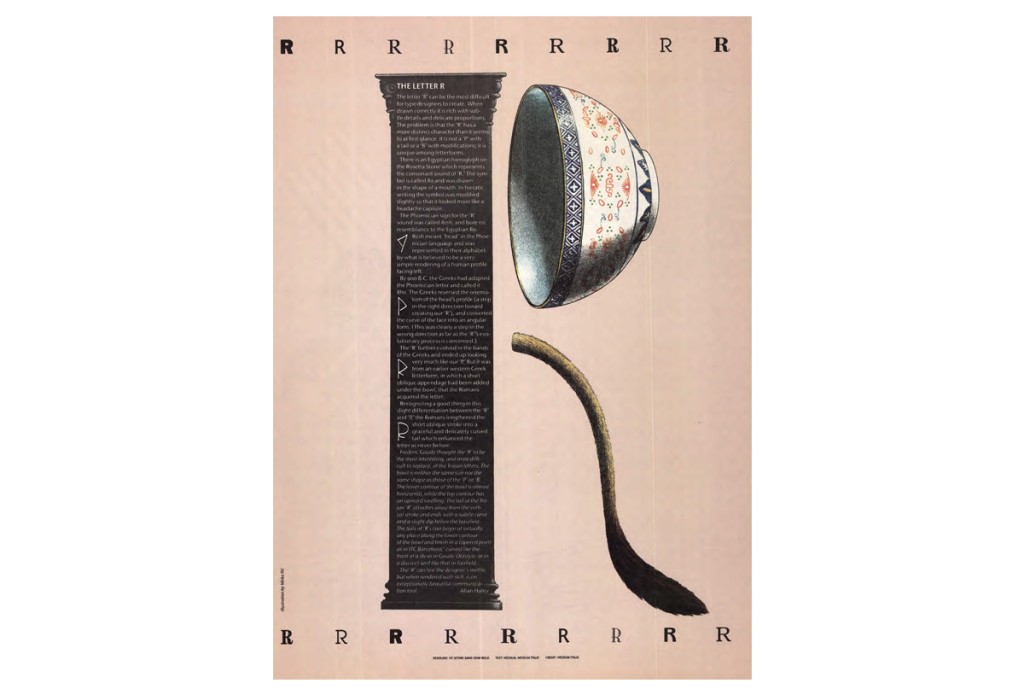
The R is ‘not a “P” with a tail or a “B” with modifications,’ cautions type designer and critic Allan Haley, formerly of Monotype and the U&lc magazine (Figure 6).[5] The tail of the R, too, is a double-edged sword, for it presents a fertile visual element for graceful innovation, or, for damning creative pitfalls. Haley is far from exaggerating to assert that ‘the “R” can test the designer’s mettle.’[6]
The R is truly a creature of agony. It is an ordeal pinching a typographer’s nerves, and likewise, the nerves of Malaysia’s anxiety about race, religion, and royalty. These three English words do have more in common beyond sharing a rhotic initial. The English word ‘race’ was derived from the Italian razza through French. Examining the etymology of ‘race’ through the lens of black existentialism, Lewis R. Gordon contends that razza bears traces of the Arabic ras, which relate to notions of the head, origins, and beginnings.[7] The Arabic ras, Gordon elaborates, was introduced by the Moors ‘into the Iberian Peninsula (Andalusia) to articulate origins and to differentiate even themselves from the Christian Germanic peoples.’[8] Here, the constitution of the racial other depends on religious difference. This historical circumstance mirrors the development in colonial Malaya, where racial identities reflect both race and religion.
The English word ‘royalty’ introduces another etymological dimension to our narrative. It may not originate from the R that connotes ‘head,’ but it is rooted in the Latin regalis, whose R bridges the Latin rēx (king) and rectus (straight). Scholar David-Antoine Williams observes:
Rēx and rectus (whence the adverb rectē) are close etymological siblings, traceable through their respective reconstructed Proto-Italic roots *rēg- and *reg- to the Proto-Indo-European (PIE) root *reg-, ‘to move in a straight line,’ which gives Indo-European languages a variety of words meaning something like ‘to direct in a straight line, lead’ (including ‘direct’ in English, of course, but also ‘rule,’ ‘raj,’ ‘right,’ and ‘reckon’).[9]
As we probe the lineages of our alphabetic and rhotic R, we become more conscious of the implications of our public discourse, mysteriously enveloped in the acronymic 3Rs. While etymological explications do not reflect contemporary understandings of the words at stake, they reveal a history of conjunctures, where distinct words like ‘race,’ ‘religion,’ and ‘royalty’ have embarked on idiosyncratic journeys. Today, they come under the umbrella of ‘3Rs’ to concoct a desire to differentiate, to bind, and to rule.
Beyond a legacy of historical coincidence and alphabetic convenience, the 3Rs are a political language that takes the form of euphemism. It calls upon all parties—regardless of the tongue we speak in—to submit to its supralinguistic reign of silence. Historical amnesia is in order. Race, religion, and royalty become a taboo as soon as we speak of them reductively as the ‘3Rs.’ The Orwellian acronym demands that we address not their full names, thereby preventing us from acknowledging existing grievances and from obtaining full closure. Euphemistic silence, however, does not quell prejudices. Rather, it keeps our lips tight under its chilling secrecy, it fuels and fans the flame that continues to energize the divisive R.
[1] ‘If the history of any one of our alphabetic symbols be traced backwards, it will be found to resolve itself ultimately into the conventionalized picture of some object.’ Isaac Taylor, The Alphabet: An Account of the Origin and Development of Letters, Vol. 1, Semitic Alphabets (London: Kegan Paul, Trench, & Co., 1883), 8–9.
[2] John Coleman Darnell, F.W. Dobbs-Allsopp, Marilyn J. Lundberg, P. Kyle McCarter, Bruce Zuckerman, & Colleen Manassa, ‘Two Early Alphabetic Inscriptions from the Wadi el-Hol: New Evidence for the Origin of the Alphabet from the Western Desert of Egypt,’ The Annual of the American Schools of Oriental Research 59 (2005): 76–77.
[3] Taylor, The Alphabet, 106–107; David Sacks, Language Visible: Unraveling the Mystery of the Alphabet from A to Z (Toronto: Alfred A. Knopf Canada, 2003), 286.
[4] Stan Knight, ‘The Roman Alphabet,’ in The World’s Writing Systems, edited by Peter T. Daniels & William Bright (New York & Oxford: Oxford University Press, 1996), 319.
[5] Allan Haley, ‘The Letter “R”,’ U&lc (Upper and Lower Case, The International Journal of Type and Graphic Design) 19, no. 1 (1992): 7. See also Bruce Willen & Nolen Strals, Lettering & Type: Creating Letters and Designing Typefaces (New York: Princeton Architectural Press, 2009), 111.
[6] Haley, ‘The Letter “R”,’ 7.
[7] Lewis R. Gordon, ‘A Phenomenology of Biko’s Black Consciousness,’ in Biko Lives! Contesting the Legacies of Steve Biko, edited by Andile Mngxitama, Amanda Alexander, & Nigel C. Gibson (New York: Palgrave Macmillan, 2008), 85–86.
[8] Gordon, ‘A Phenomenology of Biko’s Black Consciousness,’ 86.
[9] David-Antoine Williams, The Life of Words: Etymology and Modern Poetry (New York & Oxford: Oxford University Press, 2020), 15.
The images used by the author fall under ‘fair use’ (not for profit; educational; sources are credited). Any queries on the use of the images should be directed to the author. Kreatif Beats must hereby disclaim any liability.