Every project starts with a spark of inspiration, and for this particular endeavour, it was ignited in the form of a challenge. As we headed into the final task of Advanced Typography, we had to design a completely generated font to solve a problem in an area of interest. At the start of the semester, we were briefly introduced to this assignment so I had planned to create a typeface that is unique and readable in the area of football. As a person who has delved into football for the past few years, I chose to explore the fonts from different leagues and teams which also drove my curiosity of typeface design in this area. From my research, I observed that there was a preference for capital letters, presumably to enhance visibility and readability as when used on jerseys. This insight prompted further research into fonts used by other football teams, a venture into shapes, strokes, and an exploration of what makes a typeface not just legible but also visually appealing. The journey began in week seven with my initial idea which was then approved by my lecturer, Mr. Vinod.
I decided to create a font for Malaysia’s football team, Harimau Malaya.
Sketches are the embryonic stage of typeface design. In this task, I utilized two different approaches — one based on freeform (shape) to create the letterforms and the other employing grids for a more structured foundation to create letterforms. The third grid I created stood out for its cleanliness and distinct style which then lay the groundwork for the digitization phase.
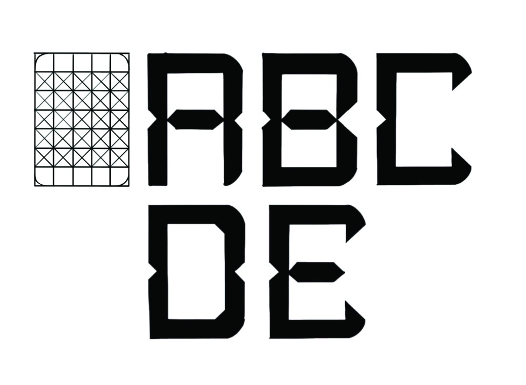
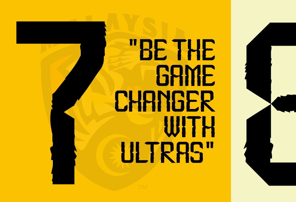
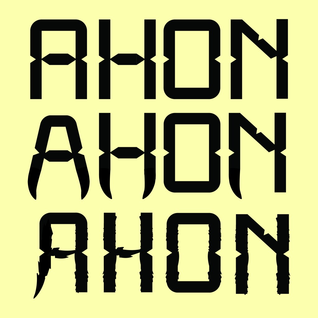
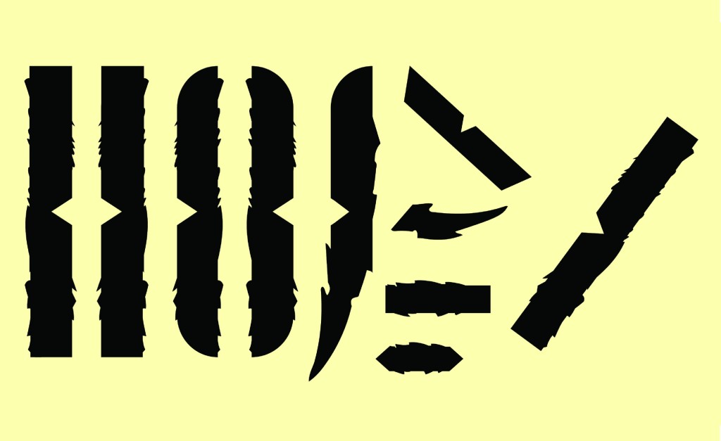
Opting for the third sketch as the foundation for digitization, I started to digitise the letters ‘A’, ‘H’, ‘O’ and ‘N’ using the grid as my guide so that I could extract the strokes to create other letterforms. Based on feedback, I utilized valuable input that prompted the infusion of elements that would unmistakably represent ‘Harimau Malaya’. I experimented with two different styles that could represent tiger — one featuring sharp ends inspired by the tiger’s teeth, and the other adorned with tiger stripes. For the stripes, I strategically incorporated them into the vertical strokes to maintain visual balance. After comparing both styles, the second, embellished with tiger stripes, emerged as the preferred choice. This style of the four letterforms also served as the blueprint for the entire set of letterforms. Making use of the strokes and blocks that had already been made, I duplicated and adapted them so that the entire typeface is consistent and has an aesthetically pleasing appearance.
This phase has allowed me to embody the identity of Harimau Malaya with the fusion of tiger-inspired elements into the letterforms.
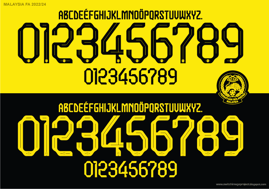
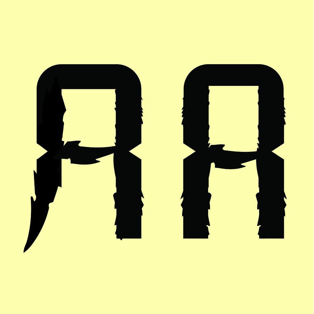
After creating the style, I started to create the letterforms with guidelines on an art board with a 1000px height and a 500px cap height. A set of capital letters was produced by the first digitization, but I observed a few letters that needed to be improved due to the differences between the vertical and diagonal strokes, elongated diagonals. Therefore, a series of refinements ensued for the letters that seem odd. An alternate rendition of the letter ‘A’ was crafted as a crucial consideration when contemplating the primary purpose and readability. In this context, the ‘A’ in the second digitization version emerged as the more fitting choice. I also refined all uppercase letterforms within the grid so that the letters are consistent in terms of width. Transitioning to the lowercase, numbers, and punctuations, was guided by grids to address these concerns that yielded a more consistent set of uppercase and lowercase letters by using the existing strokes.
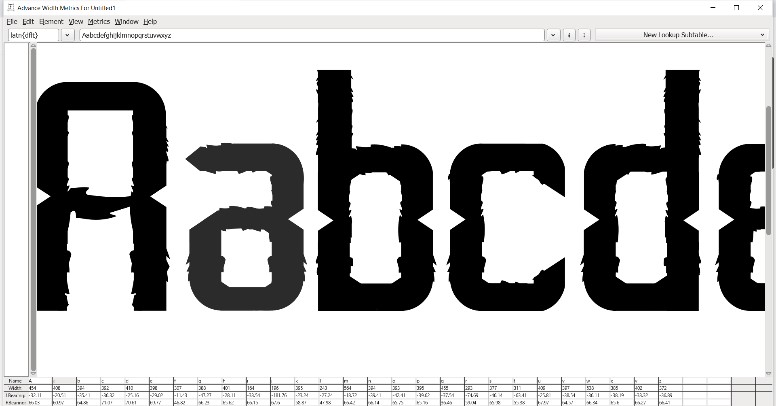
Once all the glyphs were completed, the last step involved in generating a typeface is moving them into FontForge. Following a tutorial from the Advanced Typography playlist on YouTube, I exported the letterforms from Adobe Illustrator to FontForge in SVG format. An initial hiccup arose during kerning in FontForge, a process that proved more complicated compared to FontLab. For me, individual adjustments for left and right bearings were initially challenging, then I discovered an alternative method to do kerning between all letterforms. With individual kerning meticulously executed for all letterforms, I finally generated the font which I named Ultras, which is also the name for football fanatics of Harimau Malaya. Exploring the possibility of an italic version, I delved into FontForge to craft slanted letterforms, adding a dynamic twist to the font style.
The subsequent task involved font presentation and application. To create an effective font presentation, I decided to highlight the typeface in its best light. The Malaysian National Football Team’s name served as the first inspiration for the font presentation, which then developed into an extensive investigation of various letters and numerals that feature different font sizes, styles, and transparency. I also made an attempt to display the font as it would be used, such as displaying the numbers in the style of a substitution board by including a straightforward box and listing the names and numbers of the current national team players to display the font.
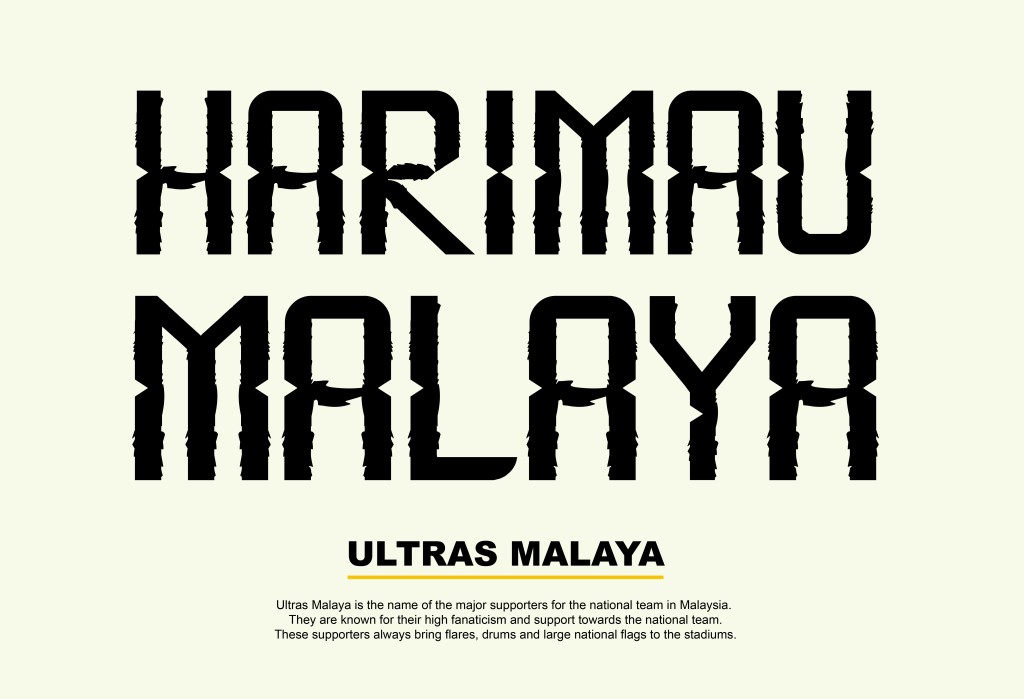
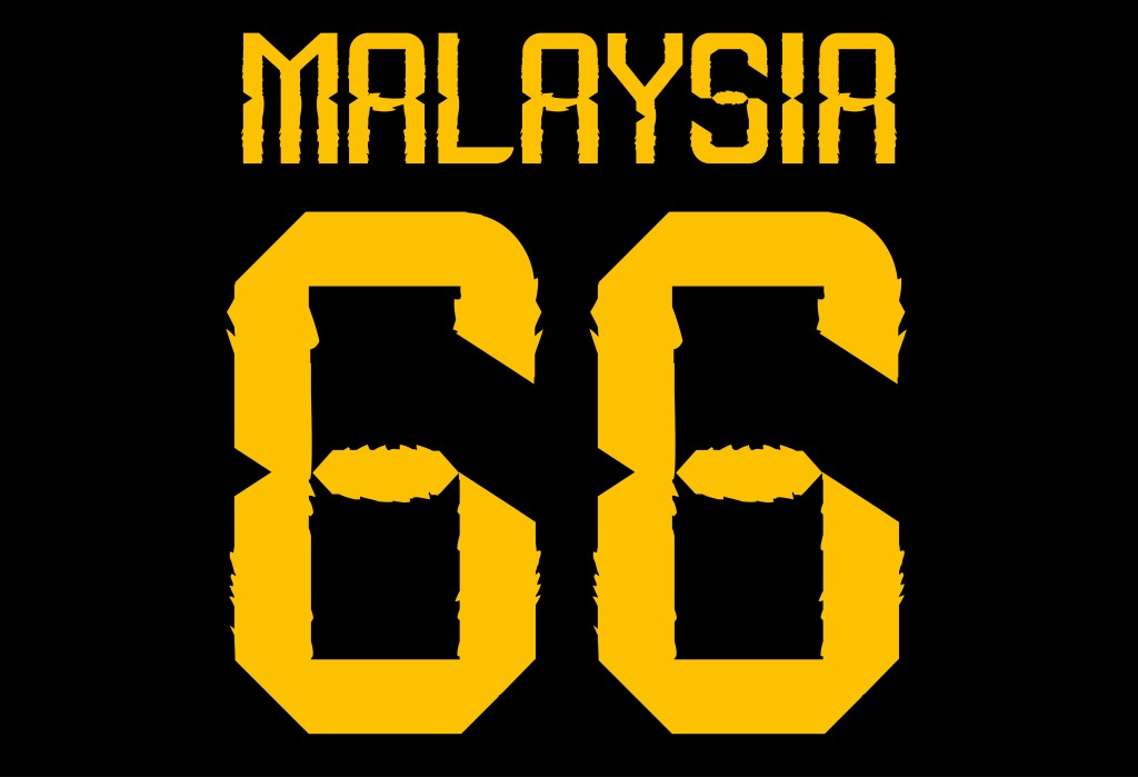
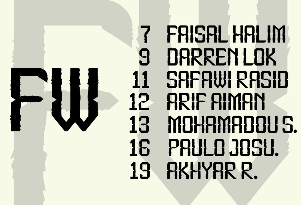
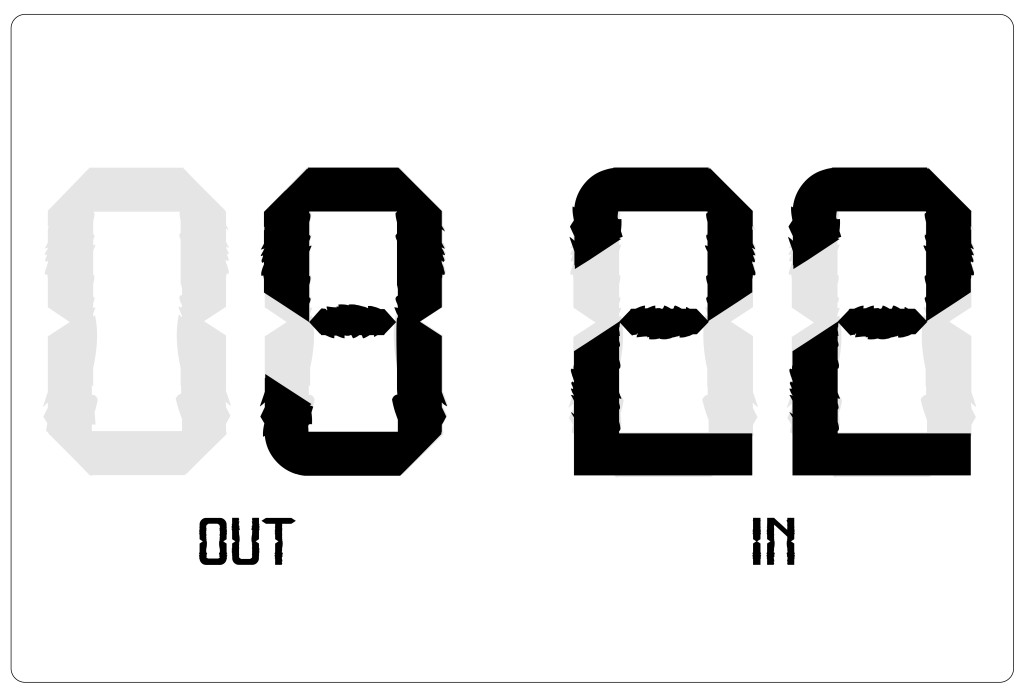
Fig 8.4 Font Presentation 4
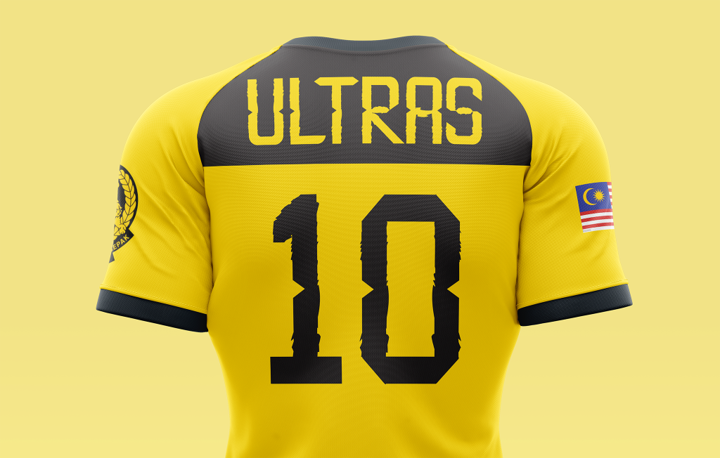
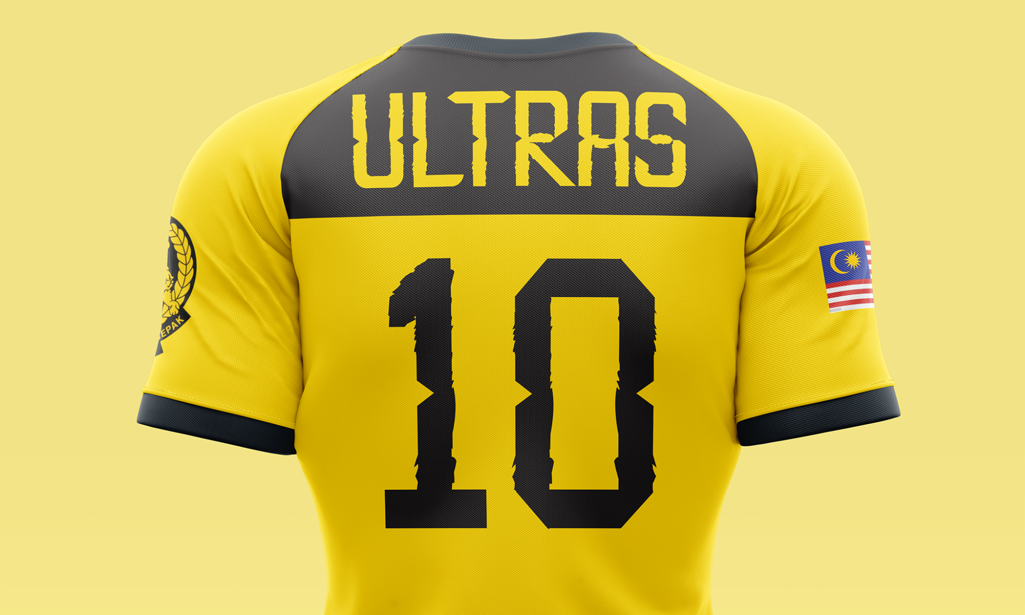
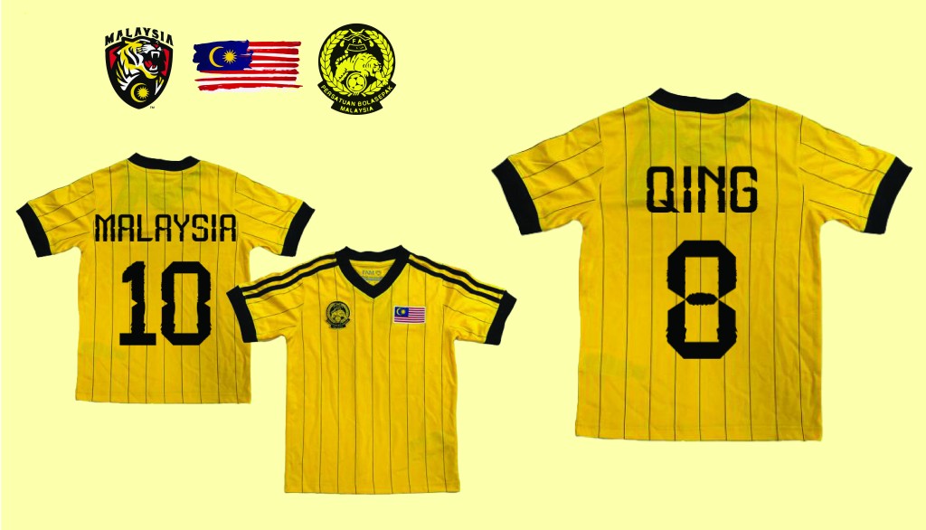
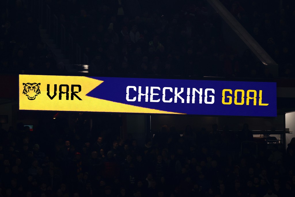
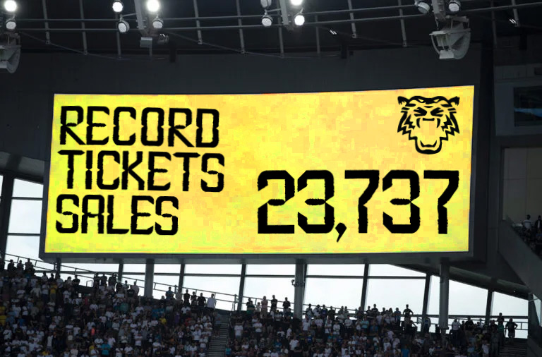
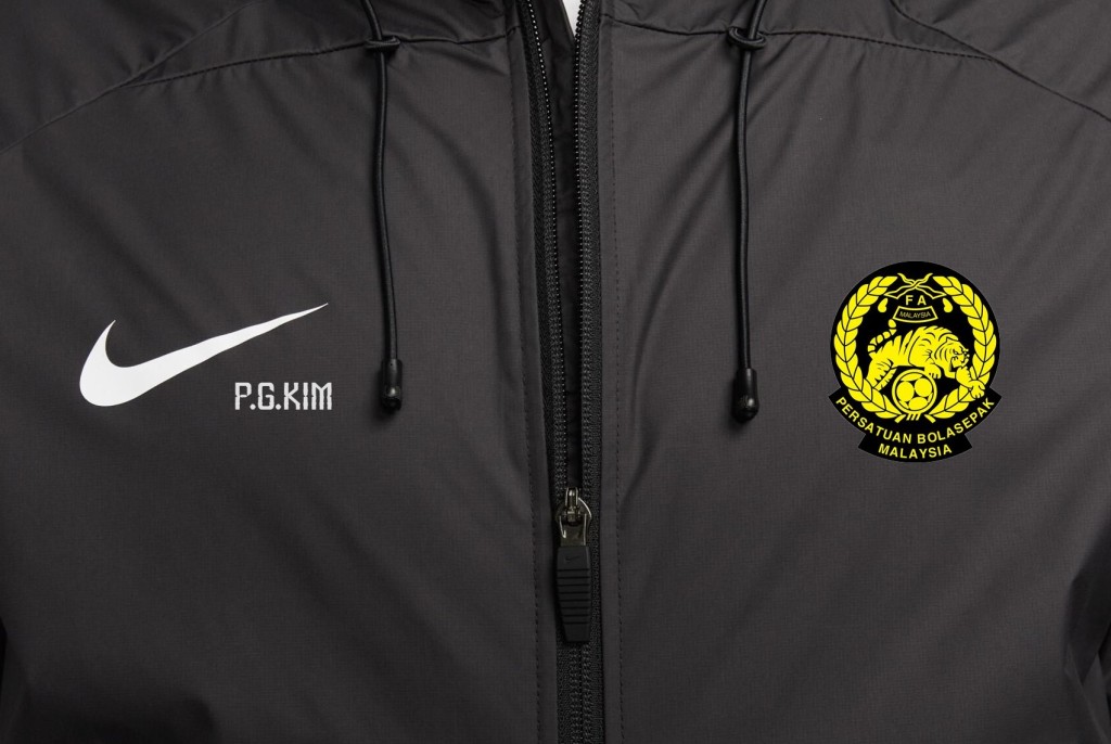
Entering the stage of font application, the emphasis switched from displaying the font to applying the font to the world of football. As this font is created especially for Harimau Malaya, the color palette takes center stage with a dynamic fusion of yellow and black which represents the identity of the football team. I tried to apply the font from tracks to L.E.D boards, and even onto merchandise and broadcast platforms such as TV screens.
My goal in this task was very clear from the start to craft a typeface that is readable and specially designed for Harimau Malaya. The whole journey required a meticulous process of sketching, digitization, and refining across weeks. Certainly, there were challenges, yet I believed that each hurdle became a stepping stone toward a more refined typeface. It was a journey that not only yielded a unique typeface but also deepened my understanding of the connecting points between form and function in typeface design.
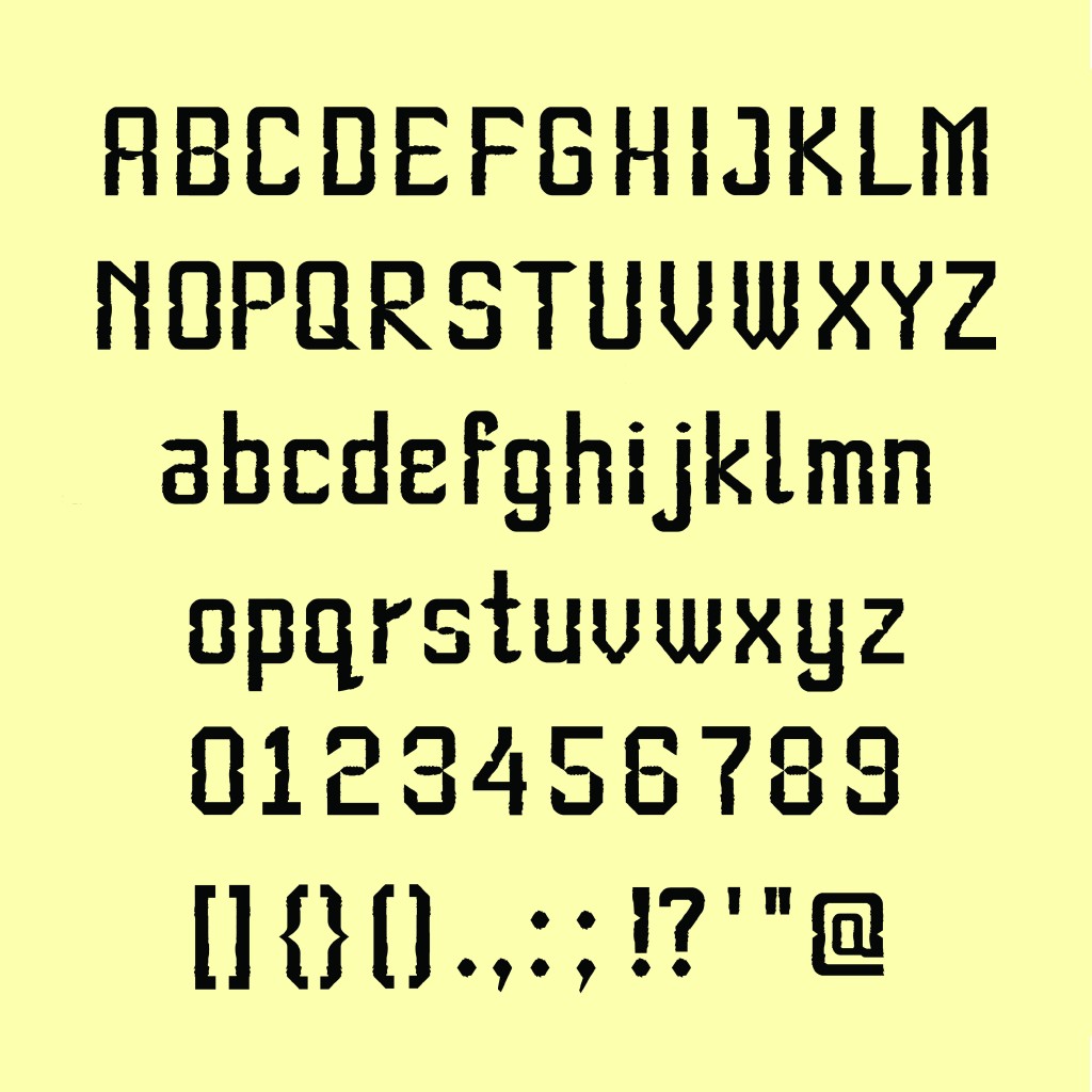
Test the capitals for my Harimau Malaya font, “Ultras” below: