
As a graphic design student from the Maldives with a keen passion for typography, exploring the creation of a Maldivian script/cursive font has been something that has interested me for quite a while, especially since I have yet to come across a digital typeface for the Maldivian alphabet Thaana (the present writing system of the Maldivian language spoken in the Maldives) that effectively captures the structural elegance inherent in Maldivian calligraphy and cursive handwriting. Given the complexity of this task, it wasn’t initially my plan for my final year project. I doubted my ability to navigate such a challenging task considering my lack of familiarity with the process of font design.
Until that point, my exposure to properly designing typefaces had been limited to a few exercises in Mr. Vinod’s typography class that focused mainly on Latin letters. The key distinction between Latin and Thaana lies in the structure: Latin employs a single line of characters, whereas Thaana, the Maldivian alphabet, involves three distinct lines of characters: one line for letters (akuru) in the middle and two lines for vowel marks (fili) above and below. A similar structure can be found in Arabic script as well. Unlike the straightforward process of connecting a single line of characters in Latin script for cursive font design, Thaana requires weaving together three lines of characters for various letter combination thus adding two additional layers of intricacy to the design process.
Roanu, the typeface’s name, draws inspiration from this intricate structure. It is derived from the traditional Maldivian coir rope, also named roanu, crafted from coconut husks. The coir ropes are meticulously woven with three lines or strands of coconut husk, mirroring the three lines of characters in the Thaana alphabet that are woven together in cursive handwriting. The choice of the name reflects the symbolic connection between the typeface’s design intricacies and the traditional artistry found in the crafting of Maldivian coir ropes. After research and contemplating the mixture of fear and excitement surrounding the topic, I eventually decided to face the task head-on, taking it as a challenge with fingers crossed.
The Design Process: From Concept to Creation
I discussed the concept with our typography lecturer, and his advice was to determine the feasibility and method within the given timeframe. I dived into FontLab tutorials and also consulted a Thaana type designer through a tutorial session. Getting back into FontLab basics was crucial because it has been a long time since I used the application, especially since I’ve never attempted Thaana design in FontLab before. I managed to learn the use of substitution codes to replace letter combinations with ligatures, a pivotal solution for designing the woven Thaana characters. Learning this technique was a huge relief, as it meant I could complete the entire font by incorporating as many ligatures as needed for the design. I also discovered that ligatures have been used in Thaana fonts by previous designers, but a complete Thaana cursive font had not been designed before.
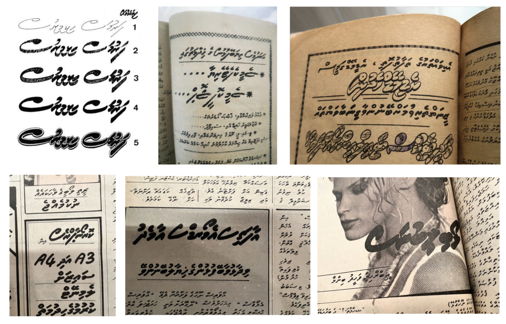
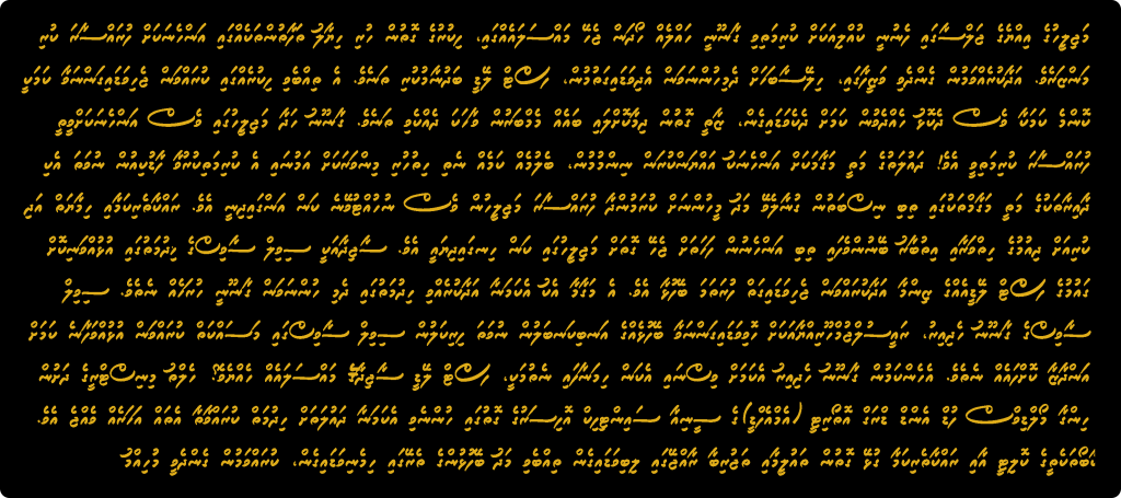
Afterward, I began designing the characters. Using traditional Thaana calligraphy and handwritings from different sources as reference, and personally experimenting with different handwriting styles, I started designing the characters digitally. I used a pressure-based brush stroke because it gave the most natural looking glyph designs. I first designed the 24 letters and 10 vowel marks in the Thaana alphabet and arranged them in an existing Thaana type template. It required a lot of kerning and individual placement to achieve the right placement of the three different lines of characters. It took a few weeks to design all the letters, vowel marks, and additional Thaana characters required and I had my own working Thaana font without, the cursive element of course.
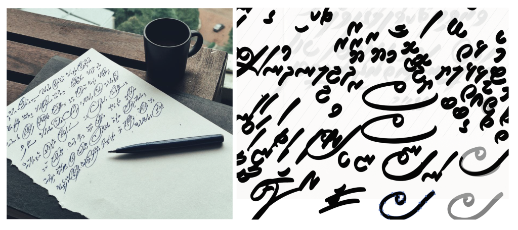
Following that, I initiated the process of designing the characters. Drawing inspiration from traditional Thaana calligraphy and various handwriting samples, I engaged in personal experimentation with diverse handwriting styles before transitioning to digital design. Using a pressure-based brush stroke, I aimed to achieve the most authentic and natural-looking glyph designs.
The initial phase of the font design involved digitally creating the 24 letters and 10 vowel marks within the Thaana alphabet. These glyphs were then strategically arranged in an existing Thaana type template, with tedious kernings and individual placements to ensure the proper alignment of the three distinct lines of characters. Designing the entire basic font design, excluding the ligatures necessary for the cursive element took me a few weeks to complete. The later part, “the woven-element” took twice as long because the number of different ligatures required different letter combinations. I kept the number of ligatures to a fixed limit because with cursive, more flexibility can often lead to less legibility so I had to keep a balance.
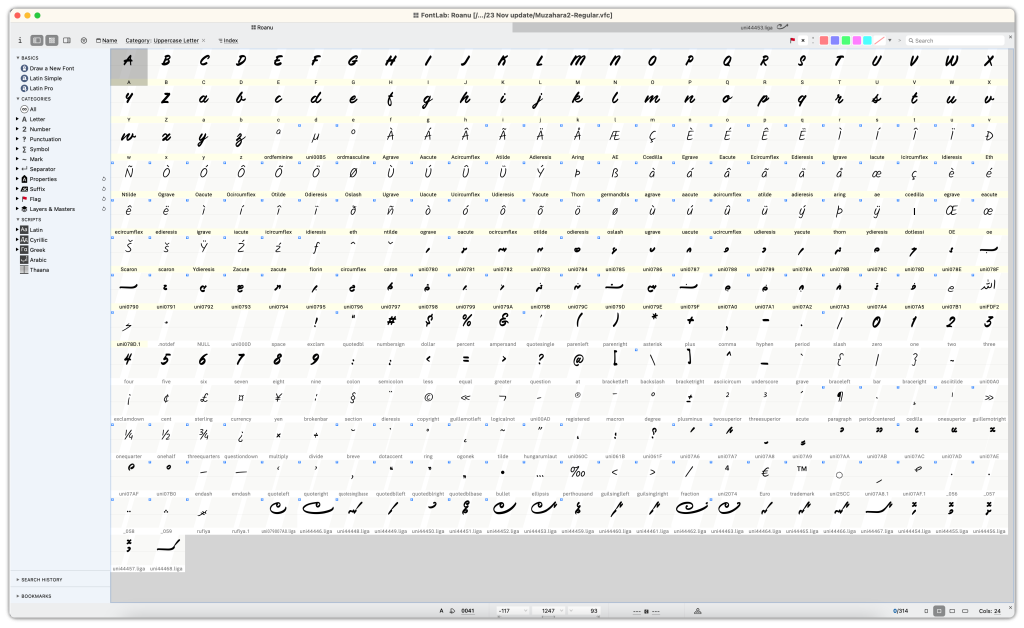
The latter phase, known as the woven element, took twice as much time due to the multitude of distinct ligatures needed for various letter combinations. I decided to limit the number of ligatures after realising that in cursive fonts, excessive flexibility can compromise legibility. Maintaining a balance became crucial in ensuring both flexibility and clarity in the design. Additionally, I created an English script typeface as the Latin Unicode to complement and support the Roanu font.
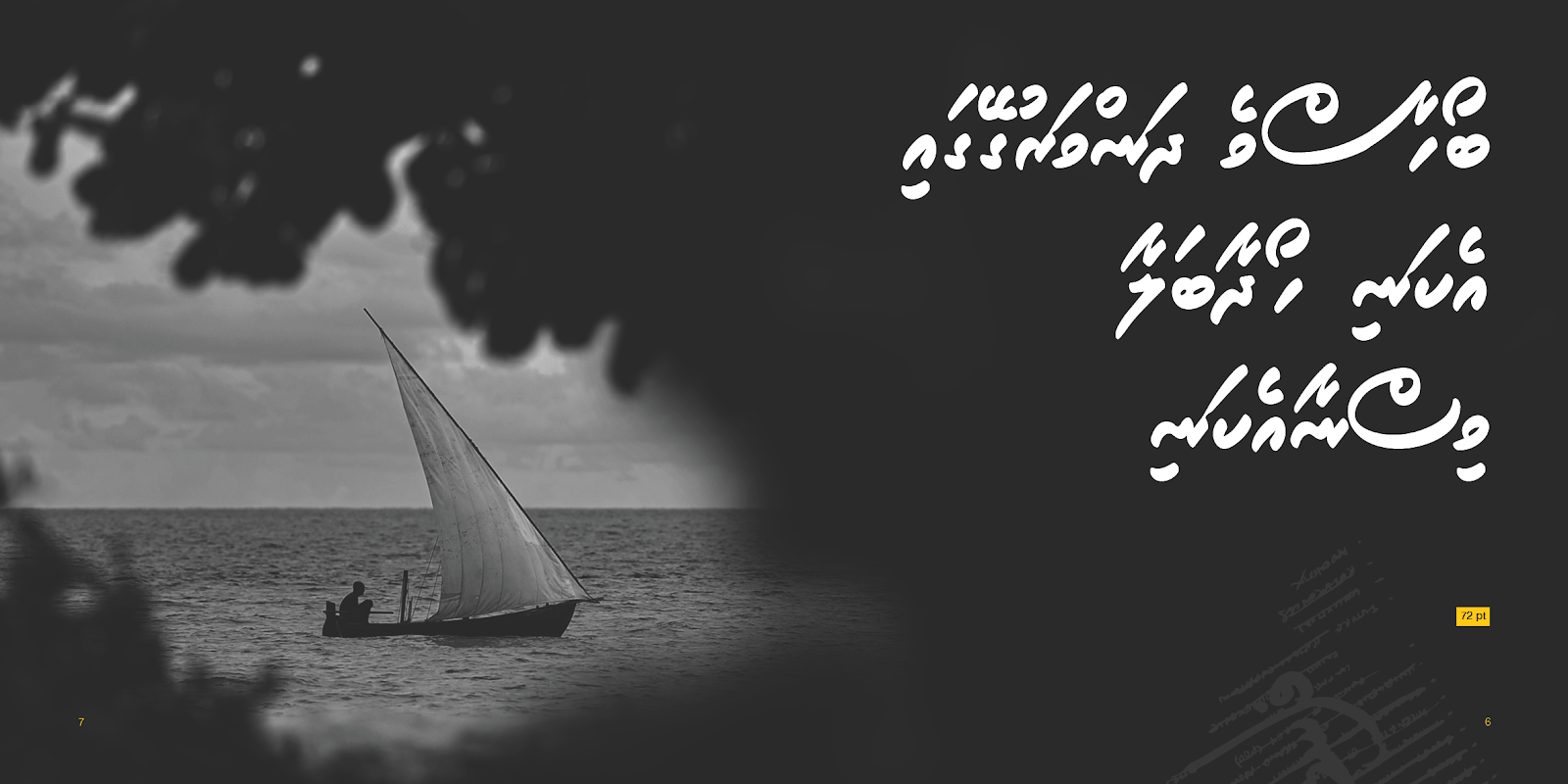
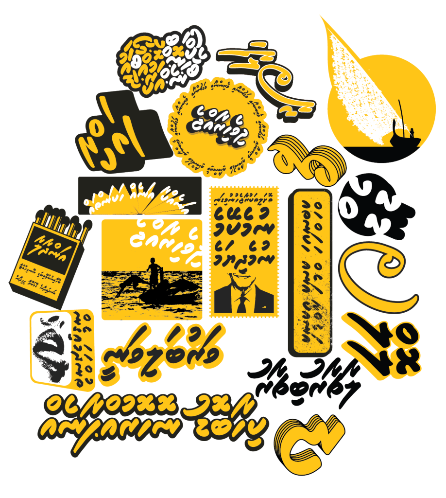
During the creation of Roanu, I simultaneously explored crafting visuals to present the font in diverse contexts. I opted for four types of visuals: type animations, a type specimen book, posters, and stickers. To highlight the bold black of the letters and showcase the distinct beauty of the characters, I infused the visuals with a vibrant yellow on a black palette, complemented by some of my photography capturing the essence of Maldivian islands and lifestyle.
The type animations serve as a dynamic display, illustrating various features of Roanu and showcasing its functionality as a font. Click or drag right or left to see all 6 animations below.
The accompanying book, titled Roanu, provides a more in-depth exploration of the font’s concept, mechanics, background, and visuals. It incorporates some of the posters and visuals inspired by Maldives, either influencing the font’s creation or capturing the cultural essence from which the font originates.
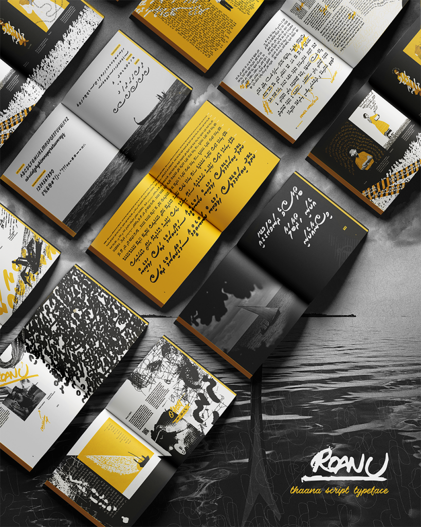
The posters are divided into two categories: inspired posters and type design posters. The inspired posters draw from Maldivian traditions, tales, and music, while the type design posters specifically highlight different glyphs, offering a visual representation of the font.
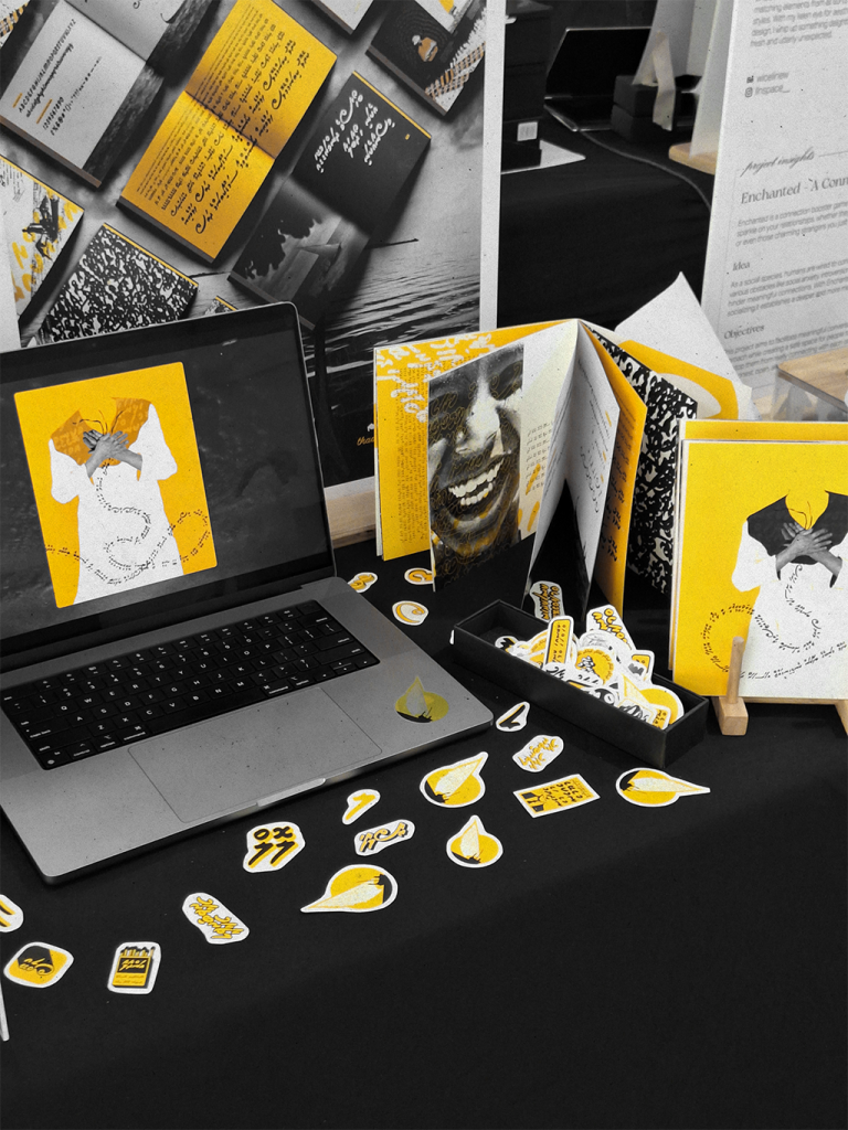
In preparation for my final project exhibition booth, I printed out all the physical visual designs and utilised a display monitor to present the animations
In conclusion, I’m very satisfied and relieved with the final result, along with the positive feedback on both the font and visuals. It’s especially rewarding, considering my initial worries about the project’s scale and complexity. At first, I even thought about giving up on the idea for another major project concept. But I’m glad I stuck with it. Moving forward, I intend to release the font online at the end of the year through a Maldivian type foundry.