
In Malaysia, gift-giving is more than just a tradition, it reflects deep-rooted cultural values and customs passed down through generations. However, this tradition is gradually losing its essence, especially during major celebrations like Mid-Autumn, Hari Raya, and Deepavali. The commercialization of these occasions has led to a surge of standardised, mass-produced gifts that often fail to capture the cultural depth and heritage unique to each celebration.
To address this cultural gap, I created a pastry brand called “CHA NING” for my final year project. This brand primarily aims to incorporate the traditional Chinese paper-cutting art for its package design as a means to preserve and promote the diverse cultural heritage of Malaysia.
The name “CHA NING” is more than just a label, it reflects the brand’s deep connection to Chinese tradition. The name is derived from a classical poem that evokes the elegant imagery of tea cakes and incense smoke. The word “CHA” refers to tea, representing hospitality and tranquillity in Chinese culture, while “NING” signifies unity and cohesion, aligning with the brand’s vision of bringing people together through shared cultural experiences.
The logo further embodies this concept with the character for tea rendered in ancient Chinese seal script, encircled by a round shape that represents both the traditional shape of pastries and the idea of unity. This thoughtful design encapsulates the brand mission to revive a personalised and culturally rich approach to gift-giving, evoking nostalgia and cultural pride while reminding consumers of the beauty and significance of the Chinese traditions.

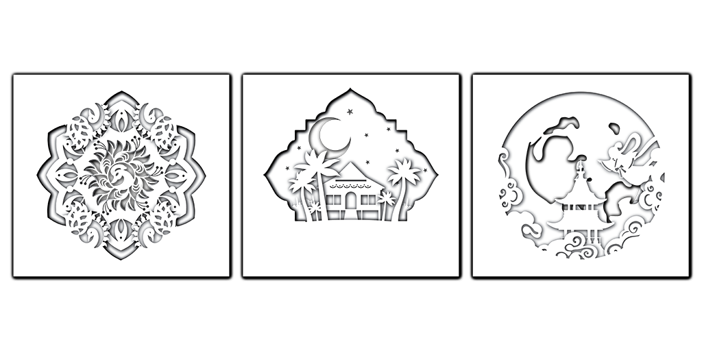
The vision of my project goes beyond creating a brand; it aims to incorporate traditional Chinese paper-cut art into personalised packaging. This ancient art form, with a history of over 1500 years, is renowned for its intricate patterns and symbolic meanings. By integrating Chinese paper-cut art, CHA NING seeks to educate and inspire younger generations to appreciate the cultural significance of this craft. Each packaging tells a story, capturing the essence of Malaysian festivities as well as the cultural customs that accompany them.
CHA NING is dedicated to celebrating Malaysia’s rich multicultural identity by incorporating not just Chinese cultural elements but also embracing Malay and Indian traditions. This diversity is reflected in the range of products which includes pastries and gifts that hold significance in various cultural celebrations. For instance, Hari Raya packaging features motifs of traditional Malay kampung houses or crescent moons, while the Deepavali packaging incorporates Indian elements such as peacock symbols and designs inspired by the festival of lights.
In this way, I aspire to create opportunities for cultural exchange that allow Malaysians to share their unique traditions, customs, and perspectives with one another. In a country rich in diversity such as Malaysia, I feel it is our responsibility to honour our differences while fostering unity through shared traditions.
Thus, CHA NING embodies this spirit by offering products that resonate with individuals from all backgrounds.

Throughout the project, I developed various brand essentials such as business cards, invoices, letterhead, envelopes, and staff T-shirts. I used a warm beige and deep burgundy colour palette. This choice of colours is intended to evoke feelings of warmth, tradition, and elegance, reinforcing the brand connection to cultural heritage. However, the highlight of the project is undoubtedly the packaging design. The first packaging design was developed specifically for daily pastry purchases with graphic elements inspired by traditional Chinese paper-cut art. I incorporated them into the packaging, observing that most current pastry packaging relies heavily on square window designs or illustrations.
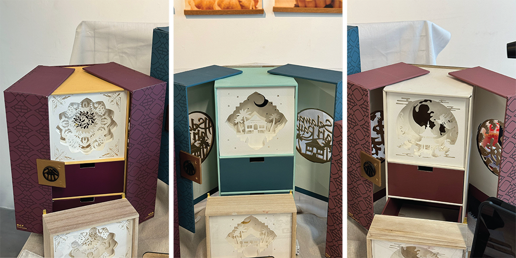
Based on my research, I discovered that 90% of people discard the packaging after receiving a gift, while only 10% keep it, depending on whether the design attracts them. This insight motivated me to create festive limited edition packaging that not only incorporates cultural paper-cut art from various Malaysian ethnic groups but also allows consumers to repurpose the drawer section of the packaging as a storage solution and decoration. This sustainability aspect adds value to the product, making it more than just a one-time gift.
The second highlight is the limited edition festive packaging that addresses the lack of personalization to reflect Malaysia’s cultural heritage. Each CHA NING limited package is thoughtfully designed to incorporate cultural elements from Mid-Autumn, Deepavali, and/or Hari Raya. Each festive packaging is unique, reflecting the distinct cultural customs of these celebrations. For instance, Mid-Autumn packaging features paper-cut art of Chang’e and the Jade Rabbit, symbolising prosperity and good fortune. Hari Raya packaging features paper-cut art of stilt houses, the crescent moon, and mosques to represent renewal and celebration. Meanwhile, Deepavali packaging features paper-cut art of kolam patterns and peacock motifs, symbolising light, prosperity, and unity.
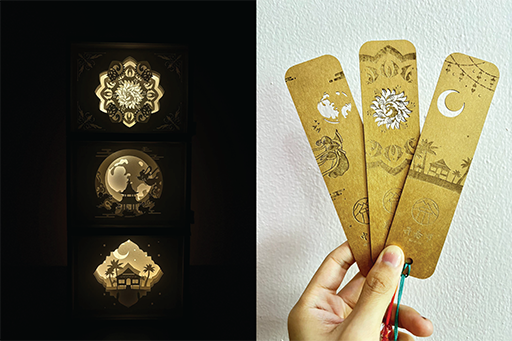
In addition to the branding and packaging design, I also designed small merchandise such as festive paper-cut shadow display boxes and paper-cut bookmarks. These items are intended to complement the main products, providing consumers with a complete cultural experience. The concept of the festive paper-cut shadow box offers consumers a decorative gift that can be shared with friends and family. The paper-cut bookmark serves a dual purpose, not only as a bookmark but also as a creative tool that allows users to align its intricate cutouts with the full moon for a unique photographic experience.
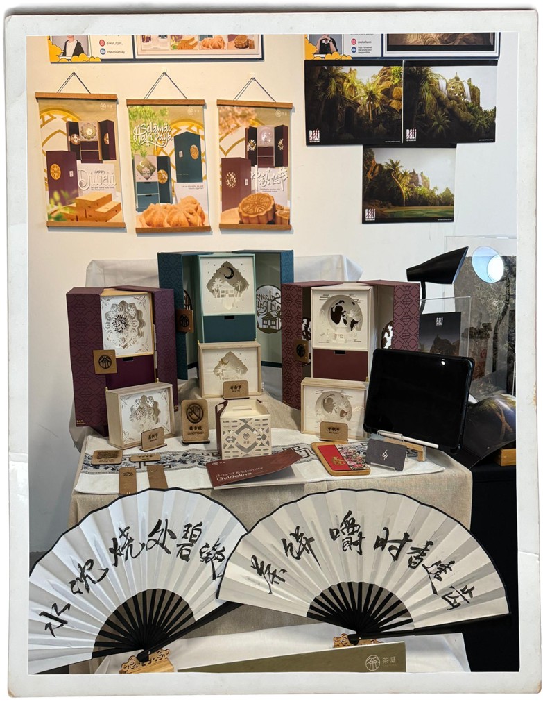
The photo above shows my booth at the 24.Interlube Final Year Showcase, where I presented my graduation project. This event provided a platform to showcase CHA NING to a broader audience and receive valuable feedback. Visitors shared their thoughts on my packaging design, offering both praise and constructive criticism. Some mentioned that they would purchase these packages if they were available in the Malaysian market, while others pointed out that only a few designers incorporate cultural elements from the three major ethnic groups into a single packaging design. They explained that the art of paper-cutting is underappreciated
This feedback made me feel proud and satisfied that my design successfully raised awareness of both Chinese paper-cut art and the uniqueness of Malaysia culture, inspiring people to appreciate these traditional art forms.
Through this project, I have successfully integrated Chinese paper-cut art into modern packaging design, emphasising the unique culture of Malaysia in a creative and educational way. For me, this was not just a project, but a meaningful endeavour to preserve our cultural identity and heritage as Malaysians and to share my love for this country with everyone.The journey of creating CHA NING has been an exploration of cultural expression, design innovation, and the power of storytelling through art. I believe CHA NING will continue to evolve, inspiring others to embrace and celebrate the rich cultural tapestry that defines Malaysia.