
This trend was a clear signal that Malaysia’s and Southeast Asia’s creative industries were evolving quickly, demanding more conceptual and expressive design tools. I created Quanta as a response to that need, designing a modular typeface that could serve as a visual system for designers looking to push creative boundaries.
Typography plays a foundational role in how visual ideas are communicated. For this project, I wanted to create a typeface that addressed that demand. A font that goes beyond functionality and into the realm of concept-driven, contemporary design.
Concept and Inspiration
It is through my past experience that I realised that students aim too much for commercial readiness and practicality, lacking creative excitement in their portfolios. Thus, I decided to create a display typeface grounded in structure but capable of visual personality.
To be a designer, is to steal like one.
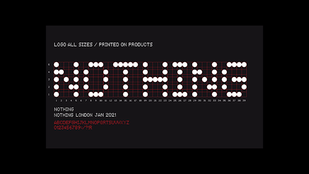
I highly believe that no idea is 100% original, and that no ideas come from the vacuum that is a designer’s mind. So explains my key inspiration that came from dot matrix letterforms and digital display systems—especially the minimalist and futuristic font used in the ‘Nothing Phone’, which itself was likely inspired by other dot-matrix typefaces that came before it. I was drawn to how it used simple dot modules to create a compact, grid-aligned aesthetic. Particularly, it was an example of how a highly distinct and conceptual design language was successfully implemented onto a large-scale brand.
I decided to build Quanta with that same logic, reimagined for modern branding, motion graphics, and interface design. This font, that had no name at the time, would become my endeavour in reproducing that same ingeniousity.
Design System and Grid Structure
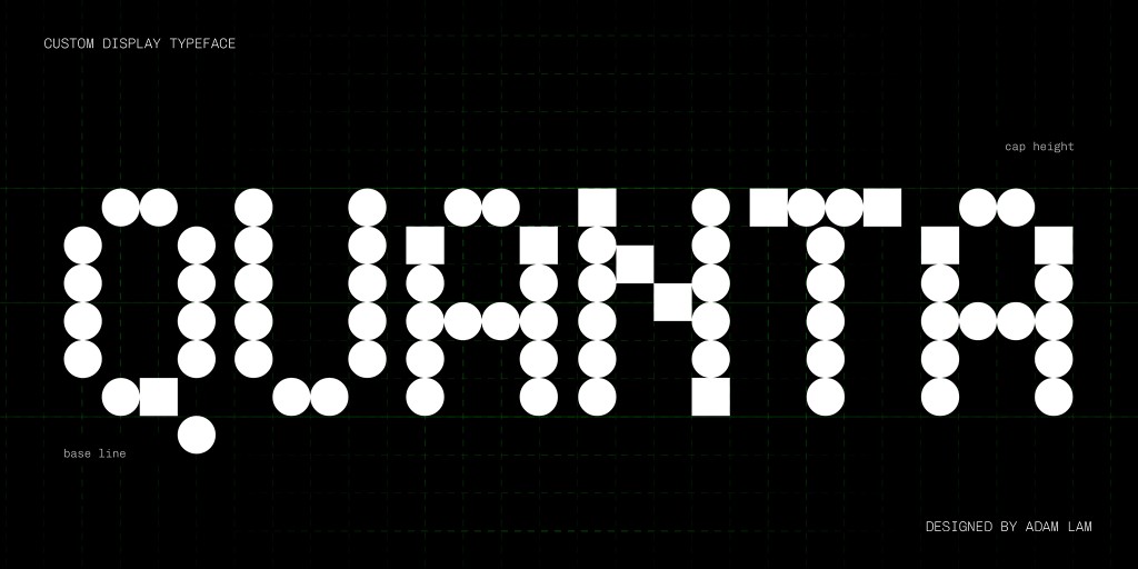
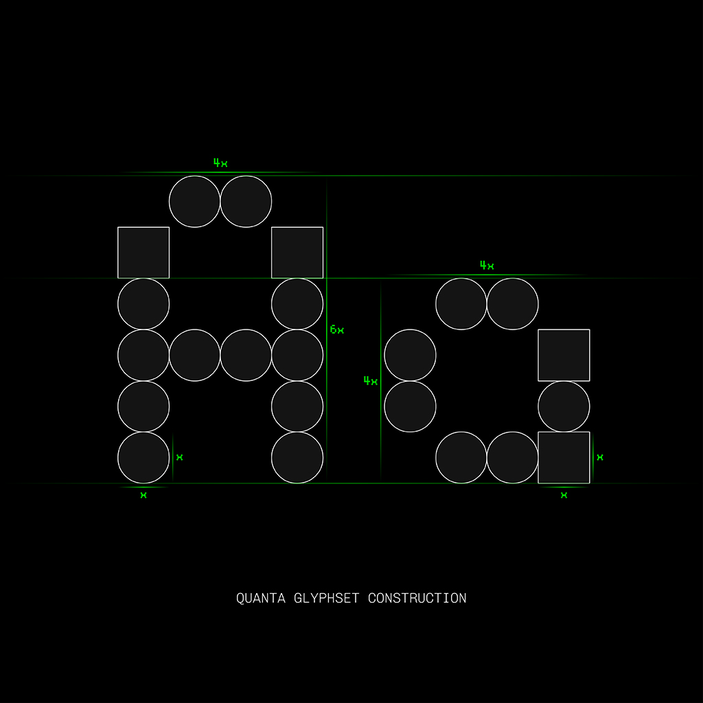
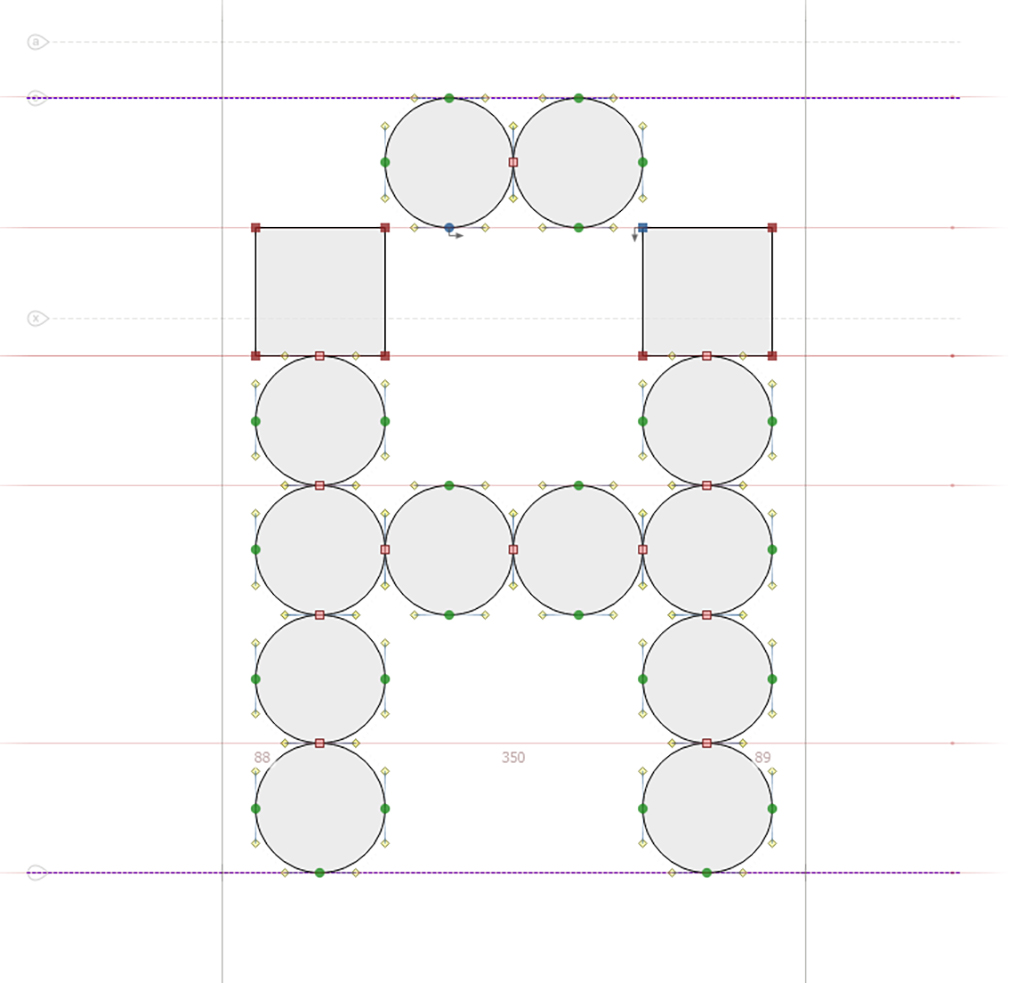
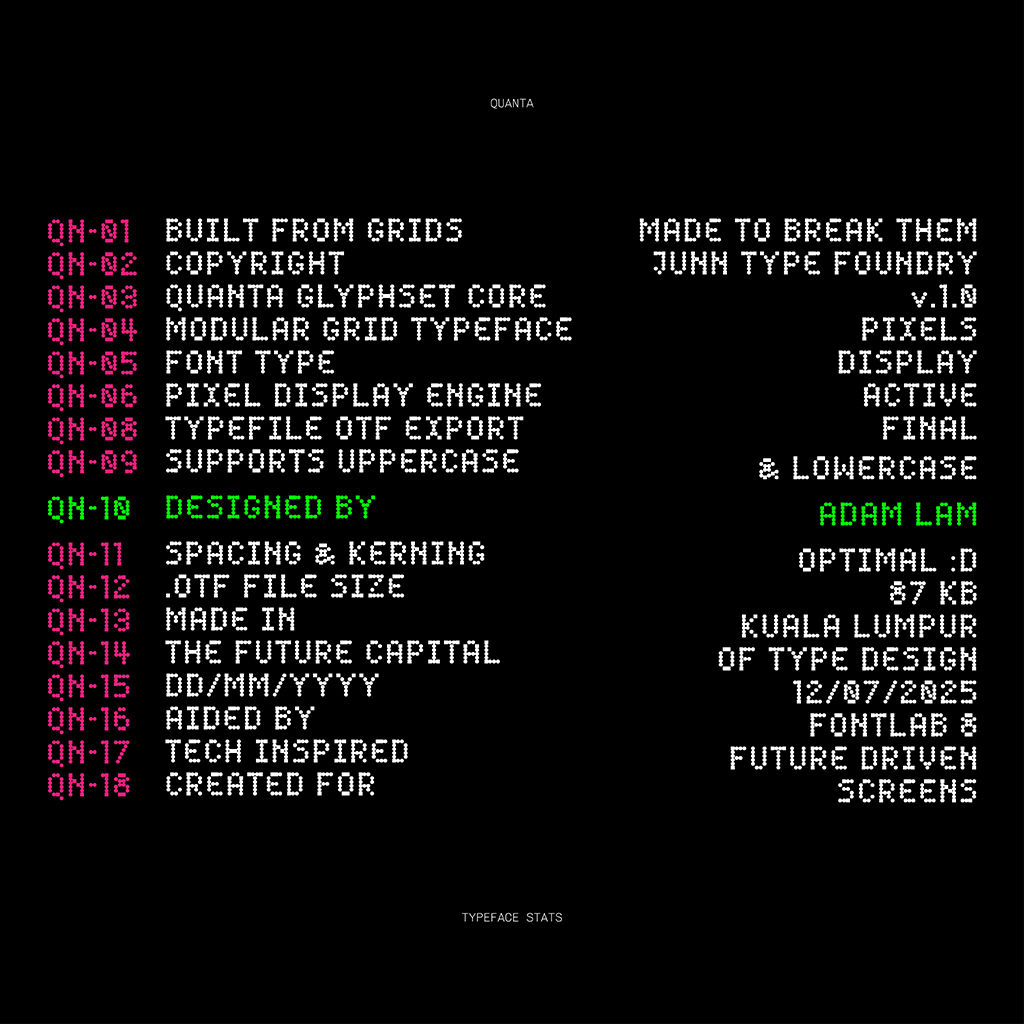
I developed Quanta on a strict modular framework. The height of every character is capped at 6 units, while the width varies between 3 and 5 units, and some glyphs only occupy 1 unit width where appropriate. This approach allowed flexibility and rhythm without sacrificing consistency.
I observed that characters like “W” or “M” needed full width, while “i” and “l” could anchor the system at minimal width. That flexibility enabled me to retain modular harmony while making decisions that favored recognizability and design balance. Most characters, however, stuck to a 6 × 4 grid.
Process: Explorations, Prototypes, Feedback
I began explorations in Adobe Illustrator, starting with uppercase letters. I defined cap height and baseline first, and used the grid to ensure each glyph aligned properly. After modeling a few uppercase letters, I reviewed the mockups with Mr. Vinod, who approved moving forward with lowercase designs.
Next, I doubled the grid height to accommodate descenders for lowercase forms. I annotated x height, baseline, cap height, and descender levels, then experimented with multiple grid configurations for each glyph. I even referenced Calibri for punctuation sizing, particularly for glyphs like “&” and “@”.
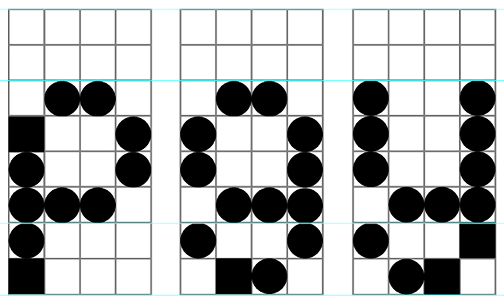
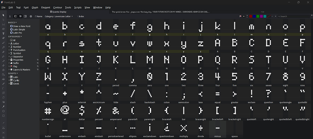
Once I had a full character set, I imported all glyphs into FontLab 8 to set font metrics, like the cap height, x-height, ascender and descenders. I used the scale tool to ensure consistency across uppercase and lowercase, and corrected misalignments in characters like lowercase “f”, “j”, and uppercase “Q”. I tested the font at small sizes to confirm legibility and spacing rhythm.
Presentation Development and Messaging
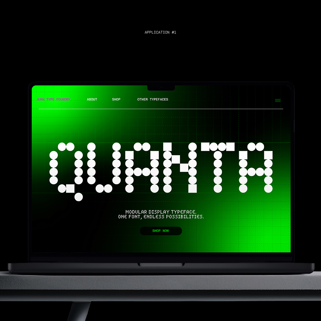
I created five distinct presentation layouts in Illustrator, using a palette of neon green, pink, black, and white—evoking early digital screens and cyberpunk aesthetics. I titled the font Quanta Modular Typeface and crafted taglines such as “Built from the Grid Up” to reinforce the futuristic vision.
Each presentation module showcased Quanta in different contexts:
- Full Character Set – showing all explored character/glyph units.
- Headline Mockup – a design layout using Quanta for bold messaging, paired with an appropriate monospaced font.
- UI Dashboard Example – a simulated interface using Quanta fully on its own.
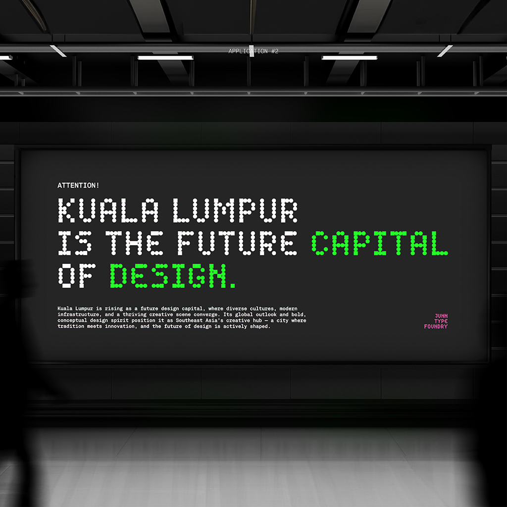
- Mock Product Branding – Quanta used on screens, billboards and signage with mock slogans with creative messaging that embodies the futuristic nature of the font.
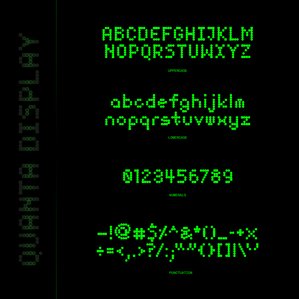
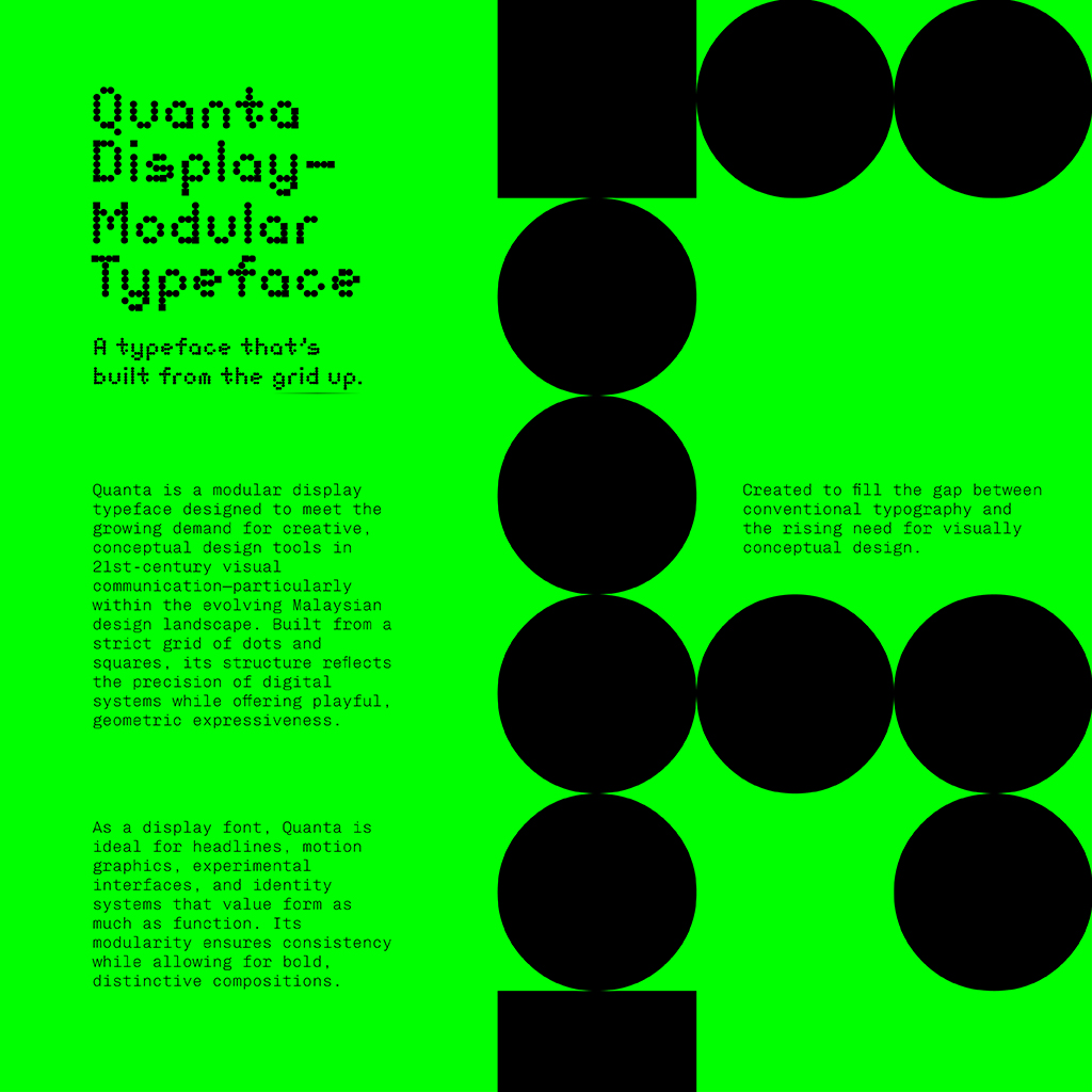
Fig. 5.2 Quanta Display Type Pairing © Adam Lam, 2025
Each presentation spoke to the conceptual purpose of Quanta—showing how modular geometry translates into real-world communication tools.
Application Use Cases
I designed Quanta for specific creative and functional contexts in mind:
- Tech Branding – clear and assertive headers for startups and innovation labels.
- UI/UX Interface Prototypes – especially for smartphone screen or computer displays.
- Motion Typography – modular forms animate cleanly in looping sequences.
- Posters and Editorial Layouts – eye-catching headings and display phrases that carry conceptual weight.
- Experiential Installations – signage, ambient projections, or TV screens where modular units can be assembled dynamically.
I created a few mockups inspired by the above use cases to sell the idea further.
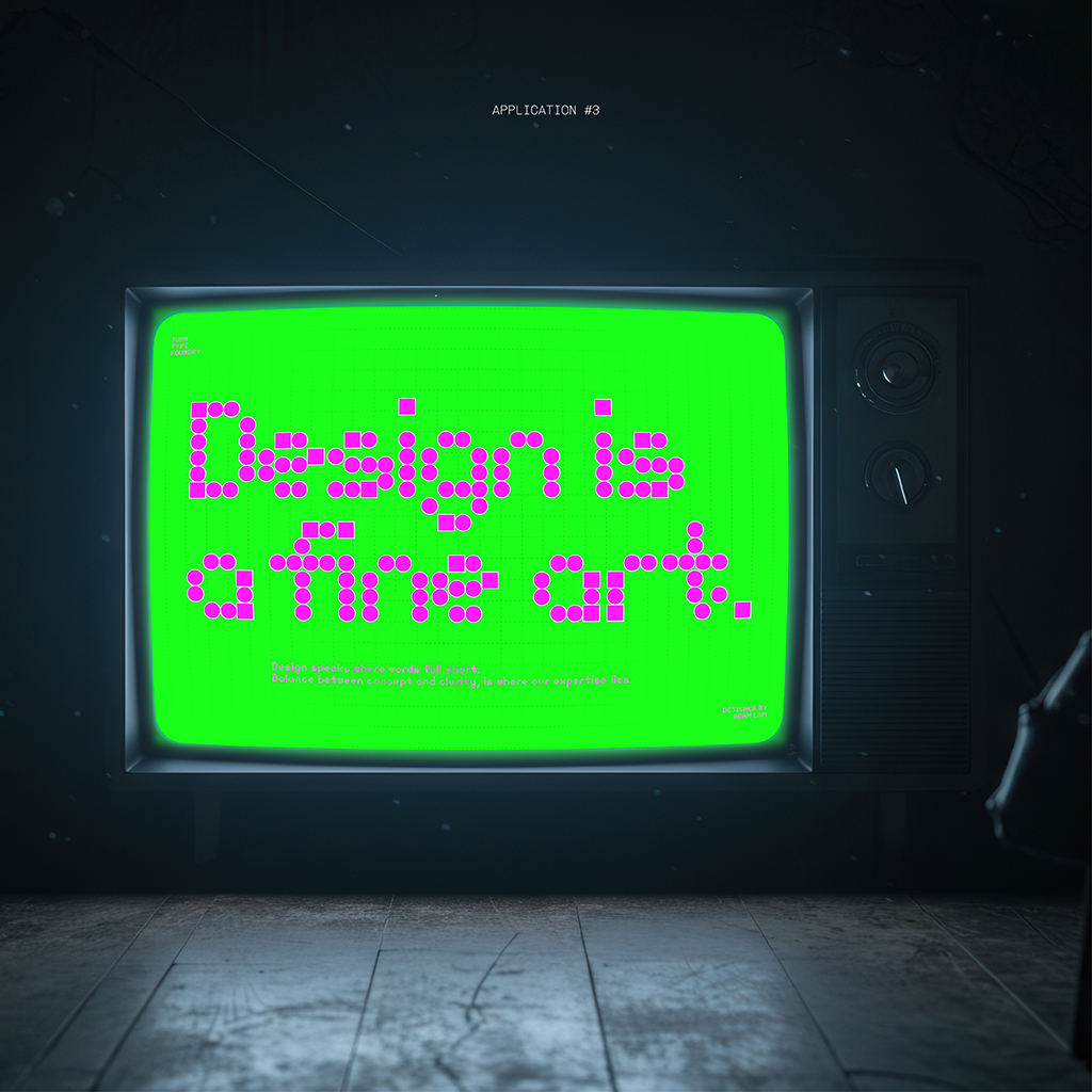
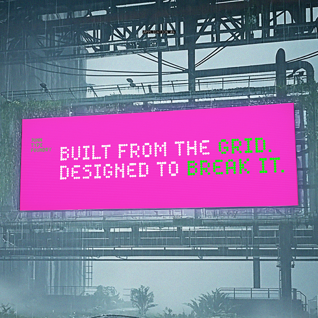
The messaging in these examples—phrases like “DESIGN IS A FINE ART”, “BUILT FROM THE GRID, DESIGNED TO BREAK IT”, and “ONE FONT, ENDLESS POSSIBILITIES”—emphasized the futuristic and modular, systematic identity I intended for Quanta.
Does Quanta Serve a Purpose?
I designed Quanta to address a tangible gap: Southeast Asia’s market increasingly demand conceptual and system-conscious visual tools, but few local designers meet this standard. Quanta offers:
- A modular system that is consistent yet expressive.
- Structural clarity for display on large digital formats.
- Unique visual personality appropriate for modern tech-brand identity.
- A homegrown alternative to global display typefaces, rooted in a Southeast Asian design sensibility.
In mockups and presentations I positioned Quanta as both a visual statement and a design resource: part fine art, part functional brand identity.
Kuala Lumpur & Southeast Asia: My Vision
Quanta, while just one contribution, is a step toward empowering designers to express new visual ideas with type. It reflects a broader regional trend: we aren’t just catching up, we’re starting to define what contemporary design can look like on our own terms.
Final Thoughts
As a student and a designer who’s worked in both academic and industry settings, I recognize that design tools must reflect both creativity and logic. Quanta embodies that duality: modular, systemic, expressive, and adaptable. It bridges the conceptual expectations of modern design with practical functionality.
I see modularity, structure, and creativity not as conflicting forces, but as foundational pillars for expressive design in the 21st century.
Try Quanta Display font out below: