The assignment gave me freedom to explore topics I was passionate about and to creatively solve problems through design. This led me to embark on designing a typeface for a mock cryptocurrency exchange I called Satosch.
Satosch is more than a visual experiment. It represents an attempt to capture the energy, complexity, and optimism inherent in blockchain culture. My goal was for the font to communicate trust, clarity, and brand identity—from standby default screens to crypto debit cards.
Have you ever wondered how a typeface could embody the bold spirit of the crypto universe? That’s exactly where my journey of Satosch began.
As a designer entrenched in the worlds of typography and visual branding, my curiosity collided head-on with the fast paced fintech culture. The challenge: could I create a typeface that channels both the technical backbone and accessible face of a modern cryptocurrency exchange mock-company named Satosch, in an industry built on trust, innovation, and a dash of secrecy?
What Sparked Satosch?
The origin story is a mash-up of two worlds. On one hand, the extreme modularity and geometric language of the digital age; on the other, the palpable need for brands (especially in finance and crypto) to be as approachable as they are secure. Satosch is named after Satoshi Nakamoto, whose own persona hovers between enigmatic code and blockchain transparency. This tension became my guiding framework: could Satosch walk that fine line, too?
With crypto exchanges prolifically launching and disappearing around the globe, the race is on to build distinctive, memorable brands. But what underpins that first flicker of user trust? Typography. The right font quietly signals authority, creativity and clarity on every login screen, dashboard, and trade confirmation.
Concept: Modular Geometry Meets Blockchain
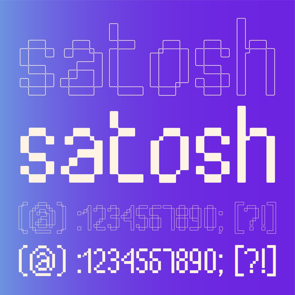
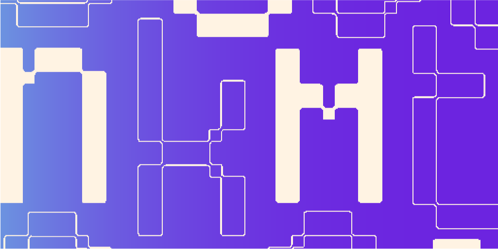
I knew right away I didn’t want Satosch to feel like “just another sans.” Instead, every glyph in the typeface leans into a modular approach: built with rounded-corner squares, balancing cold precision with a digital warmth reminiscent of approachable interfaces. This echoes blockchain’s structure, human at its fringes.
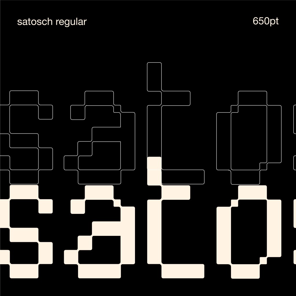
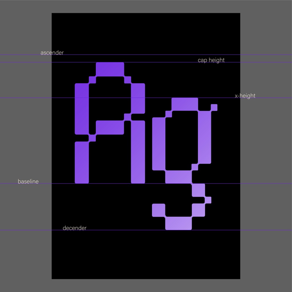
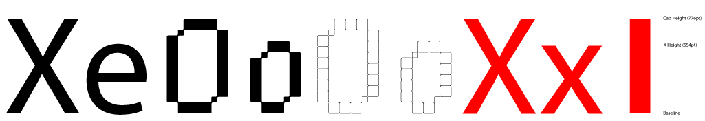
The uppercase letterforms embody disciplined geometry. Imagine shapes that almost belong on a pixel grid, softened by gentle curves to avoid rigidity. For example, the capital letter S is carefully crafted to balance strength, while letters such as A, O, and C exhibit generous internal spaces that create a sense of invitation.
Achieving harmony within the lowercase set took deliberate care. After meaningful and much-needed feedback, I dedicated time to aligning the heights and widths carefully so that the lowercase letters would complement their uppercase seamlessly. Modularity and consistency do not guarantee harmony automatically; the subtle, iterative process of measuring, tweaking, and rebalancing. Only after multiple rounds of obsessive refinement did the lowercase glyphs stand confidently alongside the uppercase, contributing to a cohesive typographic voice.
In essence, Satosch represents the interplay between geometric order and human touch. It aims to signal stability and reliability while extending a friendly, approachable visual invitation.
The Design Process: From Mood Boards to FontLab
1. Research & Ideation
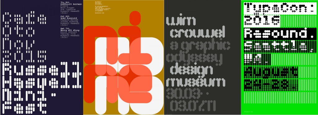
My design space was soon blitzed with screenshots from crypto exchanges, mood boards, and similar fonts (MuirMcNeil’s Artworks) for references. I spent some time on sketching, shuffling shapes, and testing how rounded-corner modules could deliver both structure and surprise.
2. Construction & Application
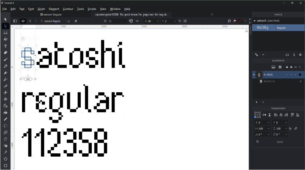
In Adobe Illustrator, where each glyph’s anatomy was carved out of arranged rectangles. The font took its first steps in FontLab 8; a geeky playground where spacing, kerning and side bearings occupy hours of designing.
One of the most rewarding aspects of designing a typeface is witnessing it come to life through practical applications. After completing the core character set for Satosch, I was excited to explore how this typeface could enhance genuine user experiences and shape branding moments within the crypto community.
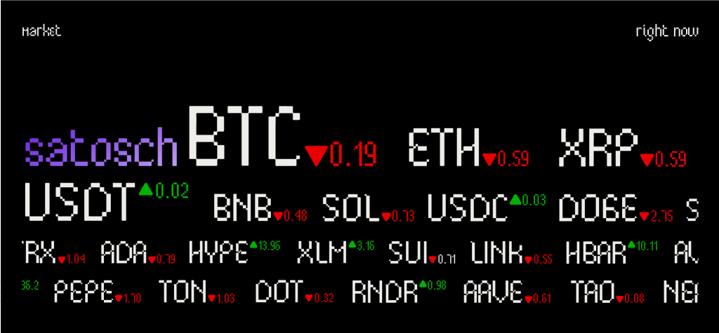
I first introduced Satosch into a dashboard environment tailored for contemporary cryptocurrency users. These dashboard mockups move beyond the function of a standard clock by combining both timekeeping and real-time Bitcoin price data in a single interface. This integration empowers investors and traders to access crucial information at a glance, supporting quick and informed decisions. In these settings, the unique letterforms of Satosch are used for more than just displaying numbers and labels. They become graphic and decorative elements as well. I experimented with typographic patterns created from the font’s glyphs, weaving them into the background of the interface. Notably, I arranged the letters to spell out “nakamoto” in a vertical zig zag direction, resulting in a subtle yet distinctive branded background pattern that strengthens visual identity without distracting from the essential content.
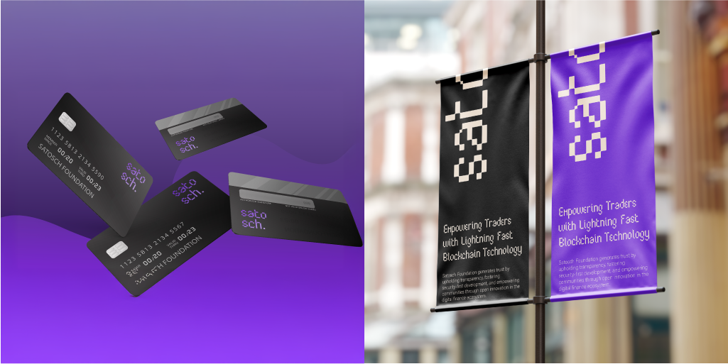
Next, I explored how Satosch could perform in promotional banners, reflecting the needs of printed brand communication. Printed advertising materials remain a staple in real-world marketing. To demonstrate versatility, I created sample banners that showcase Satosch Regular in print settings. These designs illustrate how this typeface can work alongside others with varying styles and weights, establishing a clear typographic hierarchy. The coordinated use of fonts helps branding remain cohesive, allowing headers, subheadings, and supporting text to guide the viewer’s attention and reinforce the identity of Satosch.
I also envisioned Satosch on a cryptocurrency debit card, representing the intersection of digital currencies and traditional financial systems. Even as blockchain technology supports decentralization, practical realities ensure that physical and digital forms of currency must coexist. My debit card concept utilizes Satosch Regular as a prominent, approachable wordmark, anchoring the card’s design with simplicity and confidence. The result is a visual system where the typeface stands out and projects reliability at every point of user contact, all without overwhelming the overall design.
Through these design mockups, Satosch is not only evaluated for its visual consistency and legibility but also for its ability to contribute to memorable and professional branding across digital platforms, printed campaigns, and tangible products. This approach reaffirms that an exceptional typeface is not defined solely by its appearance in a specimen but by the way it elevates experiences and strengthens brand presence wherever it is applied.
Designer’s Reflection: What Satosch Taught Me
Crafting Satosch taught me the importance of balancing creative freedom with thoughtful discipline. The process of working within a modular system introduced both limitations and surprising moments of creative discovery. I realized that user trust often depends on small details in typography, such as consistent counters, harmonious rhythm, and well-balanced proportions.
Repeated cycles of feedback and adjustment showed that type design is an ongoing, evolving process. In the fast-moving world of cryptocurrency, designers need fonts that are flexible, reliable, and full of character. With Satosch, my hope is to contribute a typeface that helps both designers and users connect more confidently and clearly within this dynamic space.
Download Satosch
Curious to try the font in your own branding experiments, UI studies, or creative projects? Download Satosch Font here. © Valerius Ethan Wirawan, 2025.
You can try typing using the Satosch font here:
Satosch is my contribution to a growing universe of expressive, next-gen typefaces. Whether you’re crafting a cutting-edge fintech interface, reimagining event graphics, or just on a journey to explore typographic possibilities. Let me know how Satosch moves through your creative world.
Font Presentation