
For my final project in Advanced Typography, the brief challenged us to design a font to: solve a larger problem, explore the use of an existing letterform of our interest, or an experimental approach that is novel and unique.
By coincidence, just days earlier, I had begun designing a font for a matcha brand as part of a branding expansion project. It felt natural—and efficient—to merge the two, creating one typeface that could fulfill both academic and real-world needs.
The Making of Kura
Over the past few months, matcha has been a growing trend. Seeing the opportunity, a client reached out and decided to jump onto the trend by making a brand in my hometown Bandung, Indonesia.
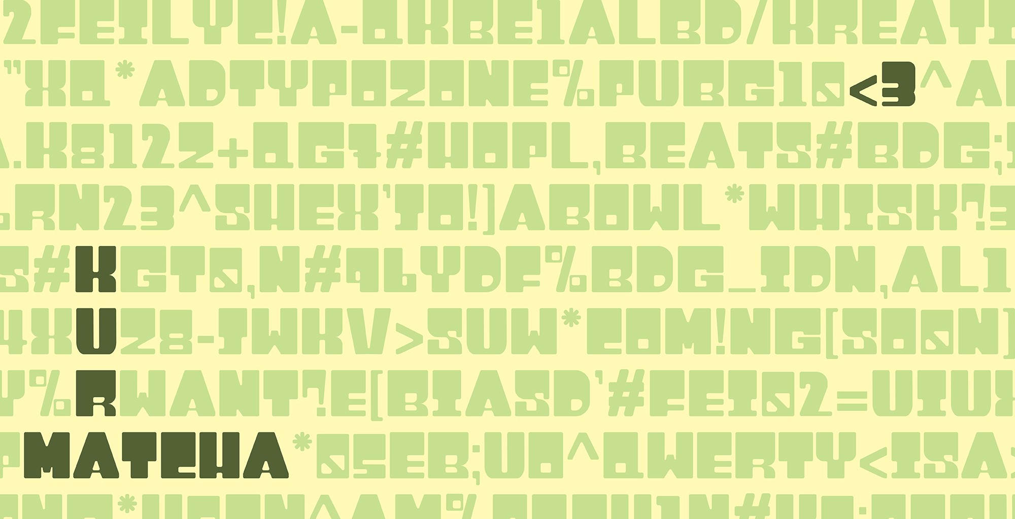
The name Kura comes from “kura-kura,” meaning “turtle” in Indonesian. Just as turtle moves with intentions, each letterform in Kura is built on a deliberate grid carrying a sense of balance and calm. The rounded edges echo the smooth curve of a turtle’s shell, while the sturdy block shapes reflect its quiet strength. In matcha culture, patience is part of the ritual, and Kura embodies that same unhurried grace—bold enough to make a statement, yet gentle enough to invite the eye to linger.
1. Project prompt : designing calm with structure: This project began with the desire to create a typographic system that balances the ritualistic serenity of matcha with the confident presence of structured form. The brief called for a custom display typeface that could translate the visual qualities of matcha-earthy, calming, deliberate–into structured letterforms. The result: a font that feels substantial yet approachable, bridging tradition and modernity.
2. Matcha as Muse: Visual Research and Collection: The research focused on two main areas: the visual atmosphere of matcha ceremonies and the structural qualities of modular type. I collected references ranging from matcha bowls and bamboo whisk to existing packaging of contemporary matcha brands.
3. Finding form in flavor:
In the early ideation phase, I explored several directions: bubbly fonts, thick-blocky fonts, and more quirky hand-drawn lettering. However, the concept that resonated most combined a blocky and structurized letterform with soft and rounded edges. This approach captured the dual nature of matcha itself — grounded and methodological, yet warm and inviting. I began developing a letterform that would feel weighty without appearing cold.
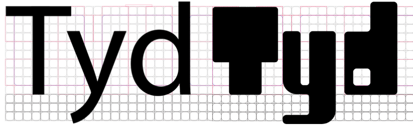
4. From sketch to structure: Initial sketches explored the extremes of proportions, some characters were narrower or more condensed than the others. Once digitized in Illustrator, I refined the forms into consistent proportions using grids.
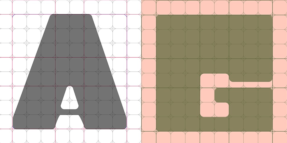
The uppercase letters established a bold, rectangular framework, while the lowercase introduced friendlier curves and a high x-height. Rounded corners softened the heavy geometry, allowing the type to feel more approachable and tactile.
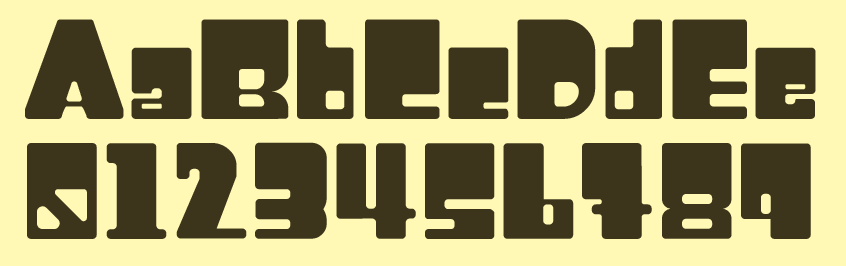
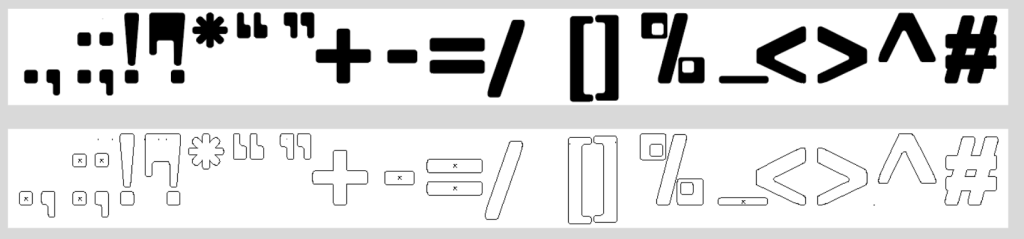
Alongside the letters, I also worked on the numerals and punctuations. I defined x-height, cap height ascender, descender and the ratio of numerals and punctuations using “Myriad Pro” as my ratio for my guide.
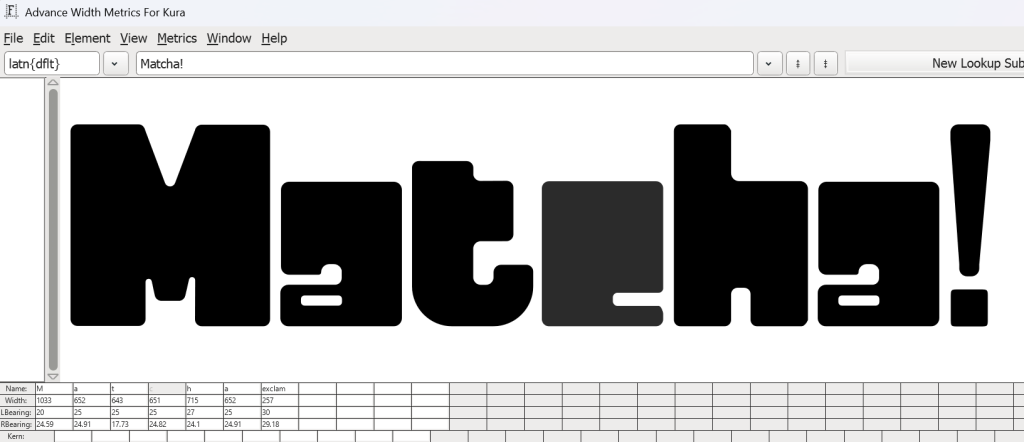
Once I finished all of the characters, each glyph was imported into FontForge. I began by setting the font’s core metrics: cap height, x-height, ascenders, and descenders. Using the grid as a quiet guide, I scaled and aligned uppercase and lowercase for consistent proportions. Adjusting the side bearings and kernings took a while, but it paid off when we viewed the preview.
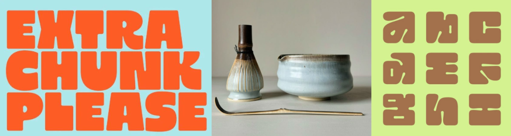
5. From Grid to Cup: To showcase the font design in action, the letterforms were applied to a series of mockups and visual samples. Presentation includes the letterforms in full display, integration into patterns and packaging. Each application becomes a canvas to highlight Kura’s balance of structure and warmth — proving that its geometric foundation doesn’t strip away personality. Here, the font isn’t just seen; it’s experienced, interacting with color palettes, imagery, and layouts that bring its character to life.
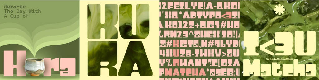
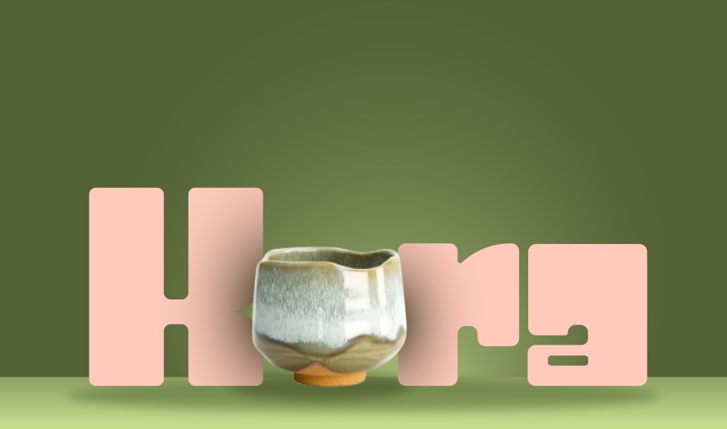
Kura’s adaptability truly shines when placed in diverse visual scenarios. Across the four application designs, the typeface shifts effortlessly between playful, bold, and expressive moods without losing its geometric backbone. Personally, the first and the third presentations are my favorites. In the first, “Kura-te: The Day with a Cup of” pairs a friendly tagline with a tactile ceramic cup, the soft matcha waves echoing the font’s rounded corners. And the third, a dense character map poster, showcases Kura’s full glyph range in alternating colors, making the font itself a graphic pattern.
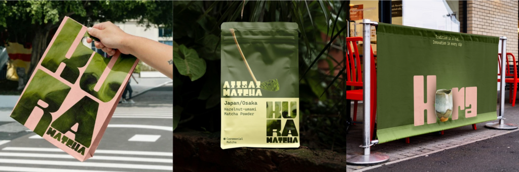
Next, Kura was placed into a series of mockups that simulates real brand environments: paper bags, matcha powder packaging, and cafe banners. The paper bag design turns every purchase into a walking advertisement, using Kura’s bold forms to carry brand messaging with confidence. The matcha powder packaging balances tradition and modernity — the letterforms frame product information while allowing illustrations to complement the brand story. The café banner, designed for high visibility, uses Kura in large-scale typography to catch attention from afar, demonstrating its legibility in outdoor and retail settings. Together, these mockups form a cohesive vision of how Kura’s character comes to life in tangible, customer-facing experiences.
6. Kura on Standby: In addition to Kura’ application in the matcha business, Mr. Vinod asked for an entry for The Honor Competition, standby category. This category called for an overall design, clock design, personalized signature design and an animation of the clock. After reviewing all of the themes, I settled for “Celebration: A Totem of Renewing Festive Culture”, specifically I will design a Lunar New Year themed design.
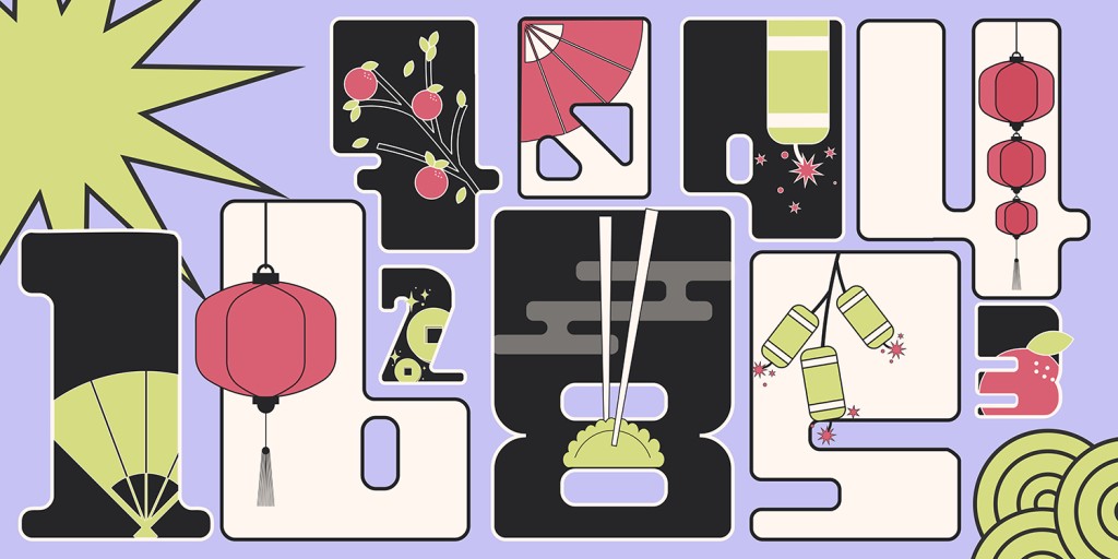
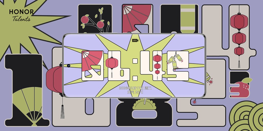
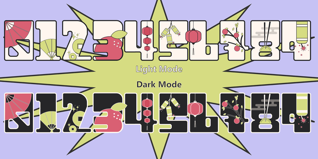
To showcase Kura’s versatility, the generous strokes become frames to hold symbolic elements — lanterns, firecrackers, folding fans, and ripe tangerines — embedded right inside the letterforms. The thickness of Kura’s structure allowed for generous detailing without losing legibility, while the grid-like forms kept the design balanced and structured. The result was more than just a functional clock display; it became a fusion of type and tradition, where every second ticked inside a celebration.
Final Thoughts | Kura’s Influence on My Design Thinking
This project was a rollercoaster — equal parts exhilarating and exhausting. Designing a font for an actual project felt meaningful because it was a “real-life” creation I could actually see in use. Designing Kura taught me how to capture a personality and translate it into design. Understanding a font’s character from choosing serif or sans-serif, to adjusting thickness and roundness — can completely define its personality.
Type using Kura Font below:
Click here to download Kura Font. (Kura Font © Feilycia , 2025)