
Concept/ Inspiration
When looking at typefaces, I always find myself attracted to bold, blocky letterforms. They look simple but work SO well at capturing people’s attention. This led me to question: What if I could create a bold typeface of my own that reflects my personal identity?
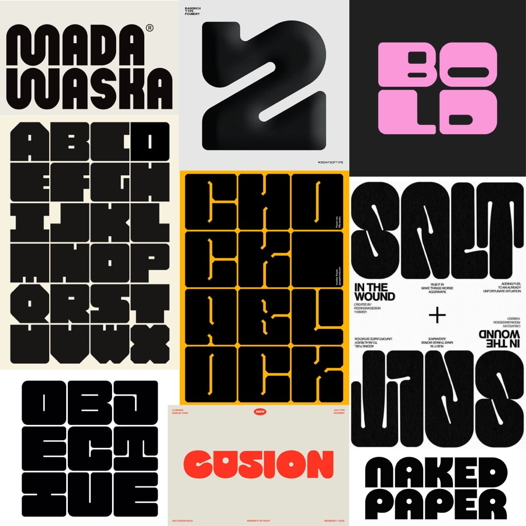
I wanted to design a bold, fat typeface that screams “Look at me!” but in a polite way (if you get what I mean). Before beginning the design process, I used my wordmark as a guideline to collect visual references of thick typefaces that could support my ideation and serve as inspiration.

Digitisation on Illustrator
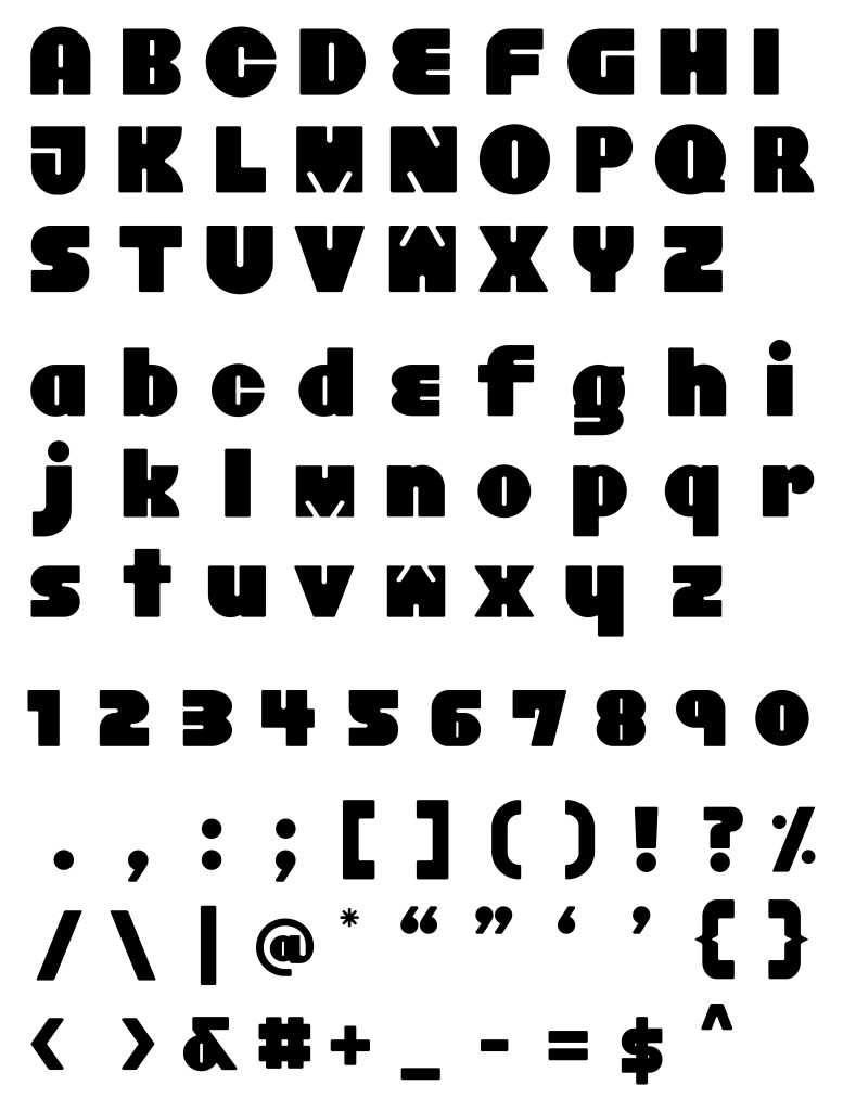
Since I already had a base from my previous wordmark, I used the same technique to design the other letters with the same mindset: simple but effective. My letterforms are constructed from three core shapes:
- Rectangle
- Circle
- Line (Counter space)
I worked with these three elements repeatedly, uniting them into compound shapes, rounding corners, or cutting them in half until I achieved the forms I envisioned. To maintain consistency, all letters share the same counter space shape, which I adjusted by either uniting or slanting at 210 degrees depending on the letter. Finally, I added a corner radius to the letters to give the font a more approachable and friendly character.
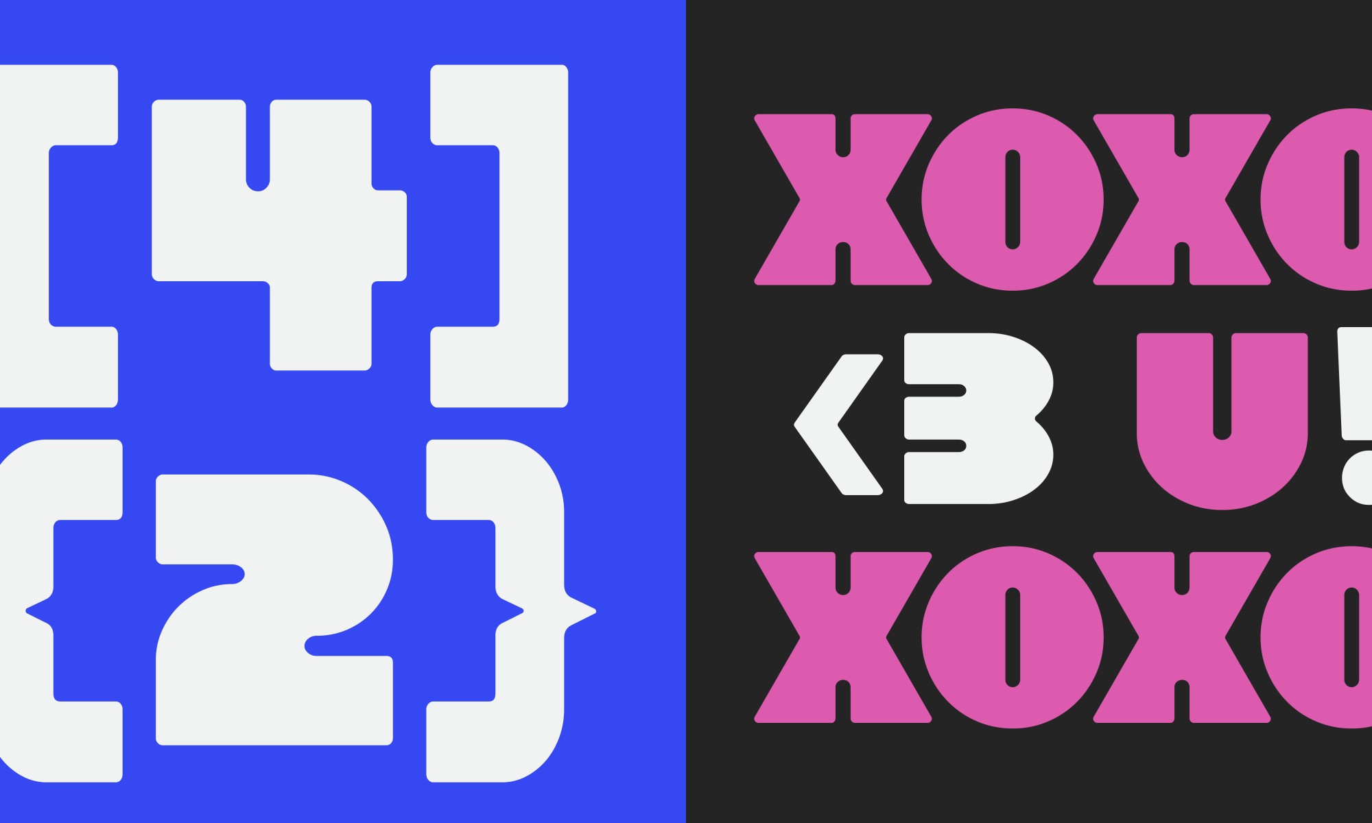
Here’s a breakdown of how the letters were constructed when designing my wordmark for Task 2:
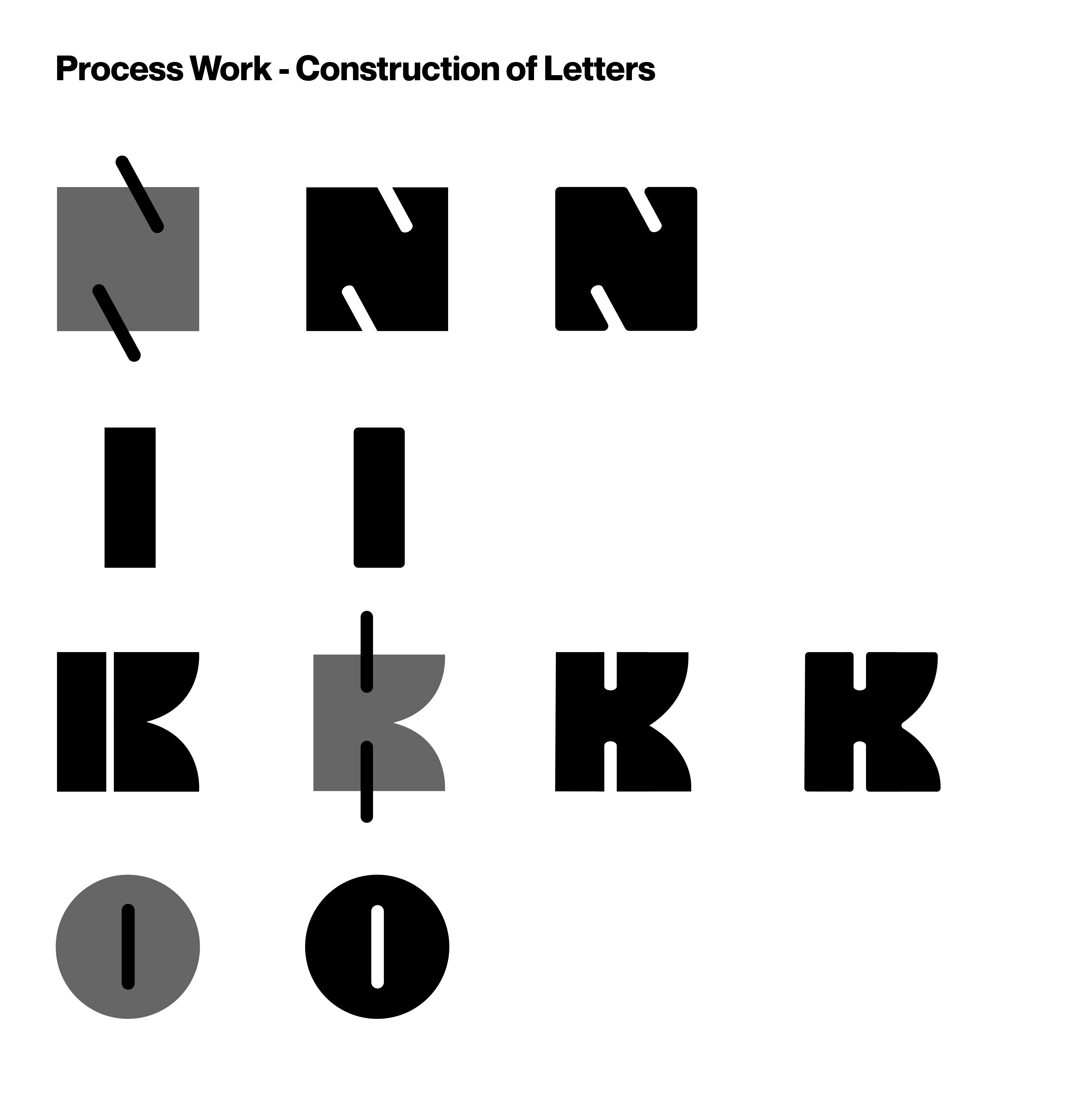
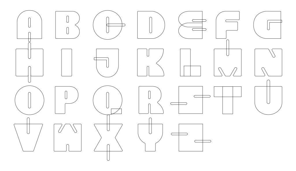
Fig. 3.1 shows the outline view of the uppercase letters:
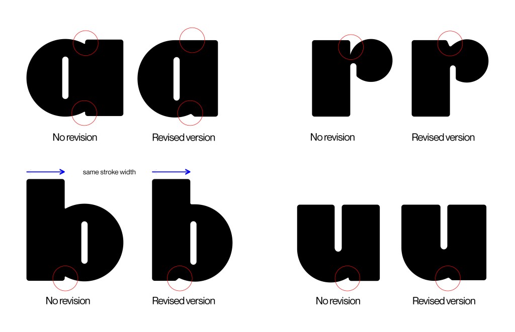
For my lowercase letters, I decided to design a simpler version—most of the letters are scaled down from the uppercase letters. During the feedback session, Mr. Vinod gave a design suggestion for the ink trap of letters a, b, d, p, and q. The width of the ink trap becomes slightly narrower, and for letter a, the stroke is merged together with the circle shape. I liked the suggestion and went along with it, revising letters n, r, and u as well to ensure consistency.
Below shows the before and after of the ink trap revision:
Importing into FontLab
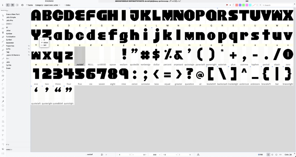
After completing the digitisation of all the cases, numerals, and punctuation, I imported them into FontLab for kerning and side bearing adjustments. I adjusted the kerning and side bearings based on the guide provided by Mr. Vinod and added individual kerning to certain problematic letters such as B, C, K, L, O, P, Q, T, V, and X. This ensures consistent spacing across all the letters.
After finalising all the spacing adjustments, I exported the font as a TTF file, and it is ready for practical use.
After exporting the font from FontLab, I felt relieved as I was somehow over the hard part of the entire project. I felt a huge sense of accomplishment when I was able to type out my font in Illustrator and experiment with it. Much effort was put in, especially for the small details that may seem unnoticeable at first glance. As I’ve mentioned in every single reflection in my e-portfolio, the devil is REALLY in the details.
Unlike how summarised and brief this article is, the actual process of designing this font deprived me of so much sleep that at one point, I didn’t want to design the lowercase letters because I was on such a time crunch. But the perfectionist in me refused to give up and pushed me to complete the font family as much as possible, and I’m glad I listened to that voice.
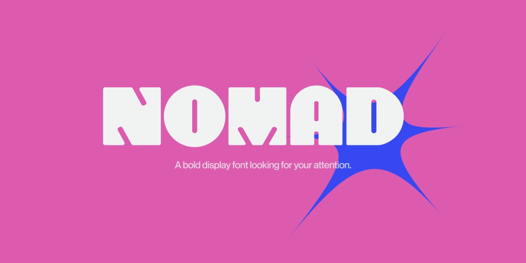
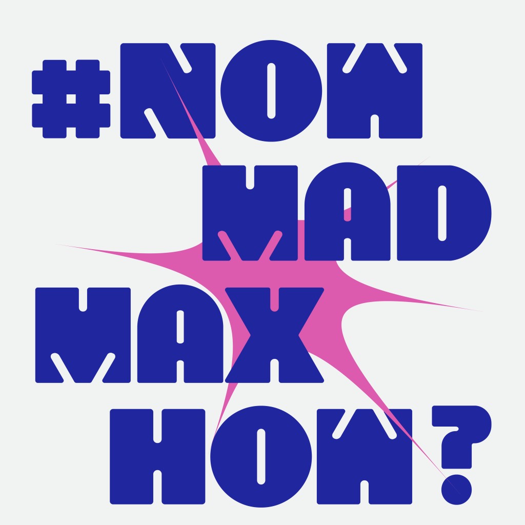
Anyways, proudly presenting the final letterforms of NOMAD:
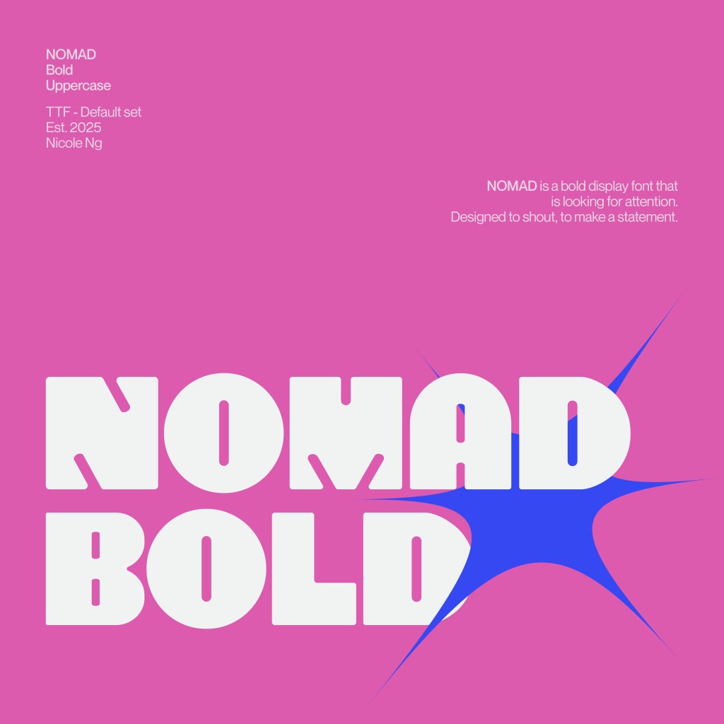
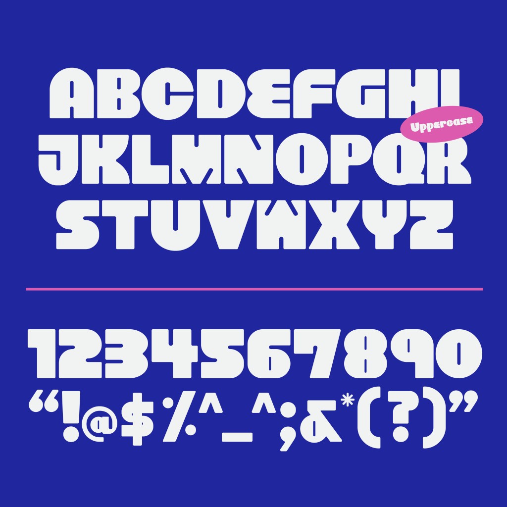
Font Presentation
The purpose of font presentation is to showcase how the font can be used in specific contexts, not to flaunt how many words I can squeeze into a tiny square canvas. Since my font is very thick and takes up a lot of space, I mostly used very short keywords for all my font presentations, except for the second one, which showcases all my uppercase letters, numerals, and punctuation.
I also used minimal graphics since the font should stand out by itself without being overshadowed by graphical elements. When implementing colours, I limited myself to a maximum of three colours per artboard so it doesn’t look distracting. The colour palette is also evenly used across all artboards to ensure consistency and harmony.
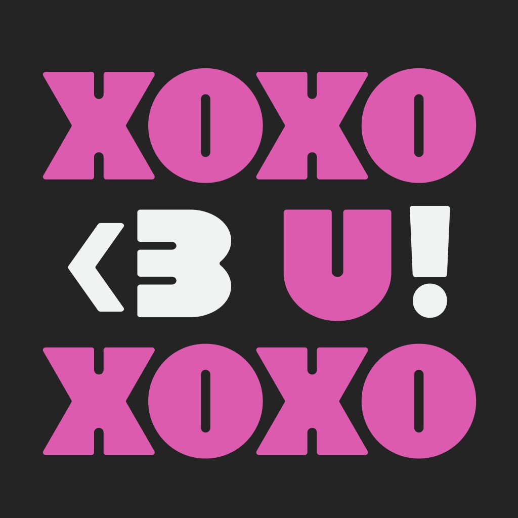

Type in NOMAD below:
Font Application
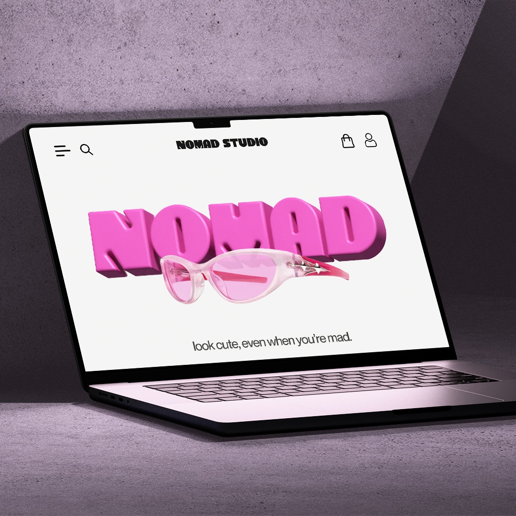
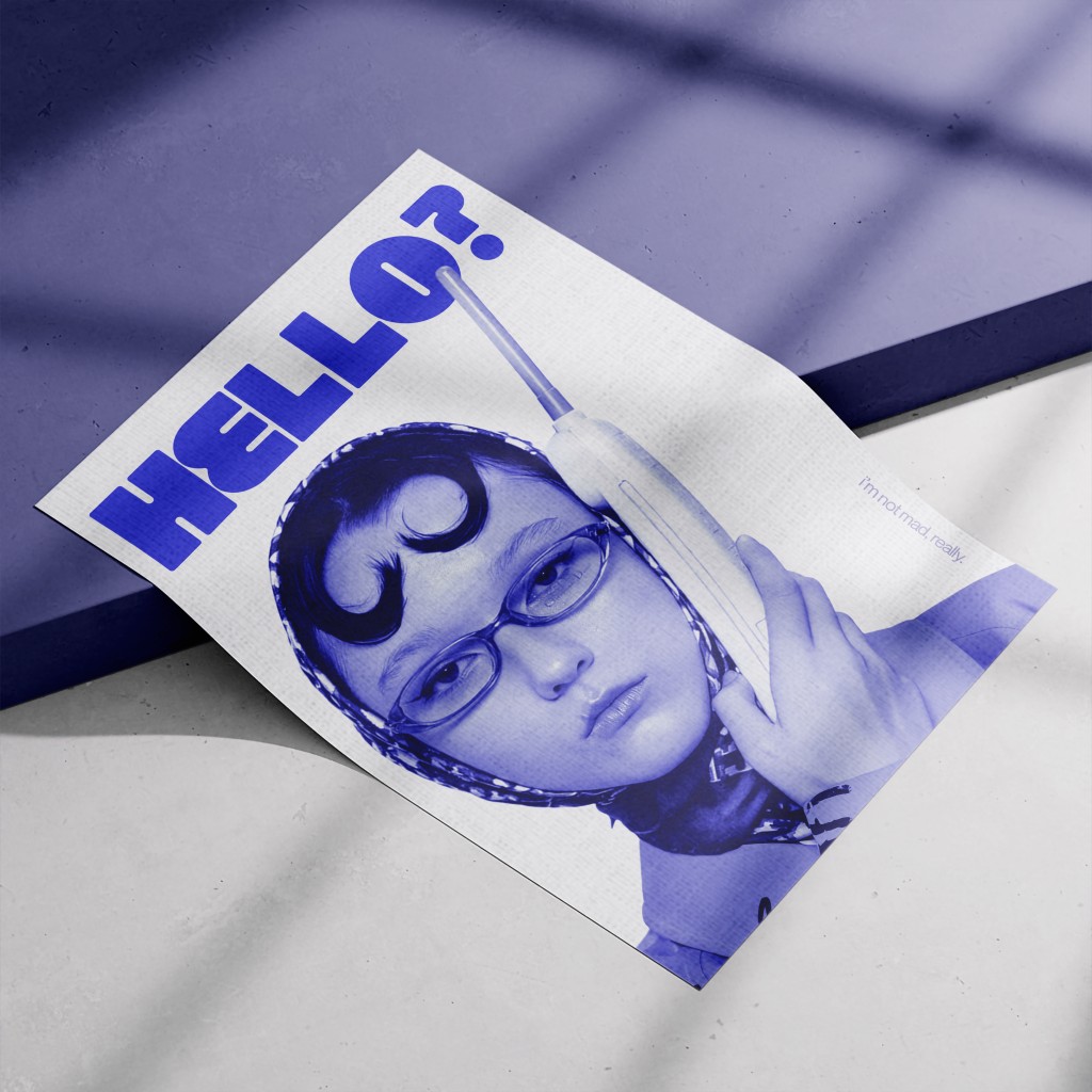
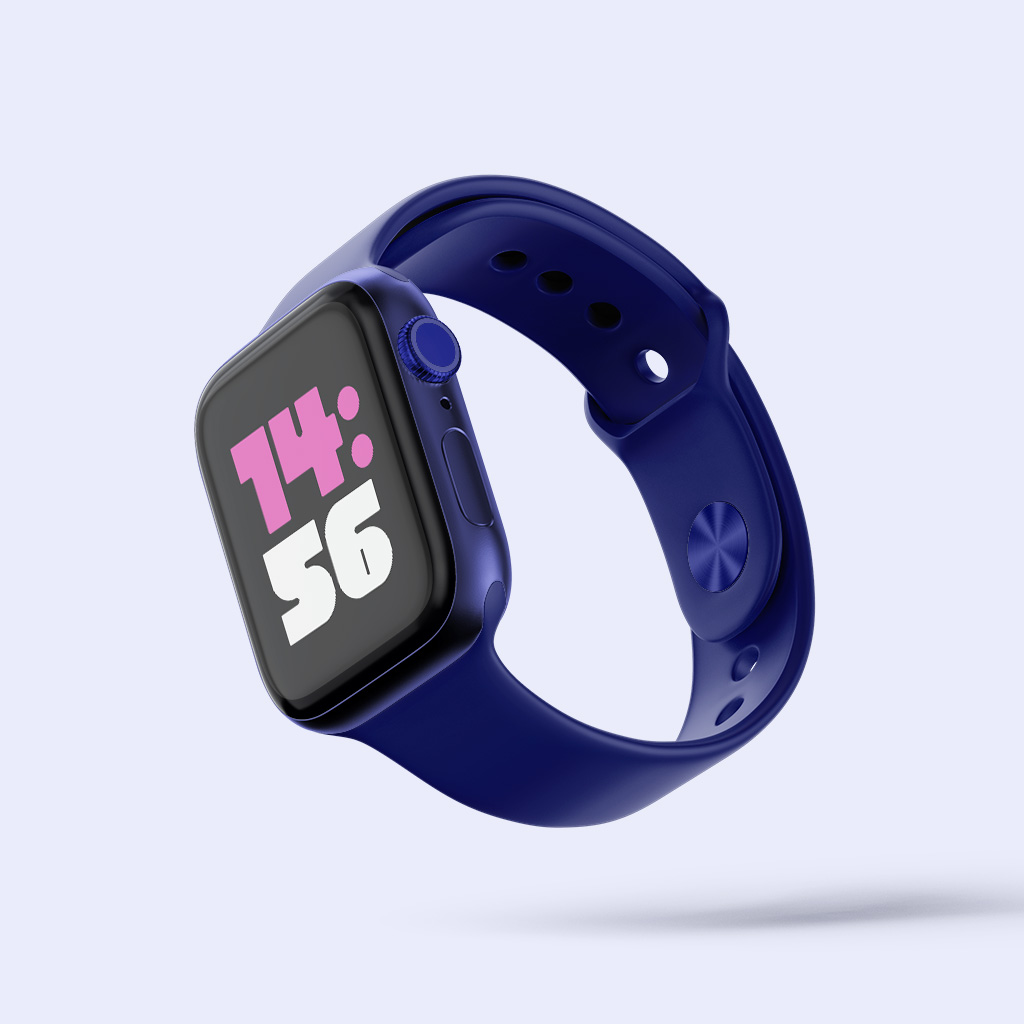
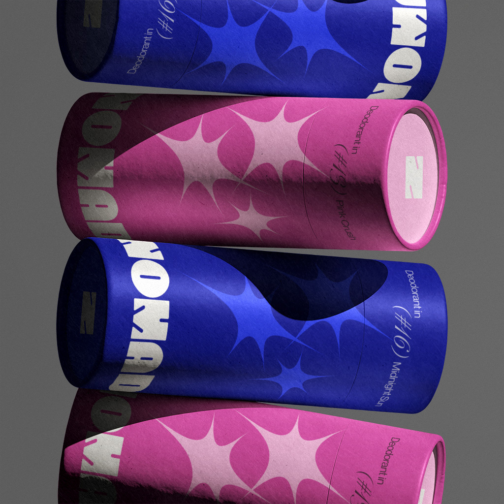
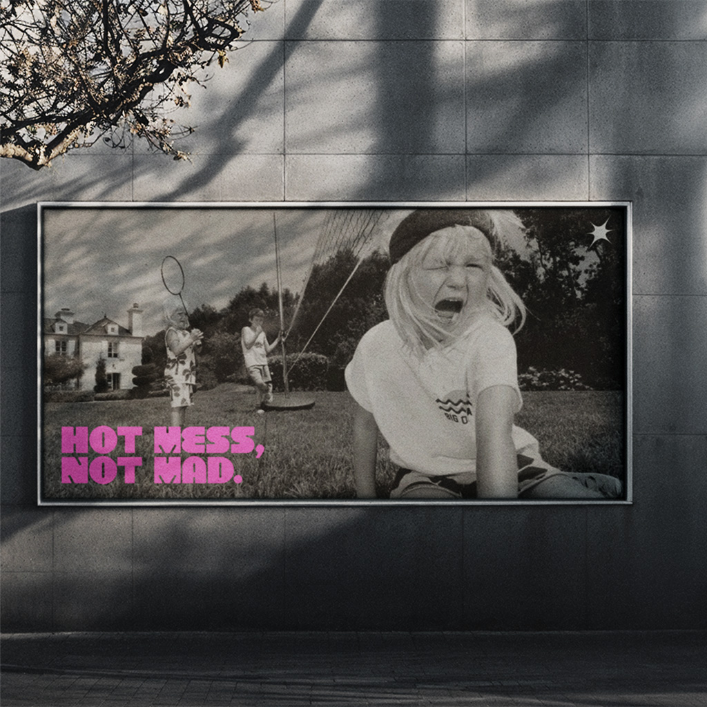
NOMAD’s charm truly shines when it’s used as a display font for branding, logo marks, editorial posters, and catchy campaign taglines—something like a soft and gentle punch in your face, just the right amount of impact. With that in mind, my final chosen mock-ups are a website landing page, poster, smart watch, deodorant packaging, and street billboard sign. The mock-ups are carefully chosen to highlight NOMAD’s personality when implemented into different creative projects.
For the website landing page mock-up, I wanted to demonstrate how versatile the font can be by rendering a 3D version using the Extrude & Bevel effect on Illustrator. When looking through some of the seniors’ work for inspiration, I realised most of them did not include numerals in their mock-ups, so I intentionally chose a smart watch mock-up to show that the numerals are just as functional and well-designed as the uppercase and lowercase letters.
Why NOMAD?
By definition, “NOMAD” means to be a wanderer, a person who is constantly moving and exploring new destinations. While I wouldn’t call myself a literal nomad, the term resonates with how I feel throughout my design journey.
As a design student, I’m still in the process of growing and discovering my unique creative voice. In that sense, I relate deeply to this word as someone who’s continuously exploring, experimenting, and learning within the design field.
Final Thoughts
Designing NOMAD was truly an exhausting yet fulfilling journey. It challenged me in unexpected ways and pushed me beyond my limits, I would never have expected myself to design a typeface from scratch. This project taught me the value of perseverance, attention to detail, and how growth often comes from our mistakes. More importantly, designing NOMAD gave me a creative outlet to express my emotions and translate my thoughts into tangible design. Typography is the foundation of all design, and I’m grateful for the knowledge I’ve gained from this module. I look forward to applying these lessons to future projects.