
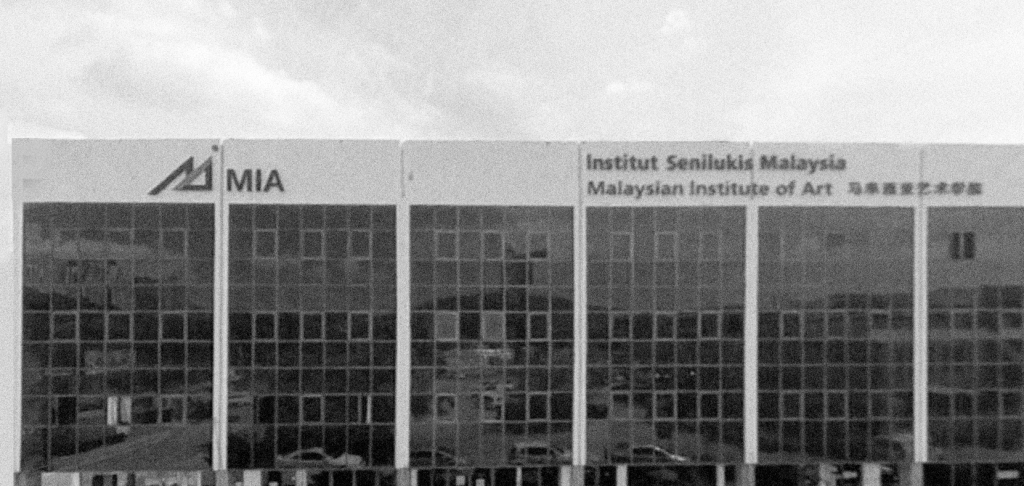
I don’t remember the exact moment I met Yuen, but I believe it was either at the mamak stall downstairs next to MIA, or while walking through the Graphic Design floor when I was first introduced to him. Yuen was a part-timer who taught Typography, a subject I had growing interest in.
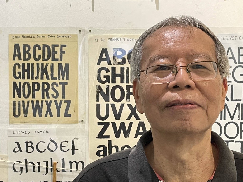
My initial impression of Yuen was that of someone anchored in another time, because his teaching methods were rooted entirely in manual skill. At a moment when everything was shifting toward digitalisation or “IT”, he insisted on process, repetition, and handwork. He would make students trace letterforms repeatedly, redraw them, erase them, and draw them again—this cycle continuing throughout the class. The intensity he brought into the room was unmistakable, and so was his complete focus on each student.
On the Graphic Design floor at MIA then—before the renovation—the steps led to a long corridor. On either side were classrooms, and through the glass panes you could see what was happening inside. Yuen would often be bent over a student, demonstrating technique or correcting work. Tables were covered with tracing paper and newsprint, filled with pencilled letterforms and exercises.
I never directly confronted Yuen about his unwavering dedication to the analogue approach in typography, though it was often a subject of discussion among lecturers during end-of-semester evaluations.
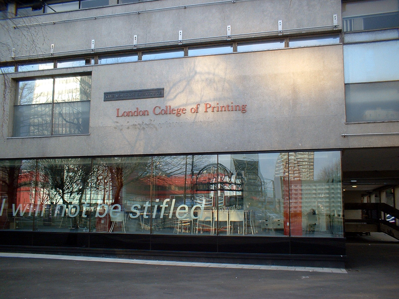
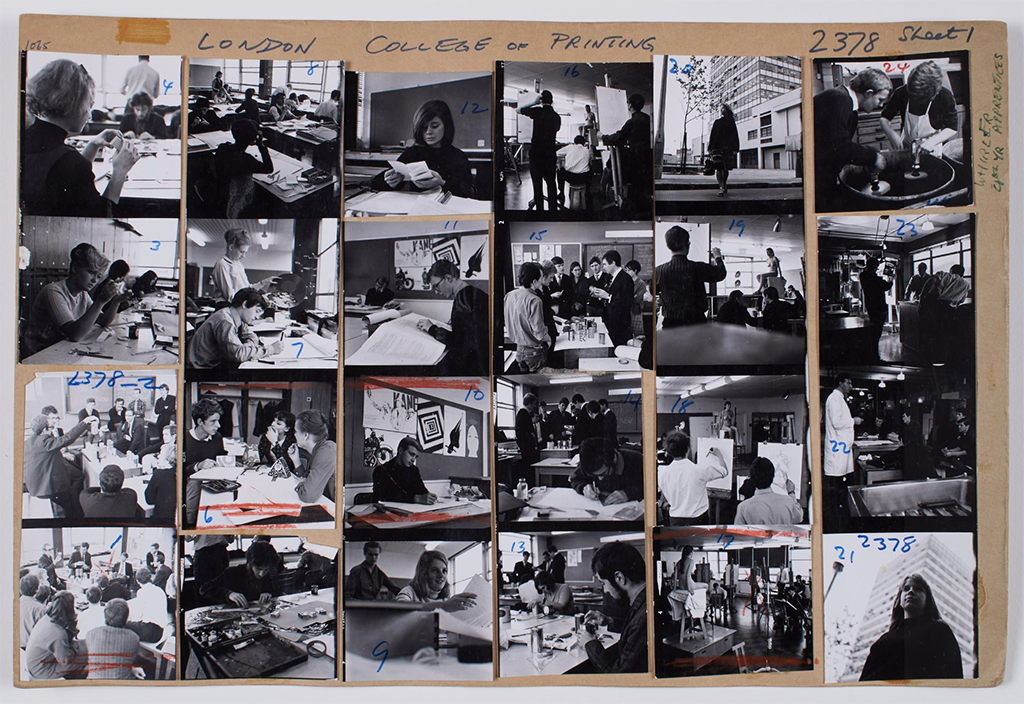
At this point, it is important to note that Yuen was an alumnus of the London College of Printing (LCP). LCP was one of the most influential schools of printing, publishing, and communication design in Britain. It’s alumni consist of people like Neville Brody, Sophie Rickett, etc. Although the name LCP no longer exists, its legacy continues today through the London College of Communication, part of the University of the Arts London.
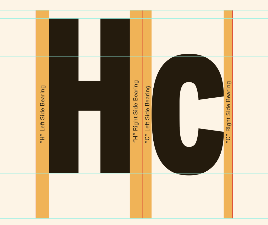
Yuen received an Advanced Diploma from LCP. Unlike me—largely self-taught in typography—he had been schooled in it from the ground up. He was a walking repository of knowledge, though he never displayed it in an overt way. He was also careful, at least with me, never to correcting in a manner that would embarrass you for your lack of knowledge. I remember once trying to explain the spaces beside a letterform and referring to them as “margins”. He gently responded by using the correct term—side bearings—without ever pointing out the mistake. He was like that.
The unfortunate part of this story is that the Ministry of Education required lecturers teaching diploma courses to hold a degree. This blanket rule did not account for where qualifications were obtained, the nature of the training, or years of professional experience. MIA was unable to secure approval for Yuen’s full-time appointment. This was deeply upsetting for him. BB Chew, Head of Foundation at MIA, once mentioned during a remembrance that Yuen could be an angry man at times. I think that is something we shared in common, in different ways.
The more I got to know Yuen, the more I grew fond of him. I would see him on the graphic design floor and call out his full name—“Yueeen Kheeeng Seeeng”—to which he would respond with an embarrassed smile, or sometimes call me “Vinod-the-man”. I still smile when I think of that.
Often, we would sit at my cubicle in the photography department, away from the main graphic design staff. We would talk about typography, punk music, life, the government, MIA—often circling the same frustrations with how things were. We found in each other a shared dissatisfaction with the status quo.
I was focused on modernising student output in the graphic design department, and I bruised a few feelings along the way. That single-mindedness drew Yuen closer; he recognised something familiar in that quiet rebellion. He would sometimes open my office door and whisper loudly, “puuunk!” or “the man,” and we would fall into long conversations of complaint and conviction.
Around 2003–2004, I decided I wanted to create a typeface. At the time, this was still uncommon. There was little commercial interest in it and its still somewhat the case today if not for agencies including it as part of their branding exercise. I discovered Fontographer and struggled with its interface, but eventually realised I could copy vector artwork from Adobe Illustrator into the software. Through experimentation, I managed to generate a working font for the first time. I was immensely pleased and shared it with Yuen.
He probably didn’t think much of it—it was, truthfully, a rather awkward-looking typeface. But my real intention was simply to make something quickly and see if it worked. It did, and that was what mattered. Yuen would often tease me as “the digital man”, especially since, at that time, none of the lecturers at MIA owned or brought laptops to work—I did.
In 2004 or 2005, Yuen was tasked with curating a typographic exhibition and invited me to participate. I was honoured. I still remember his own work in that exhibition—hand-lettered Palatino, scaled from large to small on a large canvas. It left an impression on me, and later influenced some of the press advertising work I produced for MIA.
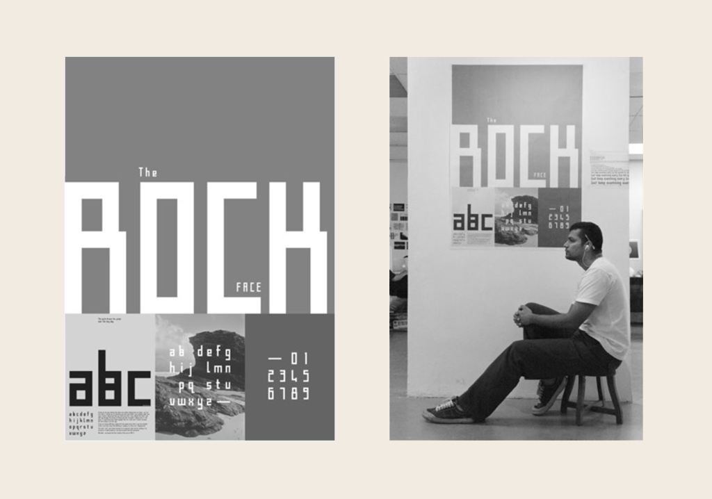
In that same exhibition, I showed my first font, Rock, as an A2 black-and-white poster.
I also worked with Yuen on another project where he organised a music festival — I think it was called Unchained — at MIA’s Jalan Kia Peng mansion, then known as the MIA Art and Design Centre near KLCC. The name of the festival escapes me now, but I worked closely with him on the design. He loved music deeply. Master Norlisham—another underappreciated and gifted figure at MIA—also took part. He was a painter, musician, poet, lyricist, and designer.
We often sat at the mamak stall, talking endlessly about ideas. Yuen called these gatherings “Type Tarik Sessions”.
Yuen was a complex character. He was rebellious, but in a quiet way. Warm and engaging, yet also distant. Everyone close to him would say the same thing: he was deeply private. Although I knew him well, our conversations never touched personal life. I knew he lived not far from me, but I was never invited to his home. He kept his world carefully to himself.
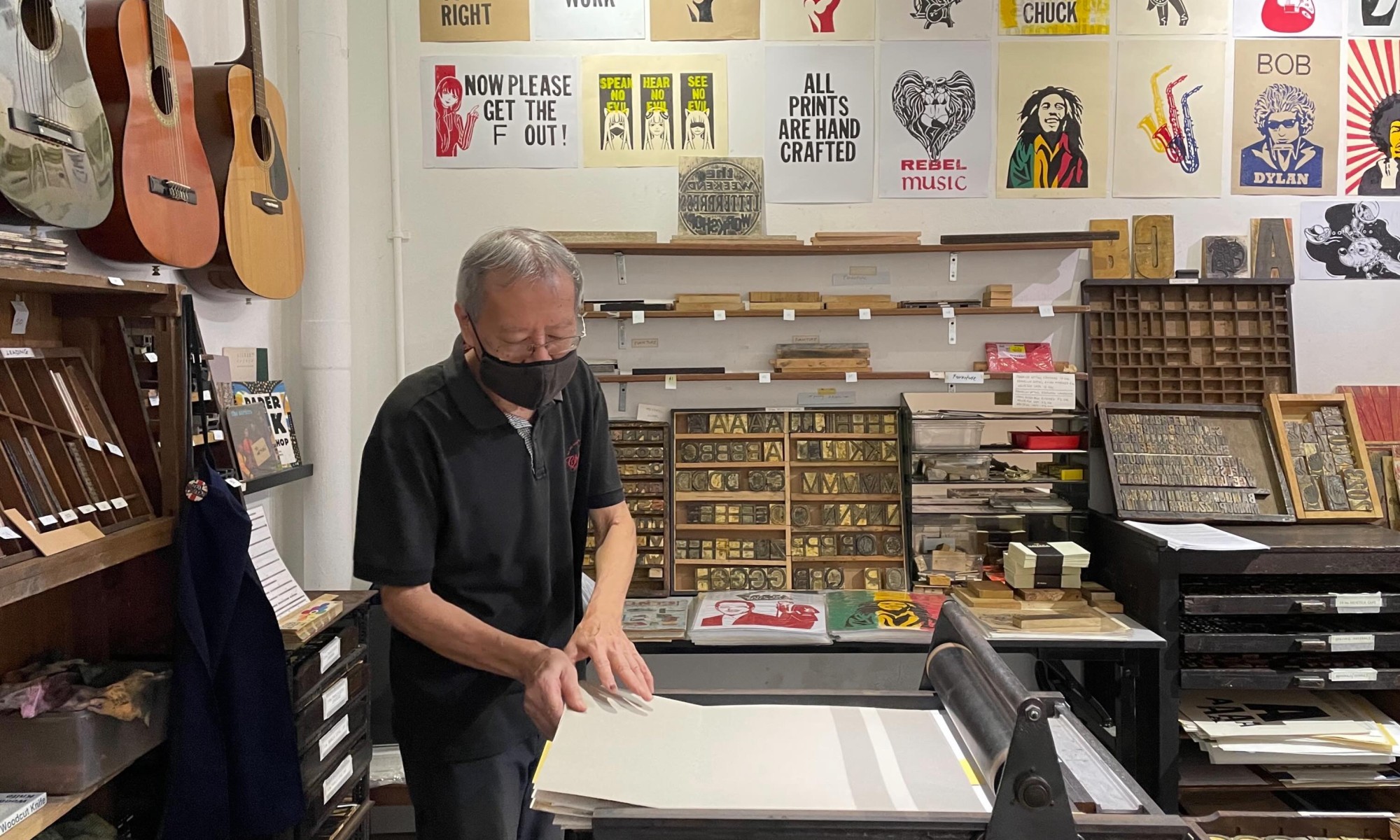
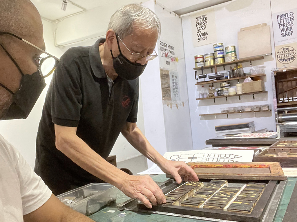
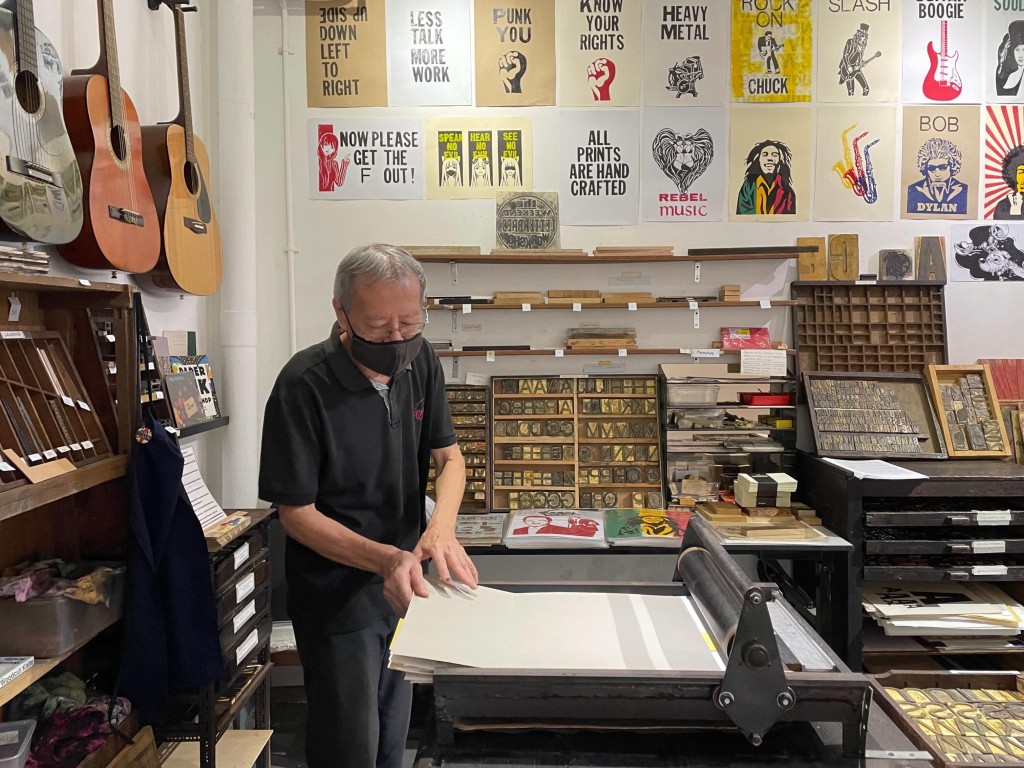
After I left MIA in 2010, we lost contact, except for once when he attended a talk I gave organised by Huruf at the Malaysian Design Archive office late in 2019. Another time was in 2022, when he invited me to see his work during the COVID period—hand-carved wooden letters used to create a letterpress at Lostgens. I was genuinely happy to see him again after so long. He looked frailer, having lost weight, but his passion remained intact.
We spoke about bringing him to my university for a talk, though he seemed reluctant. We also discussed bringing students to his letterpress workshop, but the scale made it difficult.
Mr Yuen passed away in April 2026, though the exact date remains unclear. He passed alone at his home in Segambut. It was nearly a week before a neighbour alerted the authorities. It is said he had a sister who later cleared his belongings. Many who knew him still wonder what became of his artworks—whether they were preserved or discarded.
Master Yuen was a private man, a craftsman of the old way, musically inclined, a quiet rebel, and an educator. He must be remembered, spoken of, and written about. I offer this remembrance as a small contribution to keeping his memory alive.