Skip to content
+

+

Your Regional Creative Source

  • Design
  • Visual Culture
  • Opinion
  • Arts
  • Education
  • Issues
  • About
Opinion

Stair-ing and Observing

by Sherry BlankenshipJanuary 24, 2020June 2, 2020
Continue Reading
Opinion

Collectivism, EQ and Creativity

by Anis IsmailJanuary 2, 2020May 31, 2020
Continue Reading
Uncategorized

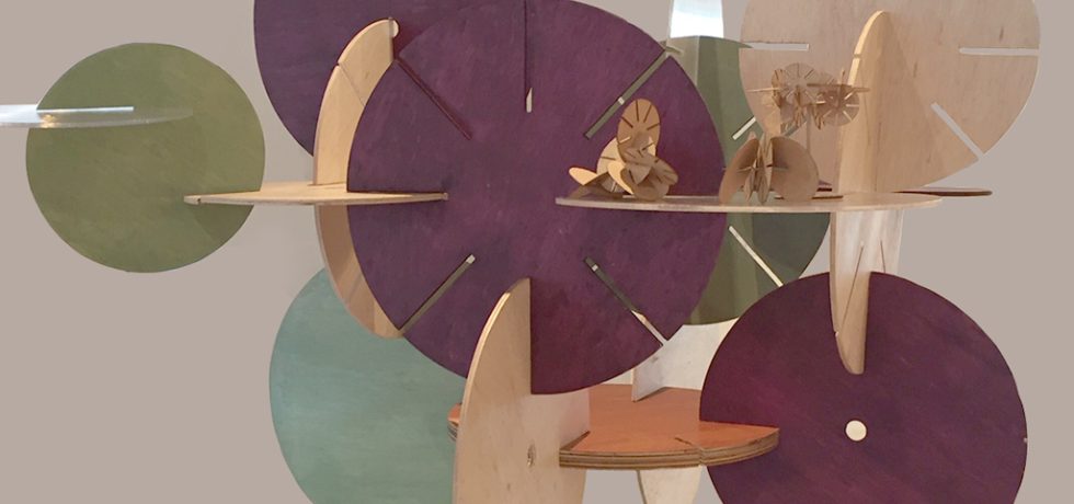
Design For Good Exhibition

by Sherry BlankenshipNovember 23, 2019March 21, 2020
Continue Reading
News + Events

Rebels With a Cause

by Jinchi Yip-EganNovember 20, 2019July 29, 2021
Continue Reading
Tech

A Trainer’s Log — What I’ve learned About Learning and Training Unity 3D

by Jeffrey PatrickNovember 12, 2019
Continue Reading
UI & UX

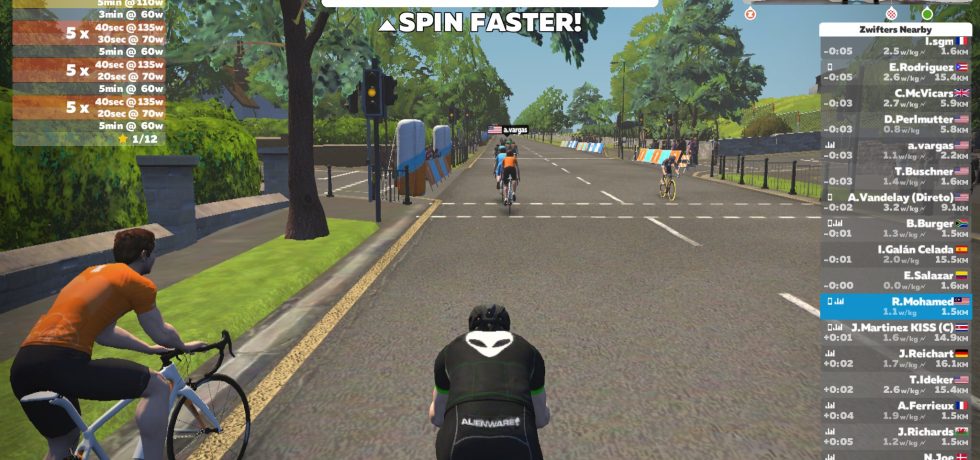
Getting Fit! A User’s Journey… Gamifying Indoor Exercises

by Razif MohamedNovember 6, 2019July 20, 2021
Continue Reading
Uncategorized

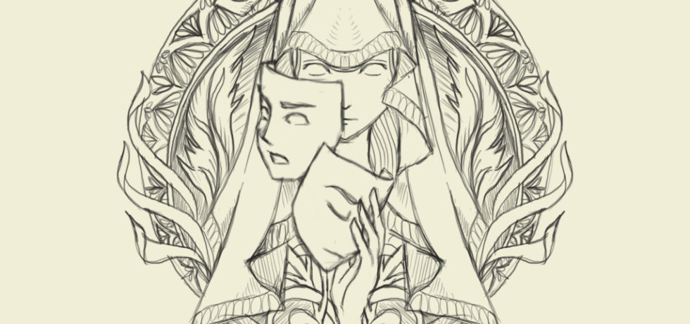
Meticulous Drawing—The Use of Metal Point

by Ernesto PujazonOctober 18, 2019July 29, 2021
Continue Reading
Uncategorized

Under My Spell; The Spiritual World of Magic, Curse and the Supernatural

by Diana Rosli, Redzwan Hisham BidinOctober 11, 2019July 29, 2021
Continue Reading
News + Events Tech

The SEA of knowledge

by Jeffrey PatrickOctober 10, 2019January 30, 2020
Continue Reading
Uncategorized

Drawing on Air

by Vickram ThevarOctober 10, 2019August 13, 2021
Continue Reading

Posts navigation

Older posts
Newer posts

kreatifbeats.com Follow

To share diverse views, local or regional knowledge related to creative disciplines and thought processes that are pertinent and pressing in SE Asia and S Asia.

kreatifbeats
kreatifbeats kreatifbeats.com @kreatifbeats ·
9 Feb

"NOMAD: Where Letters Find Their Own Way" by Nicole Ng

"I wanted to design a bold, fat typeface that screams “Look at me!” but in a polite way (if you get what I mean)."

Reply on Twitter 2020780034706026837 Retweet on Twitter 2020780034706026837 Like on Twitter 2020780034706026837 Twitter 2020780034706026837
kreatifbeats kreatifbeats.com @kreatifbeats ·
2 Feb

"Exploring Art Nouveau Through Experimental Typeface Design" by Caitlin Lung

"“I thought it was another letter.” Stylistic ambiguity w/out sacrificing readability was the goal ... so I had to make adjustments based on the feedback I received ..."

Reply on Twitter 2018314773319020803 Retweet on Twitter 2018314773319020803 Like on Twitter 2018314773319020803 Twitter 2018314773319020803
kreatifbeats kreatifbeats.com @kreatifbeats ·
27 Jan

"Blocky: Translating Handwritten Marker Strokes into Digital Type" by Tsen Ken Yee

"Even well-designed letterforms can appear unbalanced if spacing and kerning are not properly considered."

Reply on Twitter 2015973257409876124 Retweet on Twitter 2015973257409876124 Like on Twitter 2015973257409876124 Twitter 2015973257409876124
kreatifbeats kreatifbeats.com @kreatifbeats ·
16 Jan

"Letters in the Water: Designing Sünny" by Ahmed Saneeh

"I realized that the level of perfection I aimed to achieve required countless hours, days, and nights of careful refinements, many of which may appear insignificant at first glance."

Reply on Twitter 2012084757648310312 Retweet on Twitter 2012084757648310312 Like on Twitter 2012084757648310312 Twitter 2012084757648310312
Load More

+

Your Regional Creative Source

+

Copyright © 2021 Taylor’s University.
All rights reserved.

The Design School

The Design School
Taylor’s University

+

E-ISSN No. 2637-1111

+

Kreatif Beats

Troublemakers’ Assembly

Troublemakers' Assembly

The Design Asylum

Design Asylum

Mayamode

+

Supported by:

wRega

  • News + Events
  • About
  • Contact
  • KREATE
Proudly powered by WordPress | Theme: aquene by Themes Harbor.