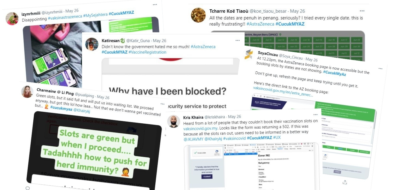
On May 26, 2021, the Internet and social media blew up with cries of furious rakyat (people) for the difficulties they faced while attempting to register themselves or their loved ones for a slot in the AstraZeneca Vaccination Programme. Many people were unable to complete the registration due to the technical glitches experienced during the process. My wife and I were among the many who had to go through this ordeal — we couldn’t get the needed slots but we also had a horrible experience attempting to do it.
We are not strangers to websites, or apps being slow, and sometimes unresponsive. It happens whenever there’s a sale going on for a limited period of time. People rush to the site which then creates massive congestion. It doesn’t require a degree to anticipate the issues that might arise with a website’s performance when so many people are anxious to be vaccinated. Thus, it is necessary to take steps that would prevent this from happening.
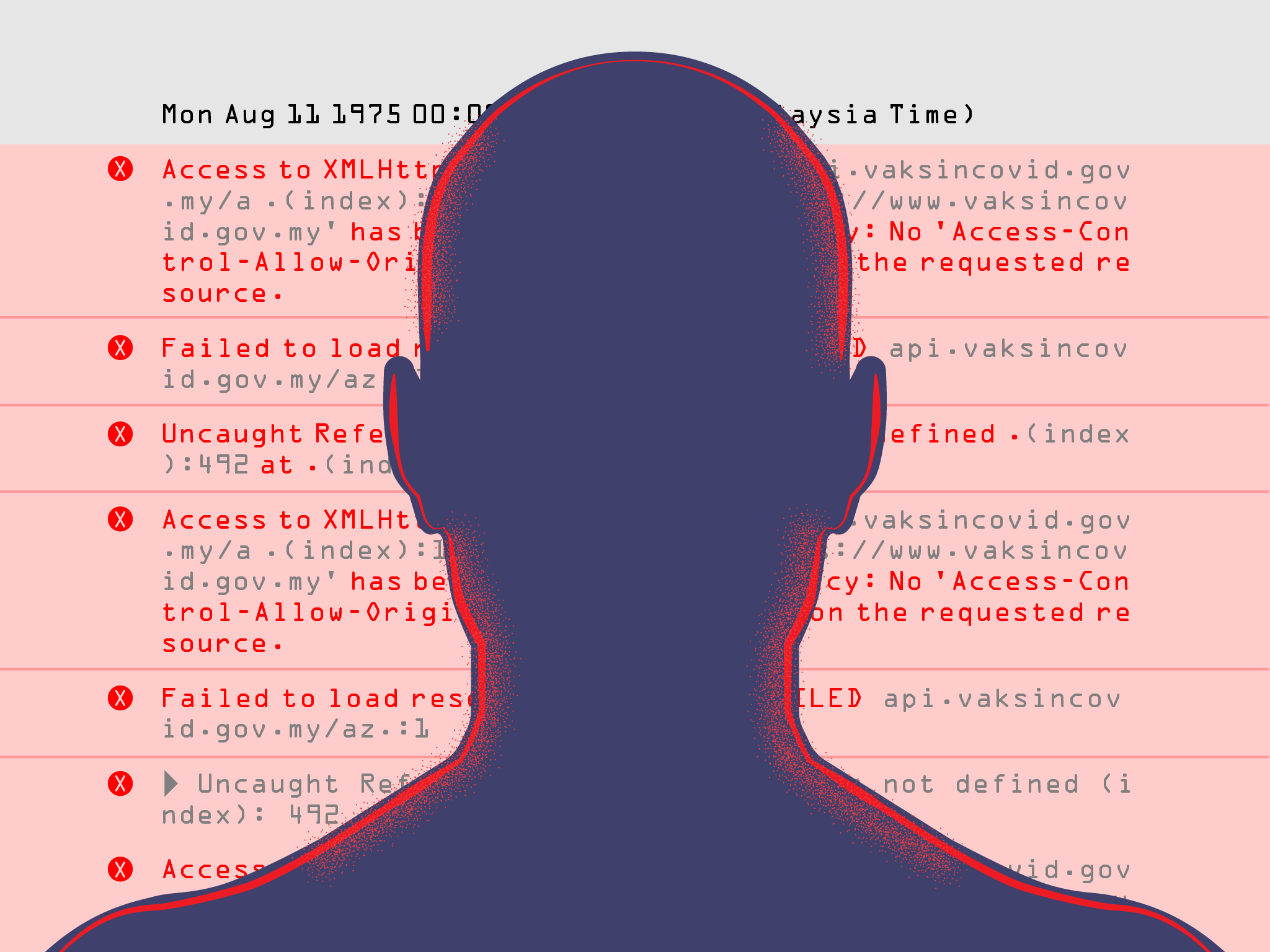
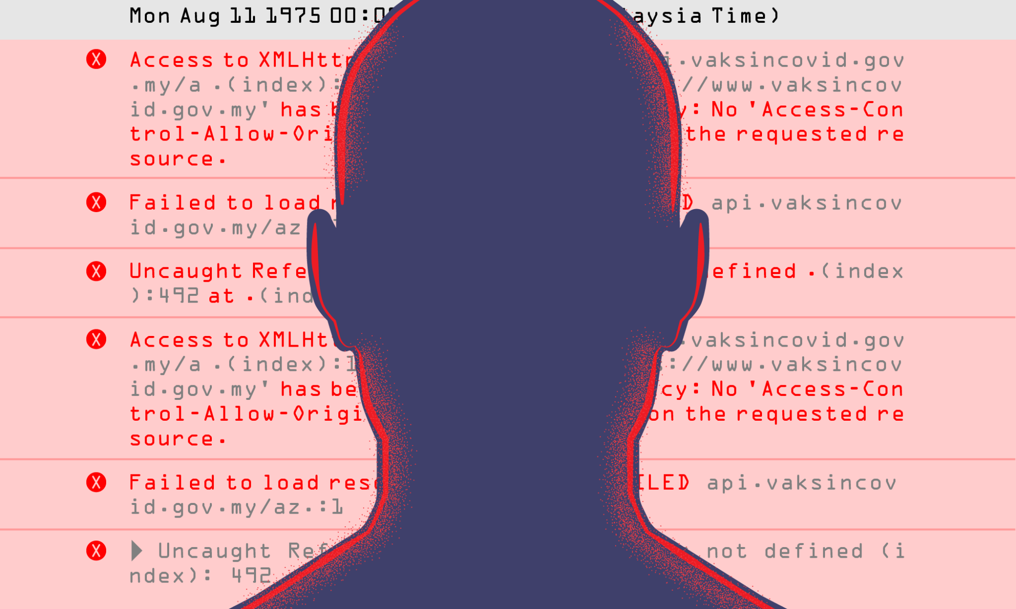
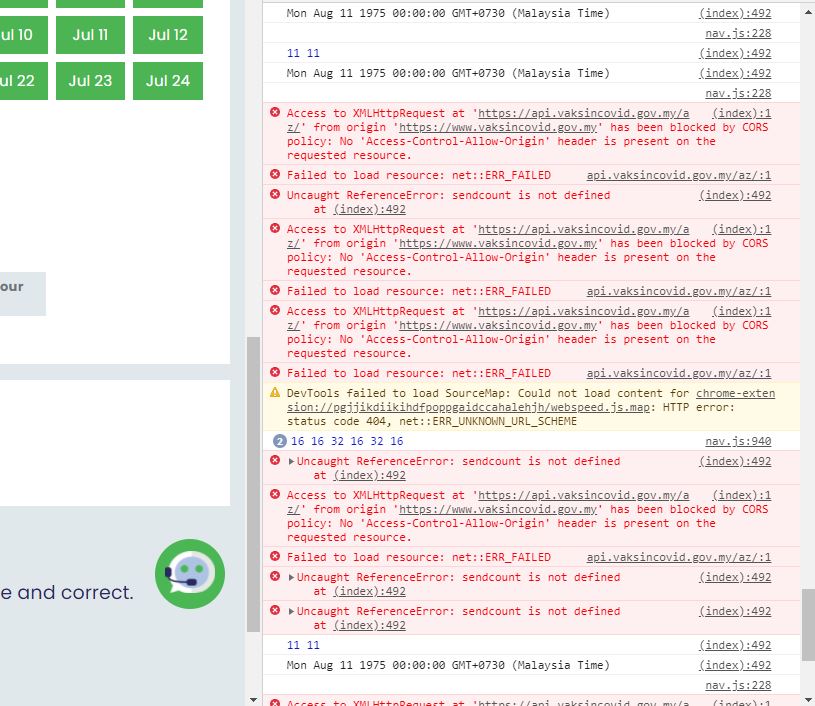
The problems that we faced yesterday are indeed technical. The registration system consists of two servers. One is the webserver which presents the user with the web pages and visual interfaces, and the other is the data server that stores the registration data. These two servers communicate via an API which acts as a tunnel between both servers. This is a good approach to reduce the workload since the workload is then distributed into two. What happened to us yesterday was that the tunnel (API) failed! Therefore, the website was unable to retrieve the data necessary to update the interfaces and complete the registration.
As a user, we don’t really care about how things work under the hood. We want to complete the given task without any issues in a way that is as pleasant as possible. If any problems do occur, we then need to know about them, and be given guides as to how to overcome them or options as what to do next.
What were the pain points?
- When clicking the “States” button, nothing happened! It should display the available slots for users to choose from.
- Users then needed to refresh the page to try again in order to fill the form again from scratch.
- Click the States button repeatedly until the choice of slots appears (magically).
- When it finally appears, users can then pick their slot. In my experience, I saw all slots as green, but when I submitted the form, nothing happened.
- There was no confirmation that my registration was successful or not.
- I tried it again and again, hoping to see some sort of confirmation.
It became clear that the usability issues would increase a users frustration as they attempted to perform the task. The more they progressed through the task, the more frustrated they become. When users don’t see any feedback from their action, they are left wondering what’s going on. Will they have to perform the task over and over again? They will click a button many times as opposed to just once. They will launch several tabs or different browsers to see if any of them will yield a better result. Some also tried using other devices such as mobile phones or tablets in a frenzy to get the task done as soon as possible. All of these attempts add more traffic to the server and make it even more congested.
One of the components in UX design is Interaction Design which looks into how user and technologies communicate with each other. Interaction design aims to build products that help users achieve their goals in the most efficient way possible.
Three elements identified in the “Interaction Design Basic” from Usability.gov that can assist users to achieve success during the myAZ registration process include:
- Give users clues about behavior before actions are taken.
- Provide information that will let a user know what will happen before they perform an action? This might inform users of what will happen if they decide to move forward with an action which might include a meaningful label on a button and/or instructions before a final submission, etc.
- Anticipate and mitigate error
Are there constraints put in place to help prevent errors? The Poka-Yoke Principle says that placing these constraints forces the user to adjust behavior in order to move forward with the intended action.
Do error messages provide a way for the user to correct the problem or explain why the error occurred? Helpful error messages provide solutions and context. - Consider system feedback and response time.
What feedback does a user get once an action is performed? When a user engages and performs an action, the system needs to respond to acknowledge the action and to let the user know what it is doing.What is the response time between an action and a product’s response time? Responsiveness (latency) can be characterized at four levels: immediate (less than 0.1 second), stammer (0.1-1 second), interruption (1-10 seconds), and disruption (more than 10 seconds).
Looking at the interaction design basics above, it is obvious that the most fundamental guidelines in the study of UX, usability practice, interaction design, and human-computer interaction were taken lightly. Considering that this is about a life and death situation, and COVID-19 cases are increasing at an alarming rate, the amount of traffic and the level of anxiety that people are having when coming onto the site should have been anticipated. Any anomalies to the registration process should have been dealt with accordingly with the user in mind. We, the users, are human after all. We need guidance, confirmation, and validation to know that we have done the right thing. In the case of this situation, we had none, and it lead to an hour cycle of confusion and frustrations that could easily have been avoided if the designer of the website went back to their class notes and stuck to the basics.