
Most women as children are able to recall the stories they read of beautiful maidens and princesses in distress who needed saving. More often than not, they would visualise a fair and delicate female who would then equated them with being beautiful. The notion that “to be fair is to be beautiful” and “to be beautiful is good” creates a strong urge in the minds of young women that they need to be beautiful to succeed in most aspects of life. Growing up in South India, surrounded by these constant reminders of beauty, I never quite understood how one’s physical appearance amounted to their worth. For my final-year project, it seemed an opportunity to challenge these norms. From that notion came Briefly Beautiful, a campaign utilising an illustrated zine, to raise awareness and provide a platform for South Indian women to share their stories of India’s stifling beauty standards and gender norms and how they shape societal perceptions.
The roots of this strange notion found its way to 18th century India then occupied by the British Crown. It was at this point that there was an introduction of Western values and culture — which also meant there was a natural weakening in appreciation of traditional culture, values, and languages. The patriarchal society in India ascribed women’s social status, education level, and class based on their physical appearance, which resulted in Indian women’s aspiration for fairness to improve their social status. Women were led into believing that being fair meant being beautiful and it is this notion that stubbornly continues to live in the Indian subcontinent to this day.
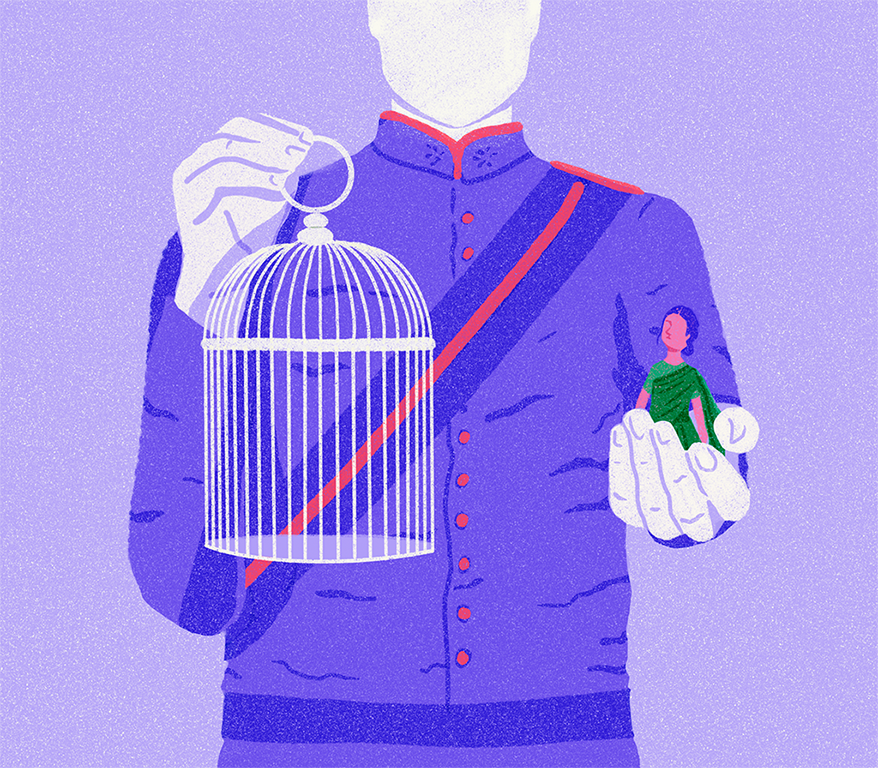
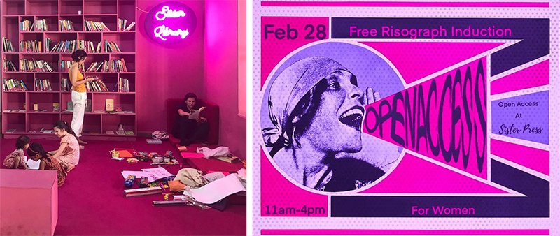
Today, to live as a woman in any Southeast Asian country, means to exist alongside constant reminders of the standards they have to live up to in order to be accepted by society and meeting these standards, is no small feat. There isn’t much that slips by the constant scrutiny of society — family, peers, or absolute strangers. Women are forced to live up to a culturally propped stereotype reinforced through film, advertising, packaging, and now heightened by the power of social media and technology. While there have been numerous advertising campaigns and films exploring colourism in India (NotFair, India’s Got Colour, Dark is Beautiful), not many have managed to explore beauty standards as a whole and its implications on societal perceptions in a more relevant and engaging manner. It was at this point that I recalled a pop-up exhibit at a design festival, Sister Library, held in my hometown, Kochi, which is considered to be India’s first feminist library. The library, founded by artist-activist Aqui Thami, was born out of a necessity to create a space where people can immerse themselves in the voice of female authors who are largely underrepresented. They also have an ongoing project called the Sister Press, teaching women risograph printing to empower them to create their own content to combat sexist stereotypes. I realised it would be an interesting idea if my project could be linked with their initiative and to the same goals.
With this project, my goals for the campaign were simple — to urge women to speak up in order to bring about more conversation regarding these beauty standards and also explore how they shape society’s perceptions. I decided to create a zine since I felt it was effective and lasting in providing a platform for women to share their stories. As part of the campaign, I also decided to create merchandise to form a collective of sorts while building followers. To get a better understanding of this perennial issue, I started by interviewing women to hear their stories but also relied extensively on secondary sources such as magazines and journals. Surprisingly, this process of researching turned out to be more upsetting than I had expected — for my interviewees and for myself. It was crushing to hear them recall stories of traumatic school days where they were bullied and mocked endlessly for their appearance. What might have been worse was to hear how young most of these women were when they began to notice how differently they were treated from their male classmates — as young as just five or six years old. It only proved how normalised this issue was and how common it was for women, or rather, young girls to be picked apart for their appearance, while men faced no similar mistreatment or discrimination.
“The first insult kids in school could think of was shaming me for my weight. This was when I was in primary school.”
“I might have been 6 or 7, in primary school when I realised that I was treated differently because I was a girl, and because I looked different from most girls my age.”
“I realised I began to equate my self-worth with what my classmates thought of me.”
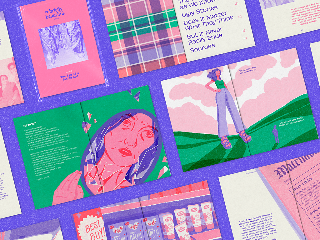
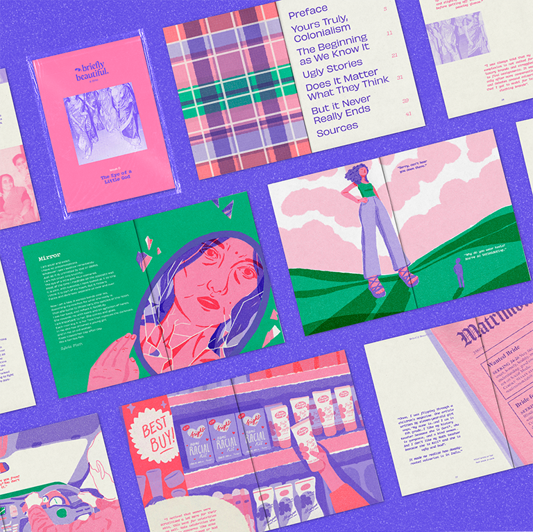
In The Eye of a Little God, the “pilot” issue of the zine, I felt I owed some insight into the issue and purpose of the campaign. The issue explored a little about India’s colonial period, while the later chapters discuss stories from women, societal perceptions and the cultural divide between North and South India.
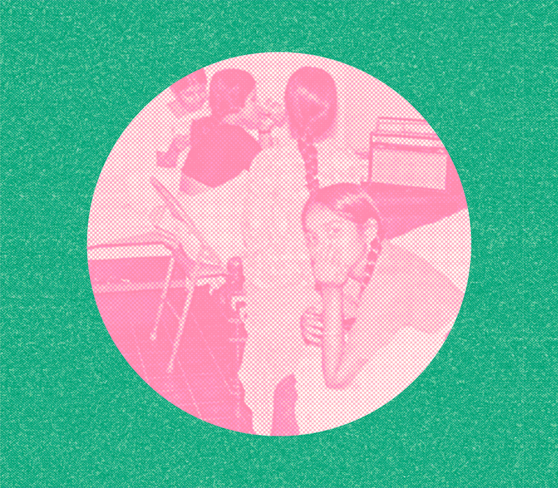
Once I was done compiling the zine’s content, I began working on dedicated illustrations for each. I wanted to recreate a risograph effect for the zine’s visuals that were in line with the zines and posters created by Sister Press. Along with this, I used photographs from my family from the 60s and 70s, and also old advertisements from newspapers and packaging that I thought would work to promote the zine. While figuring out the visual language for the campaign I was inspired by the kinds of visuals used by saya. magazine and Fat Boy zine; the eclectic arrangement of their social media feed and zines was playful and exciting. I thought it would be interesting if I could find a way to do the same while adding a more Indian flavour to it through the use of textures and patterns.
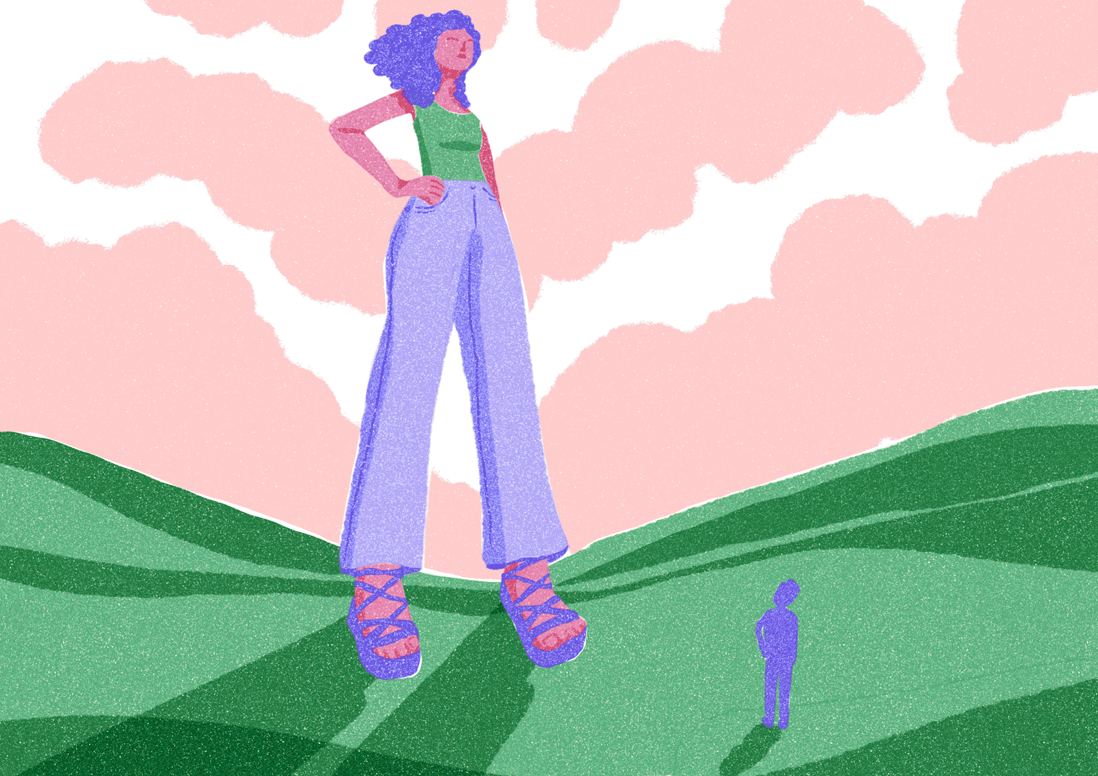
Considering the nature of the campaign and the themes it explores, it was crucial the visual language reflected the same. I used vivid pinks, purples, and greens for the visuals in order to represent femininity in a way that was more relatable to a generation of women grappling against patriarchy. As for the campaign’s collateral, I wanted to create merchandise that would be useful for anyone on the go and subtly represent their values with fun catchphrases. I decided to make a reusable bag, a tumbler, a set of enamel pins, and a jigsaw puzzle which could be a limited edition used to raise funds for the zine itself.
I do acknowledge that there is a limit to how much a flaming pink zine can do to undo generations worth of regressive thinking and systemic oppression. With this project, I only hope to provide a platform, a safe space for women to share their stories, and to challenge these norms, one at a time.
The full project can be viewed on Behance, as well as Issuu.