You may have come across the phrase “liminal spaces” on the Internet. It is often accompanied by a visual of some sort that people describe to evoke a strange feeling within them. The question is, why are these feelings evoked and what role does design play. This article explores the concept of liminality (transition between one stage and the next) and how Blade Runner 2049 (2017) uses the concept as a visual device.
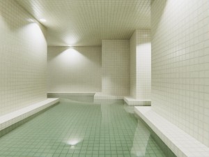
What is liminality or liminal space?
Liminal, derived from the Latin word limen, means a threshold. The spaces between the beginning and the next stage are described as liminal spaces. A liminal space is not just a physical place, but also a metaphorical place we find ourselves in when we are in a transition in life.
This article describes physical liminal spaces as thresholds between two realities — for example, empty stairwells, rest stops on highways, laundromats at night, or empty structures in general. Strange feelings arise when a particular design interacts outside of its intended context. For example, when we interact with a threshold for longer than usual, we feel the sensation of our reality shifting which causes us unease and anxiety.
“Perhaps the most interesting thing about liminal spaces is that our reaction to them is reflective of our dependency on functional design. Viewing a space within an accepted context is what we as humans innately look for. However, outside of that, in a liminal space, we lean away from it because it lacks context and purpose.” via The Ludlow Group
It is a human instinct to have a fear of the unknown, and when we see ourselves on a threshold outside of our intended context we feel anxious as to what next awaits us. This feeling is enhanced by unfamiliar environments since our brain is constantly trying to predict what will happen next in order to prepare the body.
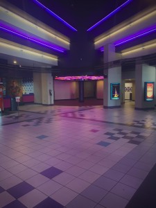
So how can this feeling be recreated using design principles? What benefit does it bring to a creative piece of work? The next section explores how these concepts in Blade Runner 2049 create liminal spaces in order to create suspense and unease among the viewers.
Blade Runner 2049
As the name suggests, this sci-fi movie directed by the one and only Denis Villeneuve is set in the year 2049. The main character K unravels a series of mysteries about humans and the “replicants” or human-like clones. While investigating the manufacturer of the replicants, K visits the Wallace headquarters. From the first scene in the headquarters, we begin to feel uneasy.
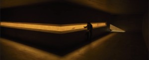
All the essential elements of creating a liminal space are present in this scene. The threshold is created by showing the entry point but not the next point. The strip of yellow light leads our eye out of the frame implying that the place continues, but we can’t see it. Hence, we have no idea what awaits us or K next.
Throughout K’s visit to the headquarters, we see a very strong use of warm yellow light. Colour, an extremely important design element, is used here to create the atmosphere. A colour associated with warmth and optimism is set in a sharp and harsh context that creates a strong contrast. This disparity allows our brain to know that something is not what it seems (which eventually turns out to be true) creating more feelings of discontent and unease. Additionally, the tone of the light seems just a little bit off from natural sunlight which shows that it is mimicking nature but isn’t able to do so fully, increasing the unease of the situation.
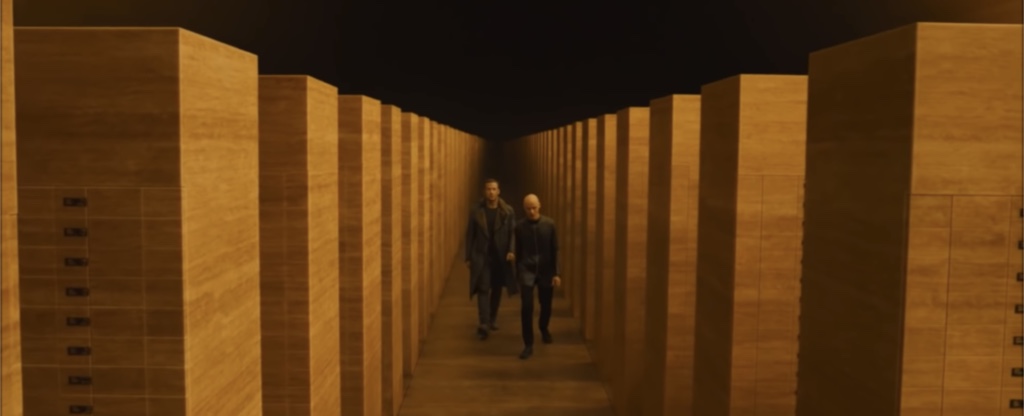
In the next scene [Fig 4.0], K is led to the archives by the receptionist. The unease within us continues to rise as we see the protagonist enter another threshold. What adds to this scene is that we don’t see— either an entry point or exit point as we did in the last scene. Repetition in shapes creates a vanishing point down the middle of the passageway. Not only does it cause our eyes to focus on the endless void behind the subjects, but it also adds to the liminality as we are seeing a place we don’t understand that seems to go on forever, presenting us with no escape route or knowledge of what will happen next. The emptiness and vastness of the space also induce panic and unease like most liminal spaces.
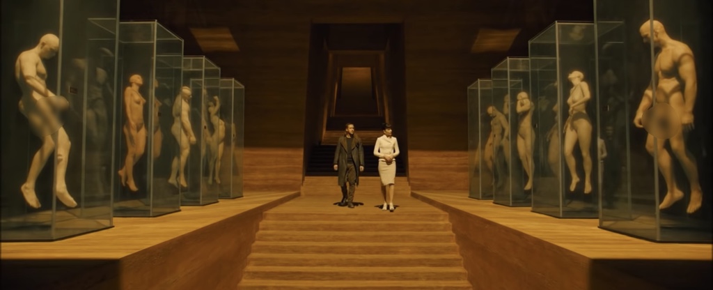
In the next scene [Fig 5.0], we see a similar set-up with long corridors, harsh shadows, repetition of figures, and the warm yellow light. Again, K is at a threshold. This links back to the point of liminal spaces being created when we interact with thresholds with a longer than intended period. At this point in the movie, the repetition in the cinematography has placed the audience in this “middle-point” for a while now.
Additionally, the movie is made up of a lot of wide-angle shots that emphasise the barren or foreboding landscape.
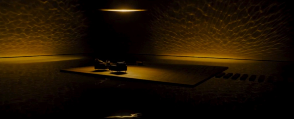

The use of the wide-angle dwarfs the protagonist and forces the audience to experience the meticulously planned mise en scène. There is a lot more to focus on and we are not entirely sure where and what will happen next. The inability to process ambiguous situations causes anxiety and builds up tension for the next scene. Additionally, as mentioned above, emptiness is a key element of a liminal space. It can evoke ominous feelings by playing on the isolation one feels in them. With the intentional use of the wide angle not only are we experiencing K’s lone journey through the desolate world but also feeling how bleak and bare the world has become.
Hence, what makes liminality so effective as a visual device is that it plays on the human instinct that everyone has. When we are interacting with a physical design outside of a purpose and understanding, we feel unease and discomfort which is our brain’s way of preparing for the unexpected. Therefore, you don’t need to understand the plot of the film for your survival instincts to kick in. A lot of the time the feelings we have in these spaces are not fully conscious ones, but rather subconscious reflex actions. Ultimately it can be argued that visual design can control, how the target audience feels without even thinking about it.
Conclusively, cinematography is a highly stimulating discipline of design. Many visual techniques and devices such as liminality can be used to fully convey messages to audiences. Skilled cinematographers and set designers are able to use design to physically manifest these ambiguous feelings.
Through years of evolution we have developed intuitive and instinctive feelings and understanding the psychological aspects behind it can greatly increase the rate of penetration of a design. Blade Runner 2049 is an example of how liminality is used effectively to create unease, discomfort and highlight the isolation and emptiness of the created world by reaching out to our subconscious through design.

Lovely article. Wonderful illustrations. Hope you will write more for Kreatif Beats.
Thank you so much, that means a lot to me! I enjoy it a lot so I definitely will!