
The introduction to typography was quite a bump on the road to gaining new knowledge about something that was outside my comfort zone. I had so many self doubts at the time but the module managed to help me to be more technical and really made me focus on the intricacy of design work. I found that there is more detail to be considered than appears. The rules that are part of typography are what makes things interesting. The guidelines to be followed are very well detailed to the extent of the anatomy of letters. Leading up to Advanced Typography, the tasks that were provided were enjoyable. Due to the experience I had from typography, I felt like I had the opportunity to further improve my work based on the tasks that were given in this module. There were many tasks in this module: exploring the eight typographic systems, extracting letterforms from images and creating key artworks. But this article is about my final task—to design a typeface to solve a problem of personal interest. It was a challenge. A challenge I found quite intriguing. I was drawn towards condensed sans-serif typefaces that can be found in vernacular signage on old shops, hotels, and offices in and around Malaysia. Since the signage had limited characters, my challenge was to recreate, revive, and/or refine the letters into a complete typeface
I felt that the vernacular typography gave depth to what the shops, hotels, or offices were like. They served as a reflection of the community in an area. As someone from Seremban, I noticed that the town was filled with vernacular signage that has always been captivating to me — each sign had its own unique style. I’ve lived in Seremban 17 years. Seremban, is known to as “Somban”, a city in the Seremban District and the capital of the state of Negeri Sembilan in Peninsular Malaysia. Seremban was founded as Sungai Ujong named after a nearby river of the same name. While the town was renamed Seremban, the name Sungai Ujong still most prominently persists as a street name for a road adjoining the southern side of town, Jalan Sungai Ujong. The old buildings are mainly situated at the heart of the Seremban town. Some of the buildings have caught my eye since I was a kid i.e. the Hotel Milo and Wisma Punca Emas. But the particular building that was most interesting was Wisma Punca Emas (built on the ruins of the old St. Paul Institution ) It was once a complex with many shophouses where many young people would hangout. Today the businesses in the building have become quieter with one business after another going out of business or moving somewhere else.
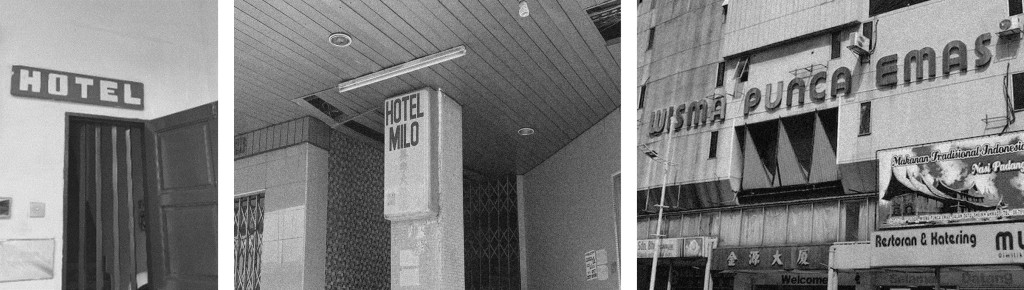
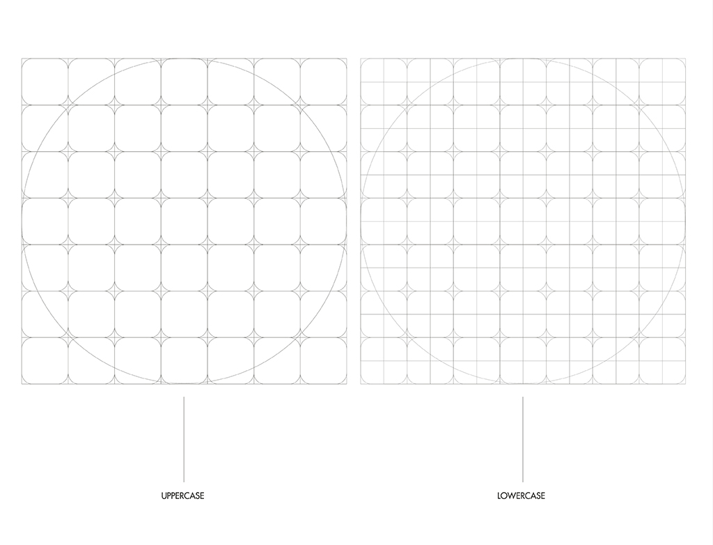
I extracted particular shapes for the letterforms from the photos I took of the signage. The HOTEL sign (top left in the picture above) served as inspiration because of its compacted and distinctive look which I think is a practical way of making signage stand out. I started working on the project by creating a grid system to ease my process while creating the typeface. A grid system was preferable because the letterforms I was working with consisted of blocks using a 7 by 7 grid that had curved boxes within them. There were a series of variations that helped me to create the refinement I imagined. I wanted to make the letterforms a modernized version of the reference but after some experimentation, I found a preferable variant.
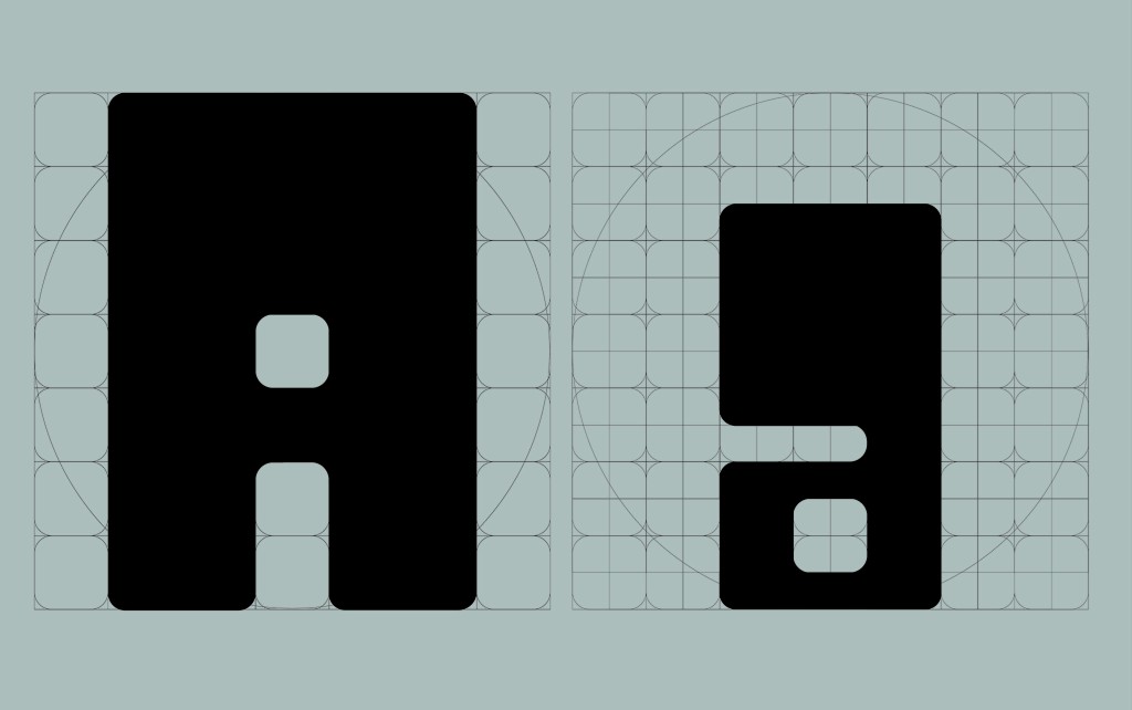
Even when there was the grid, it was difficult to create consistency between the overall letters, a minor problem that could lead to bigger things. For a brief while, I couldn’t figure out how to have the contrast between the uppercase and the lowercase letters. The lowercase letters looked rather awkward because they were thin compared to the uppercase letters that had thicker strokes. With the guidance of my lecturer, Mr. Vinod, the problem was then simply solved by allowing the upper part of the lowercase letters to have the same thickness as the same upper part of the uppercase letters. I had several doubts throughout this process but I found all was well in the end.
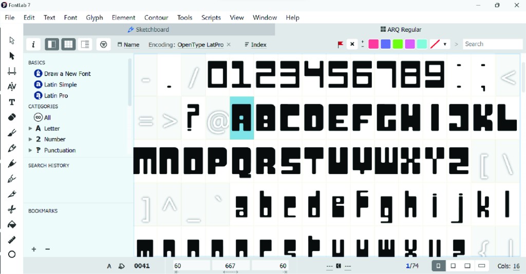
The time it took me to complete the uppercase itself was around 20 hours in total. It took less time to complete the lowercase and numerals since there were guidelines set by the uppercase’s anatomy, therefore, those only took about 13 hours. After all the readjustments, in total it took 40 hours to complete the typeface. After finishing all the necessary glyphs, then came the final process of transferring them into FontLab. Because of my inexperience, I came across many issues with the software such as disappearing glyphs. Near the very end of the process of transferring the typeface, almost every glyph that I transferred was lost. I had to start over. Then, with every six to seven glyphs I transferred, the glyphs tended to disappear. It resulted in me transferring a few glyphs, saving the file, closing it and opening it again. I think this went on as much as twenty times or so.
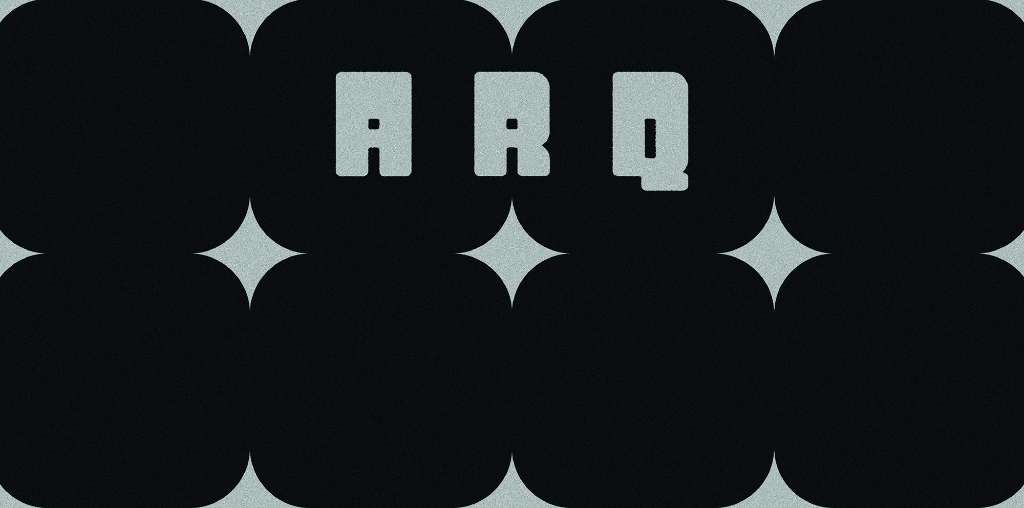
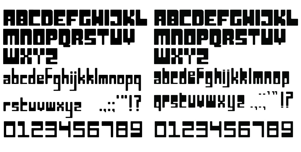
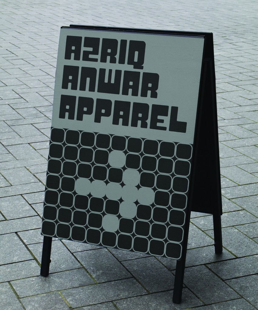
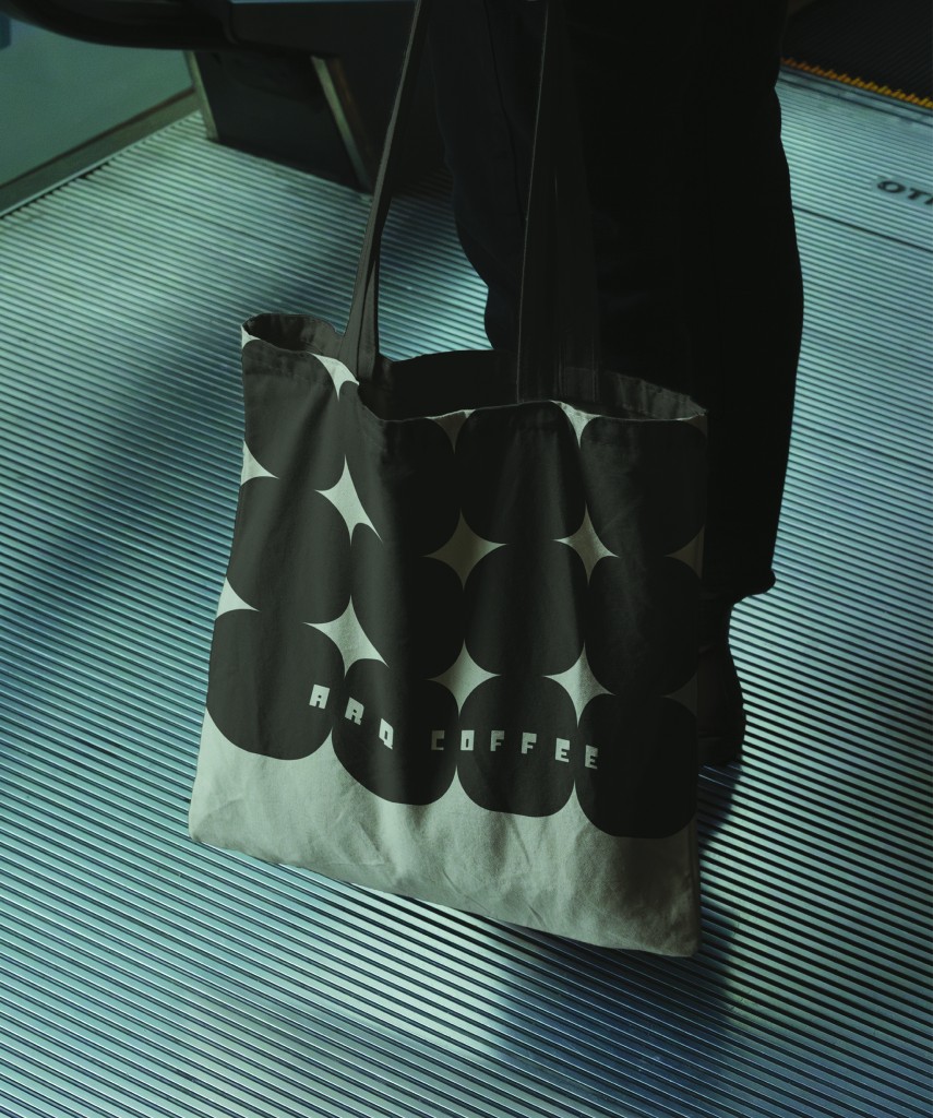
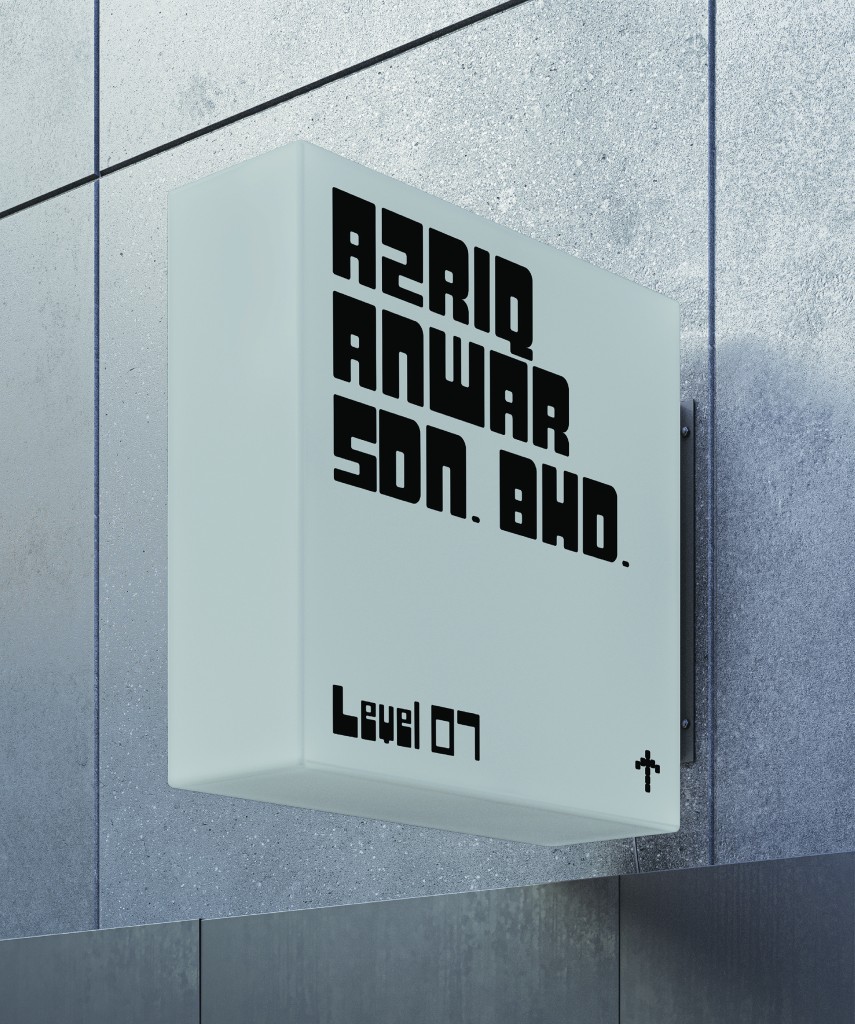
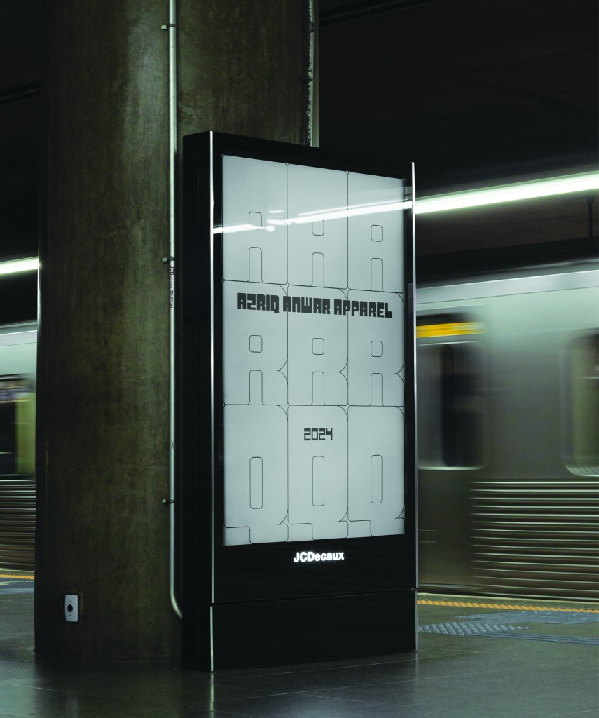
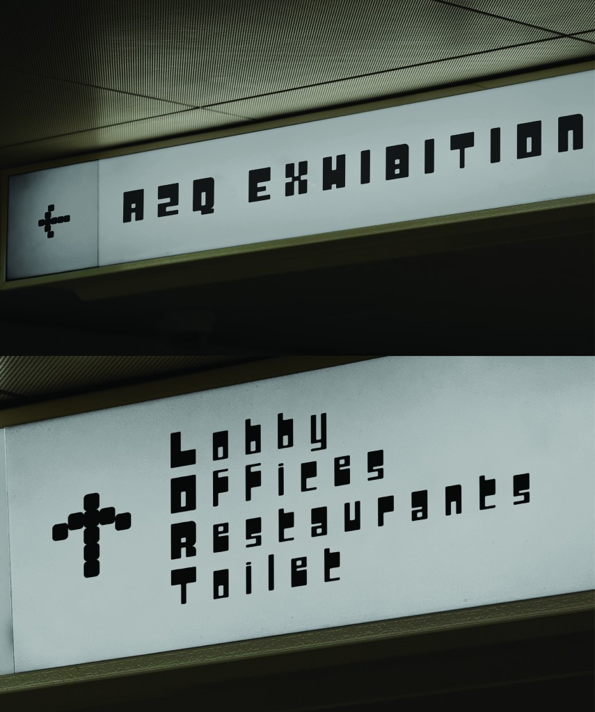
The main purpose of the ARQ typeface was to apply it to contemporary signage specifically using the uppercase letters. The design was intended to have a seemingly bygone feel but also a modern look at the same time; and to also create the feeling of familiarity that would also relate to a younger audience.
When I first tried typing out words using my own font, it felt surreal and satisfying. It felt like an accomplishment and I surely felt proud of myself from the work that I had carried out. Creating a typeface felt like figuring out a puzzle, to know which part goes where it needs to be. Because it felt like a puzzle, it was satisfying when it was all connected. And I would say the hours I spent working on this task, as difficult as it may seem, was definitely worth it.
Eventually, I then worked on the application part of the task. There was a clear vision on how I wanted to showcase it. I used gray and black to emphasize the minimal contemporary look. I began by applying the typeface on places I thought would work best using my font designed primarily for signage using uppercase letters. The difficulty I discovered was to figure out how to compose the design in the application. Some were solved easily while some needed an additional component by adding a part of the anatomy that formed the typeface in the design
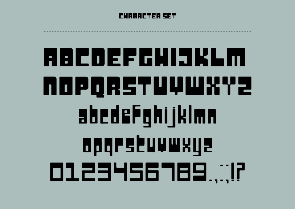
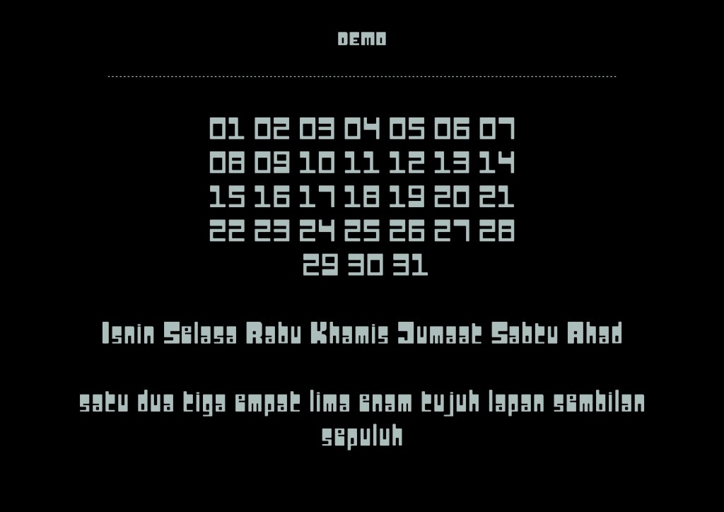
Test ARQ Regular below:
🙂
Typography is an essential aspect of graphic design, shaping how a message is conveyed visually. It goes beyond just selecting fonts; it involves choosing the right size, spacing, and alignment to enhance readability and communication. Typographyhelps create brand identity, making a brand stand out through consistent use across logos, websites, and other materials. It also plays a role in evoking emotions, with different fonts like Serif and Sans-Serif conveying traditional or modern vibes. In short, mastering typography is crucial for any graphic designer to effectively communicate and create impactful designs.