

That spark led to the creation of NuWay, an original typeface designed for a modern Malaysian wayfinding system. NuWay combines Roman uppercase letters inspired by Malaysia’s LLM lettering with a pictogram system mapped into the lowercase letters. Together, these elements form a typeface capable of handling both text and symbolic communication for highway and public signage.
Understanding Malaysia’s Wayfinding Landscape
Malaysia’s current signage uses LLM lettering, which consists of LLM Normal and LLM Narrow. Through my analysis and observation, I found that LLM Narrow appears less frequently, likely due to legibility issues commonly associated with condensed fonts — specifically inconsistent stroke thickness and tight counter spaces — issues not present in LLM Normal.
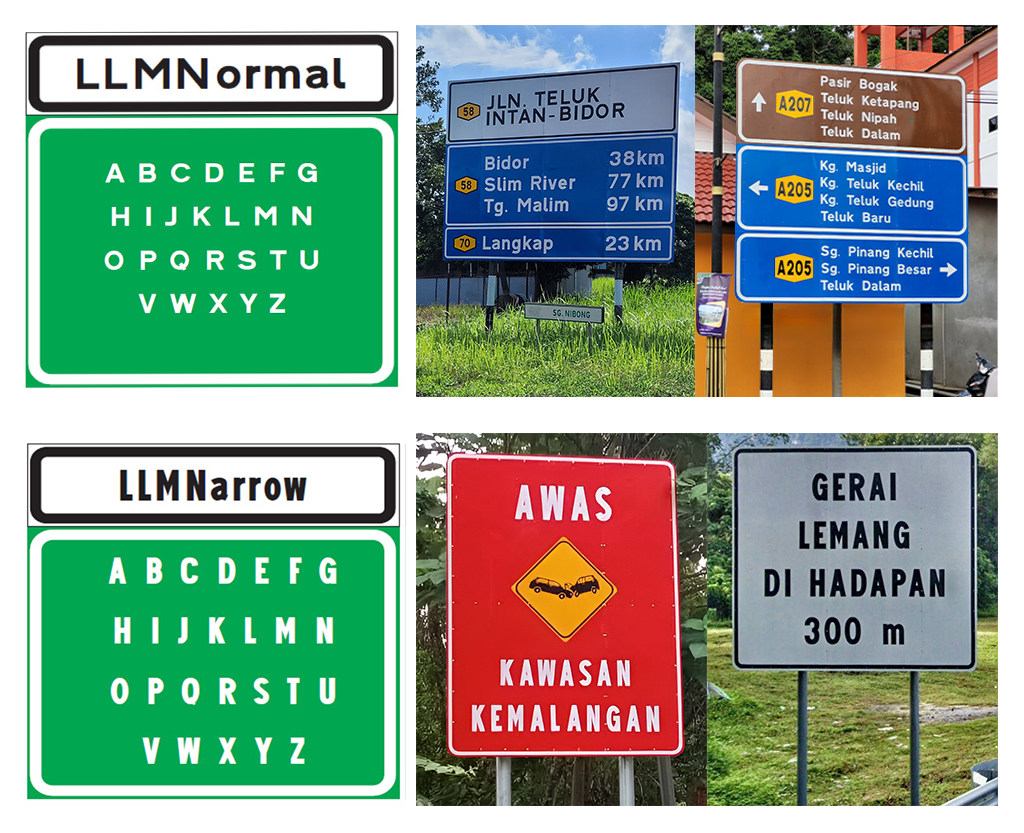
This presented an opportunity to redesign LLM Narrow to better align with the structural quality of LLM Normal. In this project, that redesign would function as the uppercase letter set.
As I delved deeper into my research, the lack of Malaysia’s own original pictogram signage became increasingly apparent, especially compared to neighboring Singapore, which provides its pictograms and diagrams publicly on its website. The same could be said for countries such as the United States and the United Kingdom, both of which have an extensive history of wayfinding development.
This realization led me to study established wayfinding frameworks more closely. A key reference was Signage and Wayfinding Design by Chris Calori and David Vanden-Eynden, which articulates principles of legibility, clarity, and simplicity for functional pictogram systems. Further inspiration was drawn from Olympic pictograms and international road signage used in various countries.
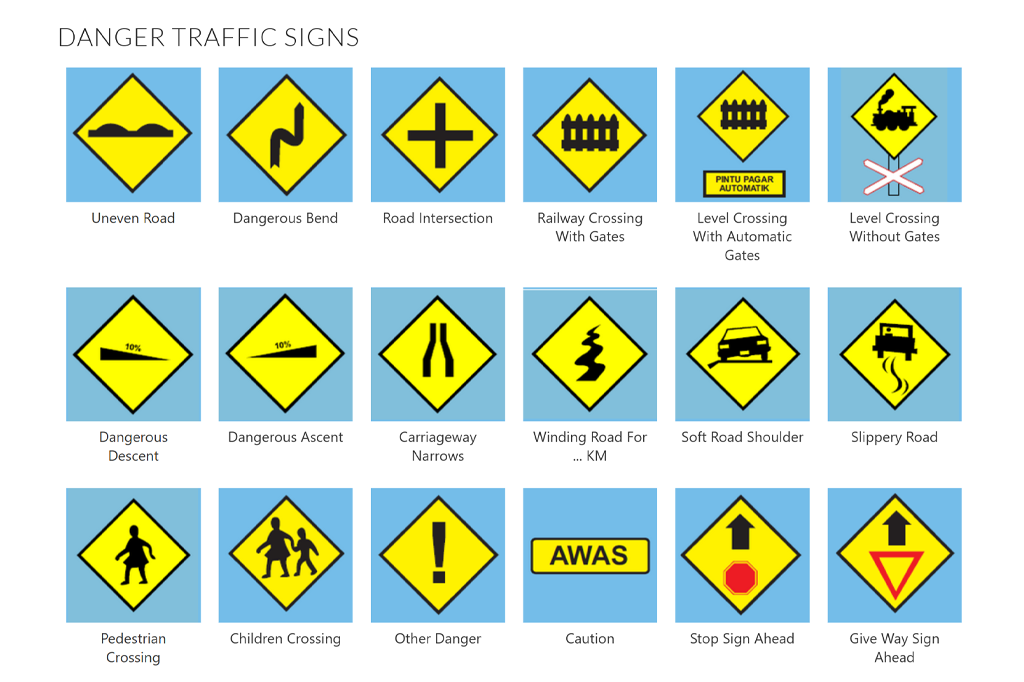
Limited by time constraints and the scope of lettering required, I focused specifically on signage commonly found on Malaysian roads, as shown on the KPP Test website. This approach grounded the project in a real-world context and allowed me to redesign unique local signs that are rarely seen elsewhere.
Redesigning the Letterforms
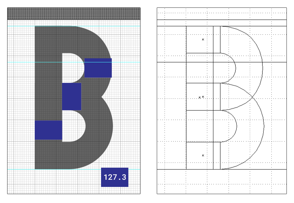
In developing the uppercase letters, I used LLM Normal as a structural reference, maintaining a consistent stroke thickness of exactly 127.3 pt. The letter “B” became my first construction model, as it contains both straight and curved elements that could be reused to build other characters.
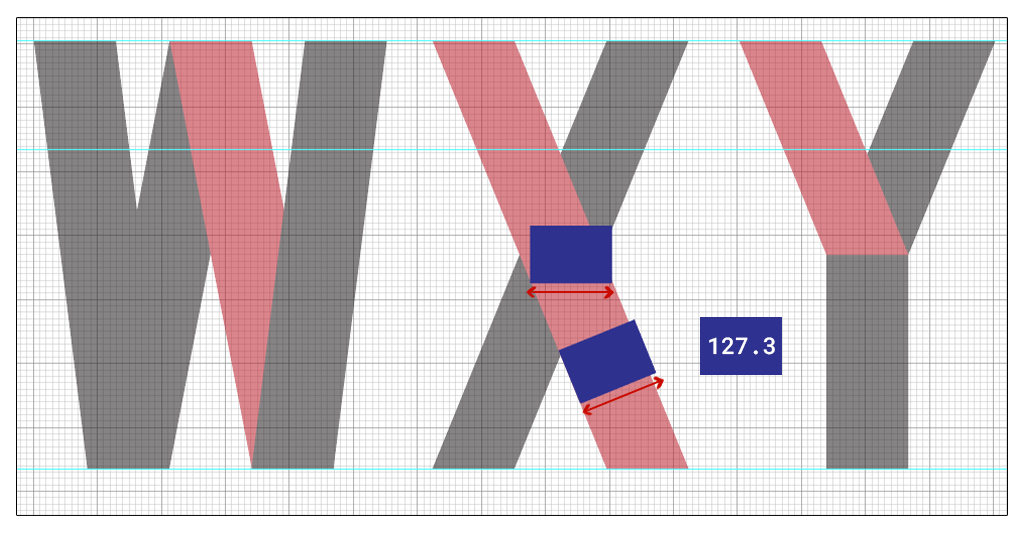
At the same time, there were challenges in maintaining consistency with slanted strokes. To create these forms, I shifted edges manually using the Shear Tool. However, one drawback of this approach is that stroke thickness appears to decrease as the angle becomes steeper, despite the width remaining consistent. This resulted in minor inconsistencies in perceived weight that required careful refinement.
Since NuWay was intended for public use, it needed to withstand real road conditions such as weather, speed, and viewing distance. To simulate these effects, I stress-tested the letterforms using various blur filters in Photoshop.
These tests highlighted a common problem: counter space compression. Letters such as “A”, “M”, “V”, “W”, “X”, “Y”, and the number “4” were most affected. While techniques such as ink traps could address this issue—as seen in some work by previous students—I chose instead to manually widen the internal counter spaces of the affected characters. Although this slightly reduced stroke consistency, the improvement in legibility outweighed strict measurement uniformity.
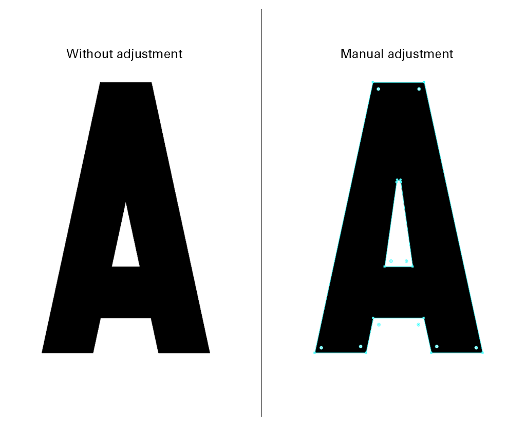
This process reinforced an important principle: functional typography should prioritize clarity over textbook rules or numerical precision.
Designing the Pictogram System
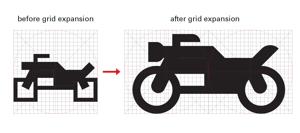
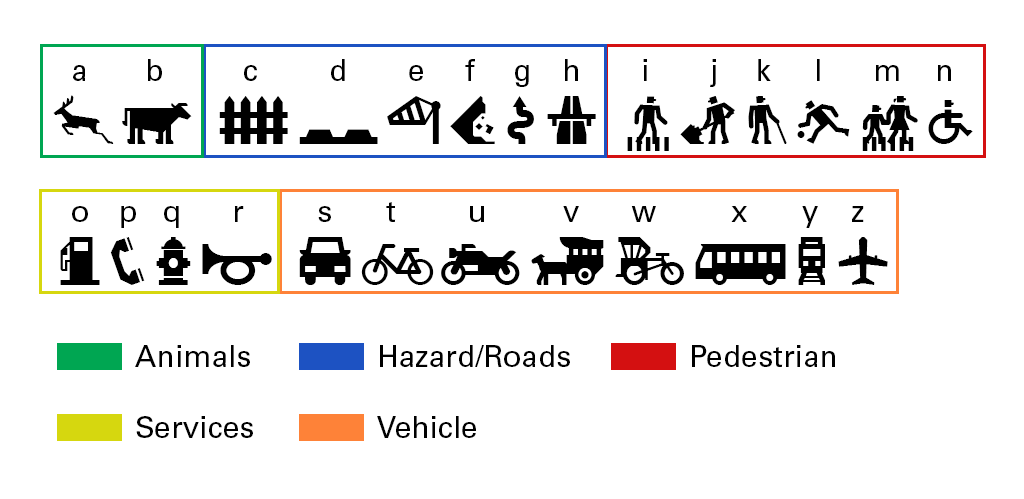
The lowercase letters of NuWay function as a pictogram system — the highlight and visual core of the typeface. Each pictogram was constructed within a 21×21 grid using reusable geometric components rather than freehand drawing. This modular approach ensured consistency and significantly reduced construction time.
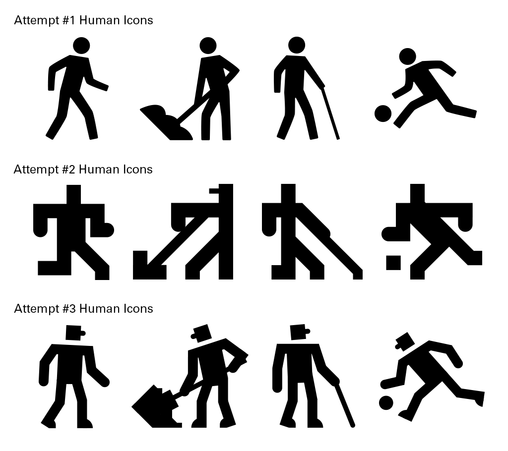
Initially, my symbols resembled existing universal signage too closely. Later redesigns made them overly rigid and difficult to read due to strict reliance on the square grid. Through refinements and research into existing pictogram fonts, I expanded the grid system, allowing for more proportional and readable designs in the final iteration.
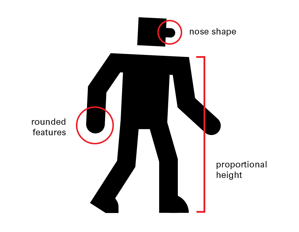
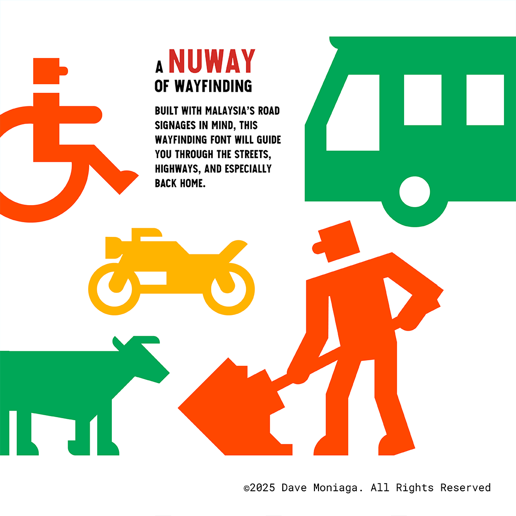
Several intentional design traits are most evident in the human pictograms, including proportional body height, a distinct nose shape indicating direction, and rounded hands that contrast with angular feet. Small details like these add character and personality to the pictograms while maintaining readability — a balance that distinguishes NuWay from existing signage systems.
With both uppercase letters and lowercase pictograms finalized, the next step was evaluating how they function as a unified type system. The design was prepared for import into FontLab to resolve proportions, alignment, and visual hierarchy across all characters.
The completed typeface also incorporates locally relevant pictograms such as a trishaw and a bullock cart, grounding the system in a Malaysian context.
From Design to Typeface
The finalized typeface was imported into FontLab for font generation. Font dimensions were matched precisely to those set in Illustrator to ensure accuracy.
Because the lowercase letters function as symbols, each letter corresponds to a pictogram. Alphabetical naming proved impractical since many pictograms share the same initial letter. Instead, the symbols were organized using semantic group ordering, mirroring professional systems used by ISO and AIGA.
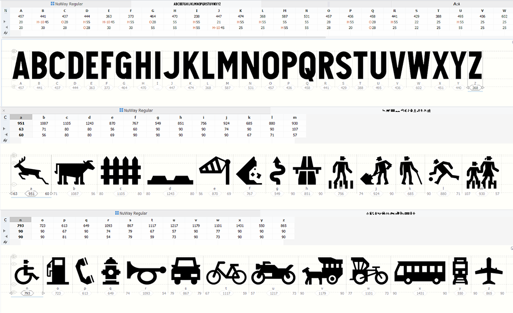
Side bearings were adjusted manually by eye rather than relying on automatic spacing. This was particularly important for pictograms, where visual rhythm matters more than numerical spacing. Each glyph was also tested in phrases to ensure spacing harmony across the typeface.
Testing NuWay in Context
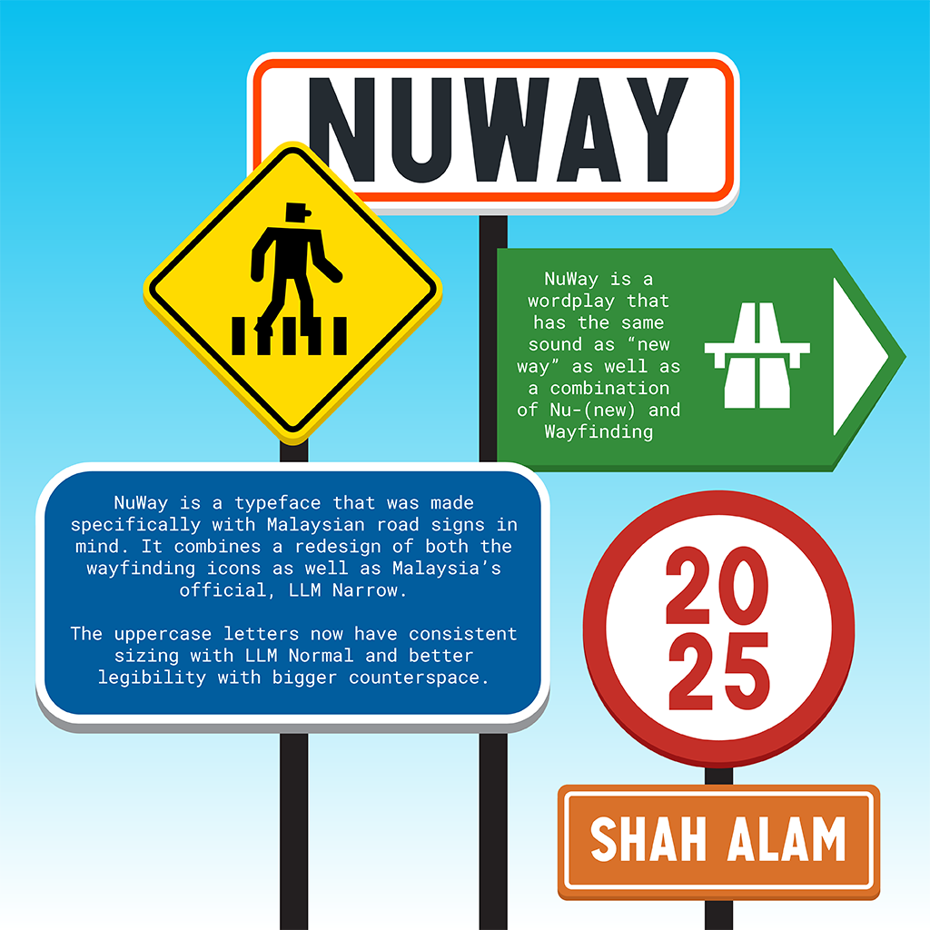
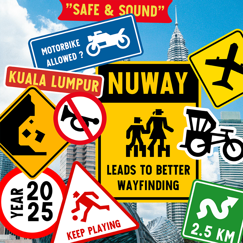
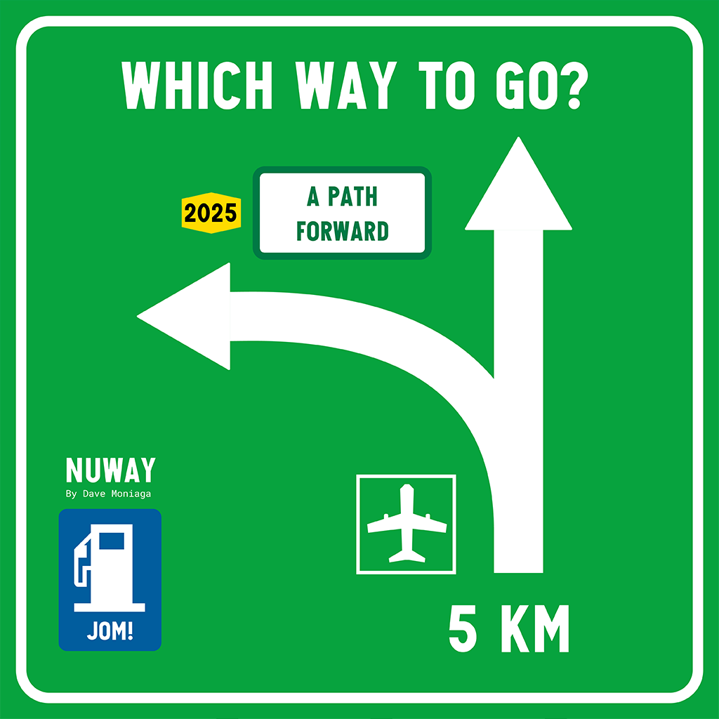
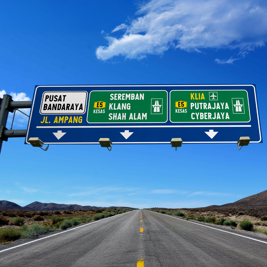
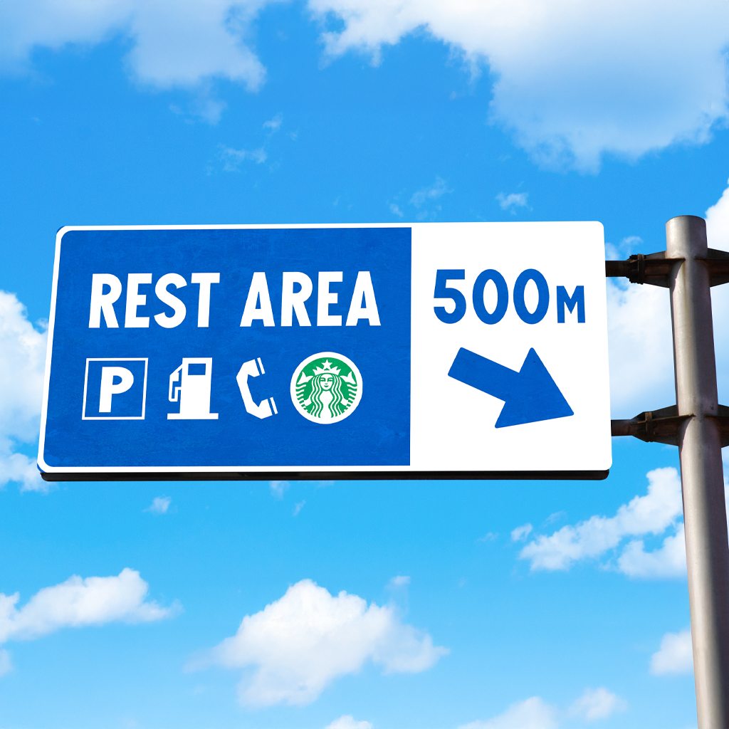
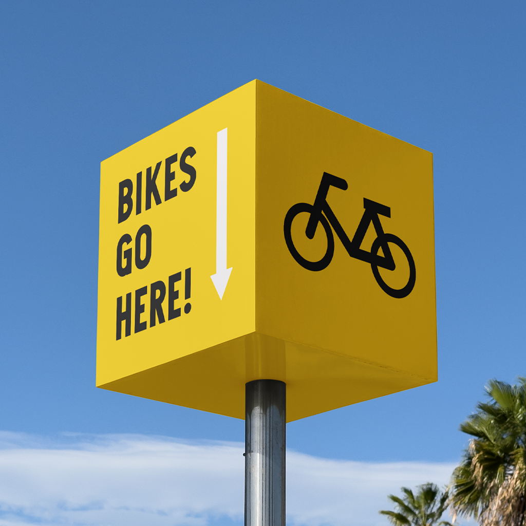
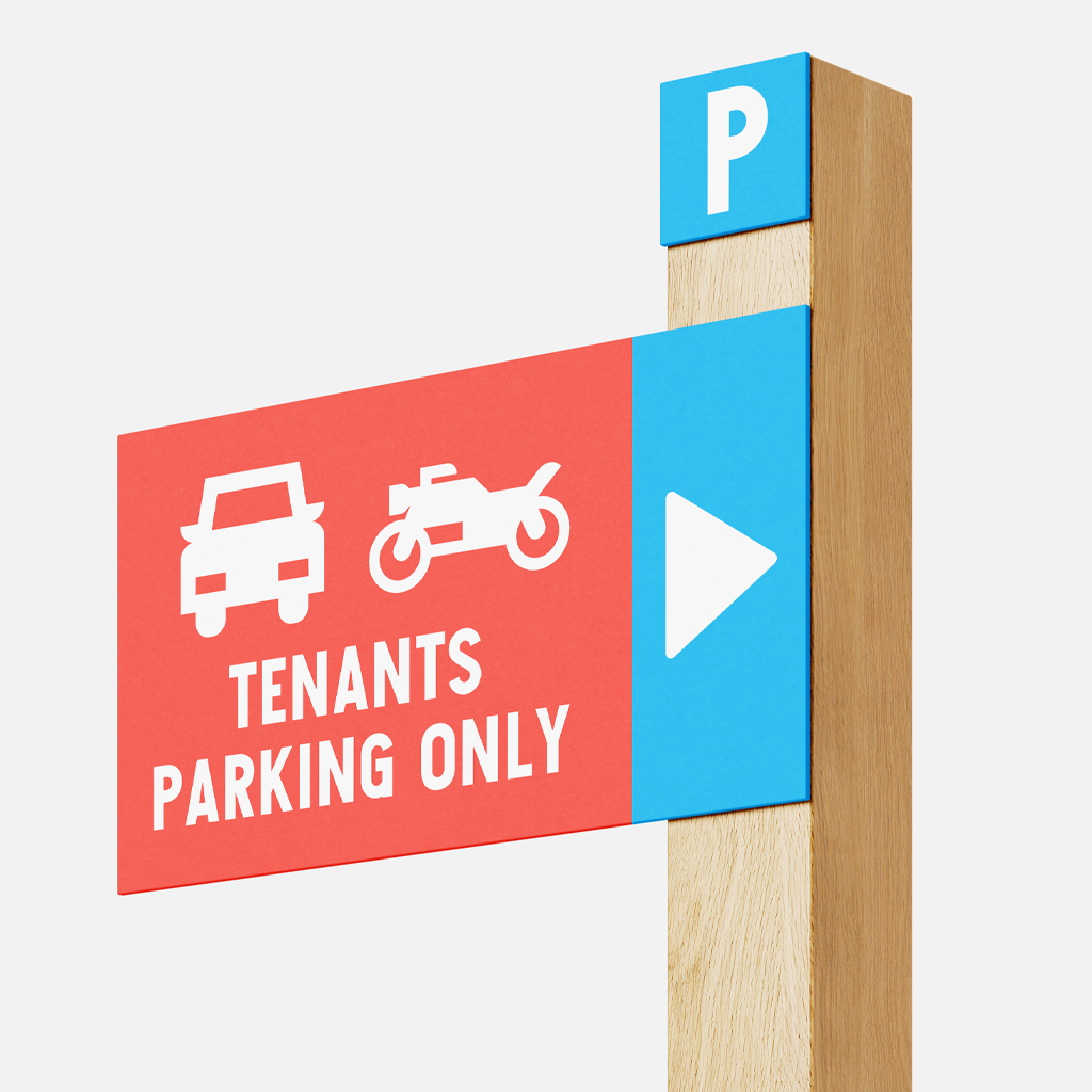
To present NuWay as a working typeface, I used bright, saturated colors associated with highway signage to ensure visibility and immediate recognition in traffic environments.
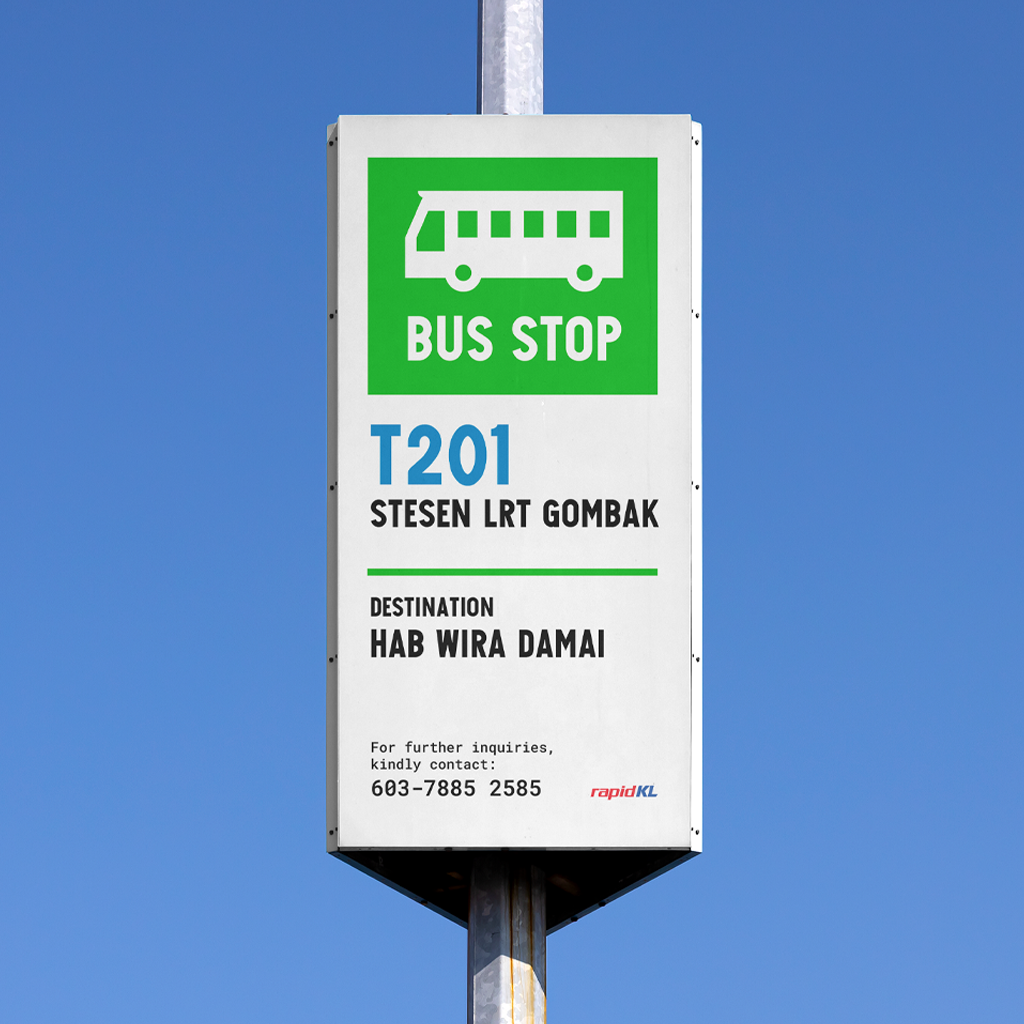
I then created mockups simulating bus stops, highway signs, parking indicators, and service panels — some functioning as redesigns of existing Malaysian signage. These applications helped visualize how the typeface would perform as a real-world system.
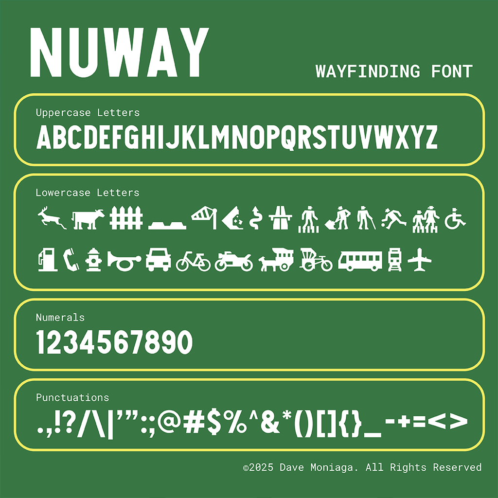
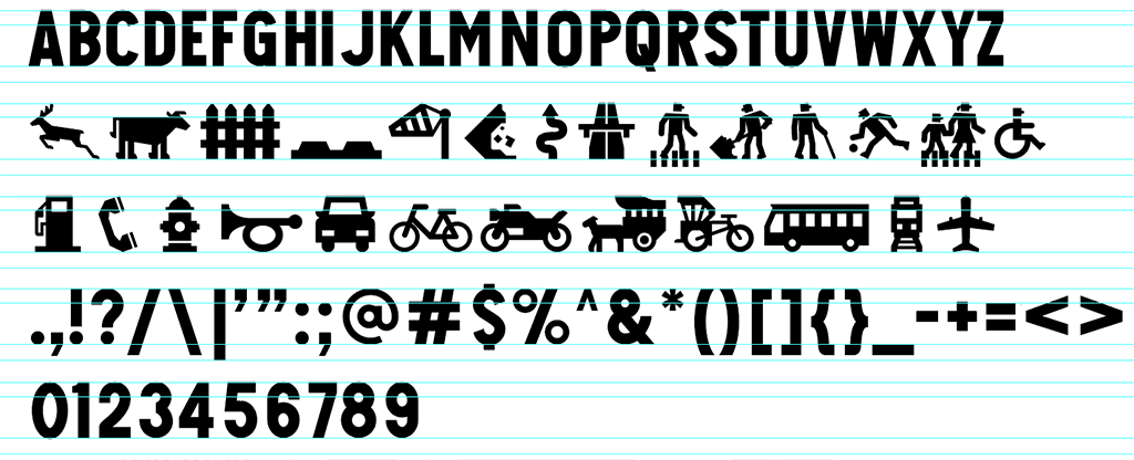
Sample “NuWAY below. Note when typing in lowercase, the font generates pictograms.
Conclusion: A “NuWay” Forward for Wayfinding
Realizing that I was not just creating a font but proposing a solution to a real-world issue became my greatest motivation. NuWay allowed me to approach design from a civic perspective, using my skills not only for personal expression but to contribute meaningfully. It was uniquely cathartic to fulfill my purpose as a designer, regardless of whether the typeface will ever be officially adopted.
NuWay is more than a modern redesign of an existing signage system. It reflects how even small design interventions can contribute to national identity and shape how citizens perceive their environment.The project also highlights cultural confidence, demonstrating that Southeast Asia can develop visual systems that remain relevant and purposeful within a global context.
A more in-depth breakdown of the research and design process can be found on my blog.