Tag: Typography
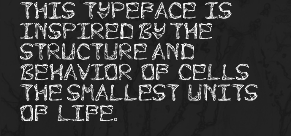
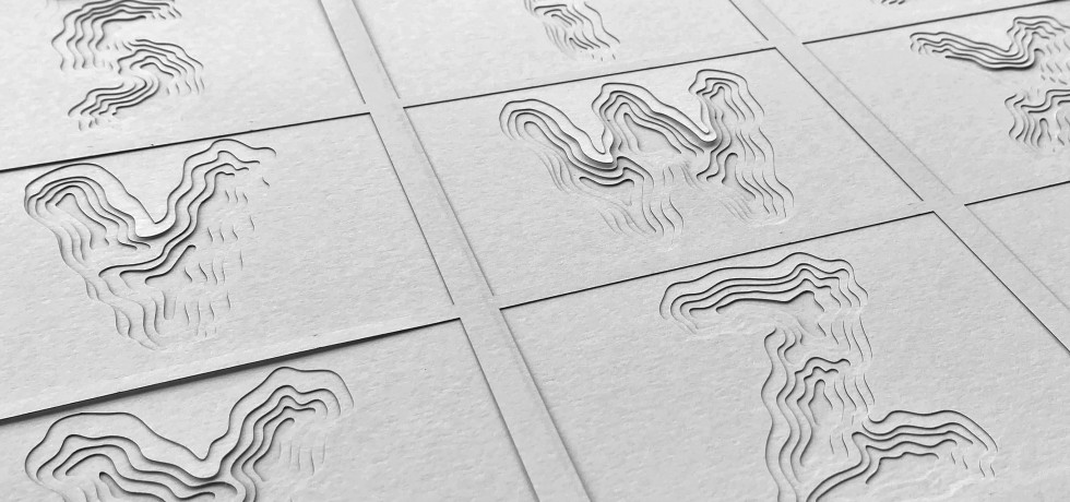
Designing Life into Letters: An Experimental Typeface Inspired by Cells
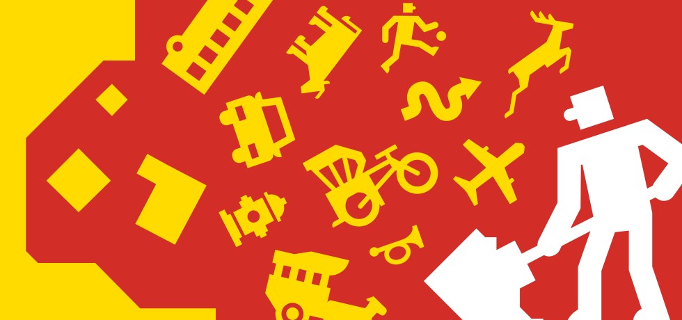
Creating A “NuWay” for Malaysia: A Wayfinding Font
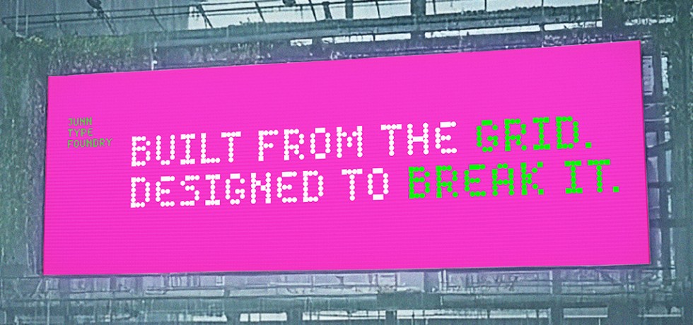
NOMAD: Where Letters Find Their Own Way
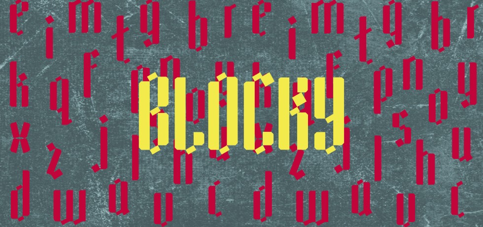
Blocky: Translating Handwritten Marker Strokes into Digital Type

Letters in the Water: Designing Sünny

The Great UX Design Clash: Typography, Super Apps, and the Myth of Universal Principles.
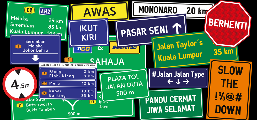
Milky Way & Mononaro: 2 Typefaces Rethinking Lettering for Malaysia’s Highway Signages
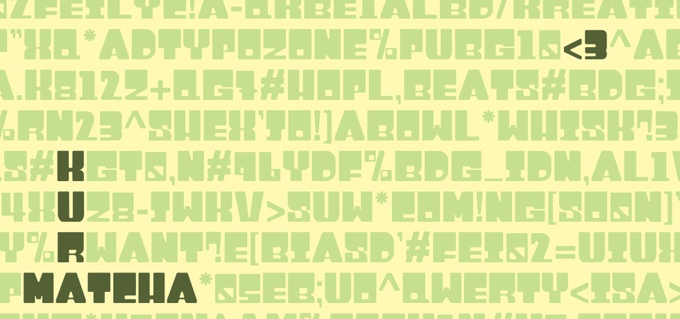
Kura: Crafting Comfort in Structured Letterforms