
“Find your own cause to reduce the number of unused toys.”
????????????
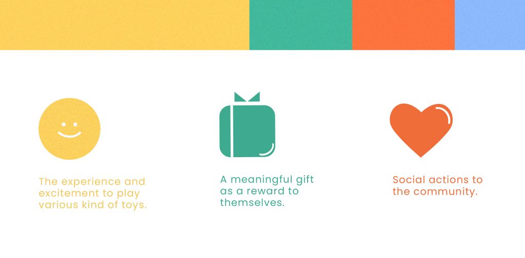
Frequently a child begs for a new toy every day but within a day or week, you will find it in the corner of the home. On average, around 238 toys are collected by a single child, but they use only 12 toys to play with throughout the day. Toy Swap was proposed as a solution to this problem by providing parents a platform to educate their children on how to manage a ‘sharing economy’. It also encourages them to show appreciation, empathy and awareness toward the community, with the hope of reducing the number of unused toys.
With the rise in technology along with the emergence of user-centered design, I introduced a practical family centred mobile application with intuitive UI/UX Design. By focusing on the user, there was careful consideration during the planning process. Much deliberation was given to the overall look and theme, UI style, colours, and illustrations in order to provide the best experience for children. Furthermore, I created an end-to-end prototype of the product along with an attractive visual identity.

Toy Swap offers simple yet comprehensive features to familiarize children with the mobile application. Most importantly, every family can find their own cause and solution through the App. To put it simplify, the app works in three main ways: Swap, Rent, and Donate Toys. Similar to what most people have experienced on an e-commerce platform, users Toy Swap are able to go through the same process to swap, rent or donate toys.
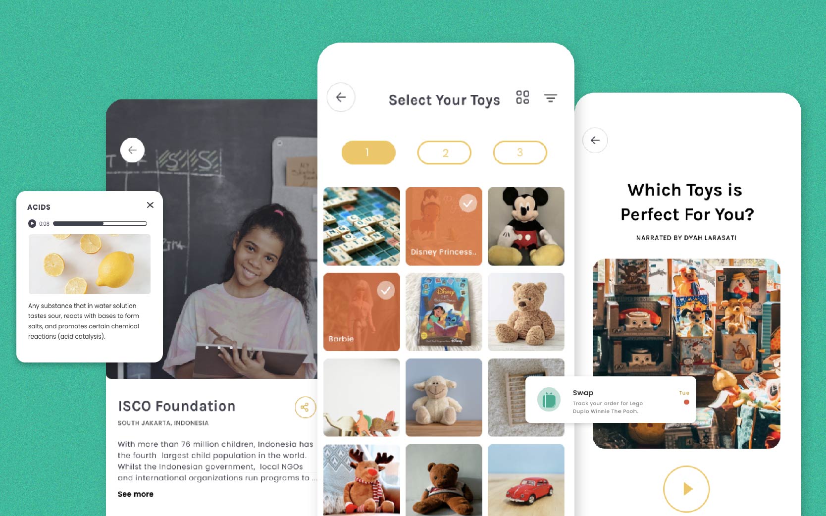
In addition, the app features educational content for both children and parents. Articles and interactive quizzes are presented to add more value to the app. These features are meant to trigger actions and awareness on how to make use of toys. Users can decide to de-clutter, donate, or even swap and rent their toys. Through these activities, the child gains knowledge and learns to appreciate and value their toys, developing sustainable habits in the process.
Apart from swapping, renting and donating toys, there are three other types of content featured in the app, these are: Slide Article, Audio Article and Interactive Quiz.
- Slide Articles give parents and children various insights that revolve around parenting tips and interesting facts about toys.
- Audio Articles have audio feature that help children to understand the content better by listening to several keywords.
- Quizzes — personality quiz — provide another set of interactive activities for children.
Gamification was another aspect that was taken into consideration in the creation of the app. To continually engage and increase participation in the app, children were rewarded for their accomplishments this increased motivation. For instance, once a user has successfully donated their toys, they would receive points which can be exchanged into other forms of entertainment.
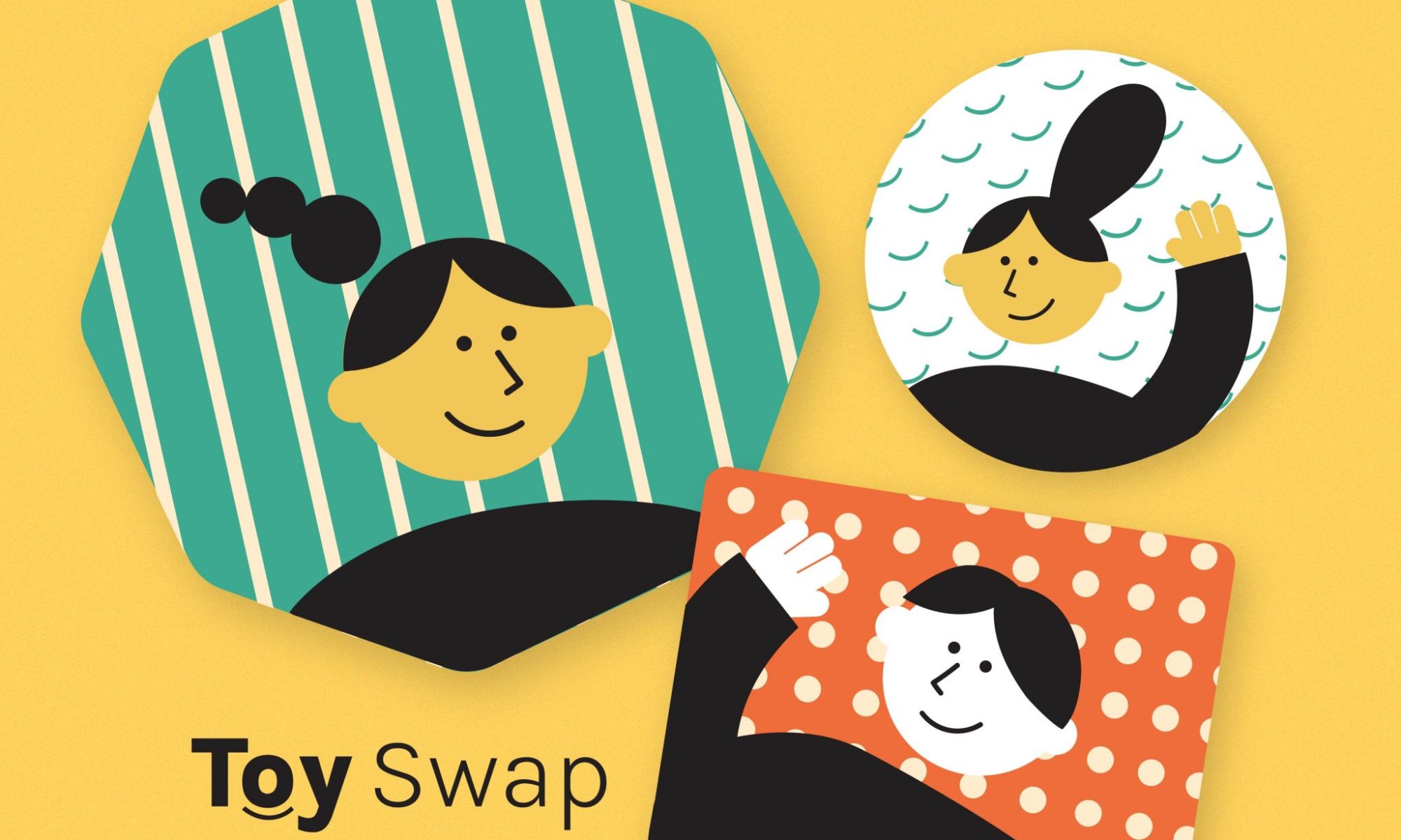
Another key point is the importance of creating a brand value and background story that speaks to the audience. With children in mind, it was essential to voice key messages of the app using symbolism. Branding was important when considering the color palette and UI. Colours were gender-neutral and selected considering a child’s sensibilities. Colours like yellow is believed to sparks excitement, cheerfulness and happiness. Orange is strongly associated with creativity and courage. While Green and Cream were combined to give balance and harmony. Lastly Blue was believed to be friendly but also calming.
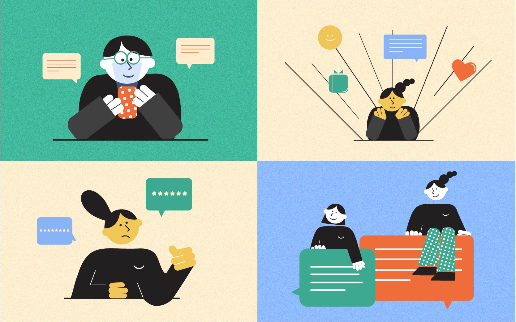
I also created and introduced a set of illustrations. Each illustration has their own meaning and action behind it that depicts the user. Some illustrations were made purely as decoration in order to enhance the visual experience and interface. Meanwhile, other illustrations were made for alerts or to guide users in the app.
Even though the project was mostly a self-directed study, I went through each process begining with Design thinking, Research methodology, and User-testing.
- Design thinking was used to gain an understanding of the user’s needs, generated prototypes, and creative ideas that could be transformed into products or services.
- Research methodology was used to identify and refine the problems, look through trends and innovation and draw new schemes across design disciplines.
- User-testing was used to evaluate how practical the product will be; finding its pain point as a reference, and further analyzing it to achieve a better solution.
UI/UX is an iterative process and I believe there is still a great deal of room for improvement and exploration. In my opinion, the future of design will be a collaboration of various disciplines that focus on user-led projects which embody methodologies and strategies of design innovation within contemporary society.
As a designer, I think it is important to have the motivation and empathy to work toward a social purpose through processes that are cross-cultural, user-centered, and collaborative in order to lead to resolved outcomes whether in a design context or another. Also, to develop the ability to apply a strategic and speculative thinking process when analyzing challenges and synthesizing responses.

This project made me realize how extensive and expansive design can be. There are so many opportunities and untapped ideas just waiting to be realised.
You are welcome to view the full project on Behance.
