In a previous article in 2018, fed up with the range of vehicle number plate typefaces proliferating Malaysian roads, I had set out to provide a designed solution to the phenomenon.


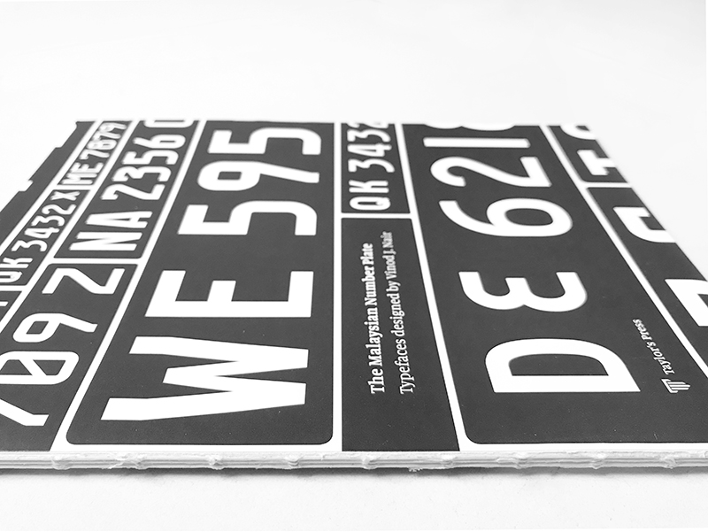
In my explorations I ended up producing 3 typefaces: Myno, Myno Extended, and Nomy. You can read about them here. Upon completion of these typefaces, I then published a book titled, “The Malaysian Number Plate: Typefaces Designed by Vinod J. Nair”. The book was published by Taylor’s Press in 2018. Here are a few excerpts:
“Every advanced country at some point in their evolution begins seeing design as an important and integral part of nation building. It is not enough to provide solutions, but rather it becomes incumbent upon us to provide designed solutions. In such instances using the available talents and resources to address existing issues becomes necessary.”
“Designs that are based on sound values, that seek to move humankind to a more evolved and civilised state, is an integral component in the evolution of a nation seeking to better its society. The designs proposed here seek to contribute to that end. It is an attempt to solve a pressing problem by providing designed solutions with style and functionality.” (Nair, V. J., 2018)
I was curious about the reactions I would get to these new designs and so I held a flawed and wholly unscientific poll on Twitter. I listed the number plate typefaces in an image along with the current ubiquitous ‘Factory Manufactured Type’ used by vehicle owners in Malaysia (here on end referred to as the FMT). The FMT is featured as option 1, see figure 1 below. Respondents were asked to choose between options 1, 2, 3 and 4. Unfortunately, there wasn’t a digital typeface for the FMT and so I had to use a real image of a number plate which stood out in contrast to the digitised options (2, 3 & 4). Thus, the instrument of measure was faulty and would have skewed the results. I was aware of this at the time of deployment but my overriding sentiment was to obtain feedback, some validation and to share what I’ve done.
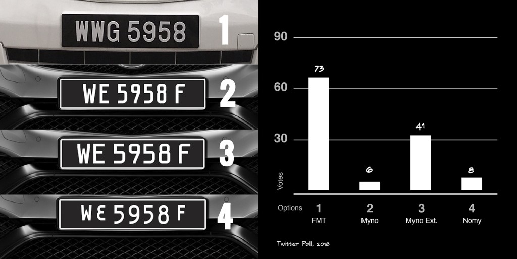
The response to the survey was surprising — there were 80 retweets, 128 people responded, 30k impressions, and 11k engagements. Then, out of the 128 who responded, 73 voted for the existing number plate typeface (FMT) which made up 57% of total respondents. Coming in second was option 3, with 41 votes at 32% of the vote. Option 2 and 4, my favourites, hardly made a dent to my surprise.
Apart from the faulty instrument of measure, I suspect that the majority of respondents chose the FMT or option 1 due to its familiarity but also its legibility. I believe familiarity and legibility are phenomena that are interdependent or intertwined. I posit, the more familiar the typeface the more legible it would seem to the respondents. There are studies on “familiarity bias” that so indicate. That said, the FMT does have an openness of character in its typeface design which increases its legibility — at least so it seems. To confirm this, I tried to recreate the FMT digitally to make a fairer comparison with the number plate typefaces that I designed (figure 2).

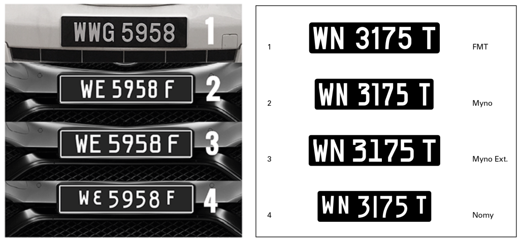
In figure 3, I recreated the survey instrument and placed it next to the faulty survey instrument for comparison. Clearly the recreated survey instrument (right in figure 3) would have been fairer. That said, I suspect the results would still have shown an overwhelming preference for the FMT. At best, option 3 (Myno Extended) may have increased its vote tally. It would be hard to know for sure unless the survey is redeployed. One sentiment that was repeated by respondents pertained to legibility. In figure 3 of the redesigned survey instrument (right), a subjective visual assessment suggests option 1 and 3 seem to standout as most legible, hence its higher vote tally. Figure 4 shows a side-by-side comparison of option 1 (left) and 3 (right), at this stage the choice between the two comes down to personal preference, or as mentioned earlier, familiarity.

At this point it is important to note that when it comes to regulatory ordinances like vehicle license plates or number plates as we call them in Malaysia, public sentiment pertaining to preference or aesthetics aren’t really factors, functionality is. Thus, the overriding concerns for authorities would be of standardisation, legibility, and readability for the prescribed distances and atmospheric conditions, conformance to the technological needs of the Automated Number Plate Recognition (ANPR) systems, and more.
Even though my intention was not to conduct a scientific poll but rather to obtain feedback, and even though the result was technically not valid due to the faulty instrument, I couldn’t help feel that there was some basis or validity in the choice of the respondents. With this disappointment came a lack of mental clarity and objectivity. I recognised that I needed to step back from the project in order to plan my next step. I took a break of around 6-8 months.
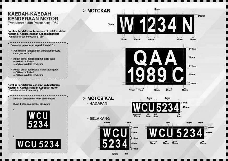
After coming to terms with the feedback/results and reflecting on my designs more critically, I decided to now turn my gaze to the FMT number plate typeface. I figured that since the FMT is widely used and familiar, it would be best to provide another option that is based on the FMT, only better. For one, I realised that the factory manufactured typeface (FMT) only existed in hardcopy format. Secondly, I realised that the Road Transport Department (or known by its Malay name Jabatan Pengangkutan Jalan aka JPJ) did not have a digital typeface to illustrate the do’s and don’ts of number plate typesetting and layout. This led them to choose typefaces like Arial Bold to illustrate regulatory requirements (figure 5).
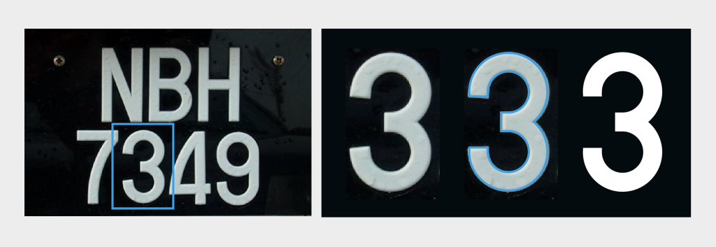
Knowing that the authorities at some point were intending to introduce metal embossed plates, I figured the existing FMT needs adjustments. A cursory visual analysis of the FMT indicates its rudimentary construction but also its geometric nature (figure 6). I now began to see possibilities of how the FMT could be made better. The more I pondered the more excited I began to get. In the latter part of 2019, I began the process of digitising and revising the FMT. I called this variant number plate typeface “JPJ 1” (Figure 7). Alterations were made to every letter and number and international glyphs were designed for it to be utilised in different countries. The labour of love put into this typeface was monumental but also inherently rewarding. For a layperson the resulting typeface would seem familiar, even similar to the FMT. However, it would also feel a lot more robust and professional in its new avatar. The new variant has also increased legibility due to certain quirks that have been introduced to it.

More will be revealed about JPJ 1 in my next article, here.

References
Nair, V. J. (2018). The Malaysian Number Plate: Typefaces Designed by Vinod J. Nair. Taylor’s Press.
Ministry of Works (2019). Malaysian ITS Blueprint 2019-2023. Ministry of Works, Highway Planning Division.

can I get this font