Tag: Featured
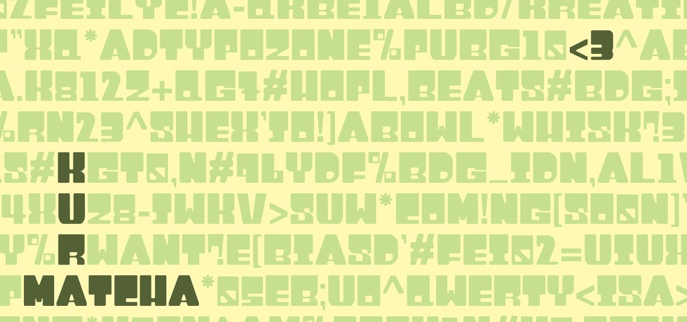
Kura: Crafting Comfort in Structured Letterforms
Between Rules and Creativity: My Curator Journey
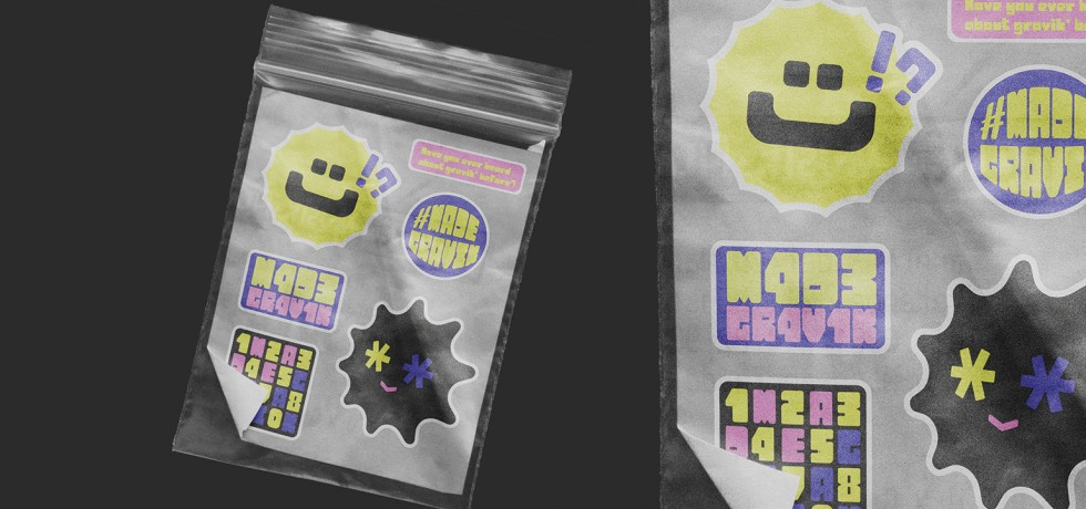
Made Gravik: Branding Yourself, One Letter at a Time
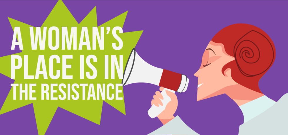
The Role of Graphic Design In Social Movements And Activism.
Is your school’s emblem truly a badge of pride—or just another forgettable design?
Letters of Heritage: Designing a Batik Font

Satosch: Designing a Typeface for a Cryptocurrency Exchange
Quanta – A Modular Typeface for a Creative Future