Tag: Featured
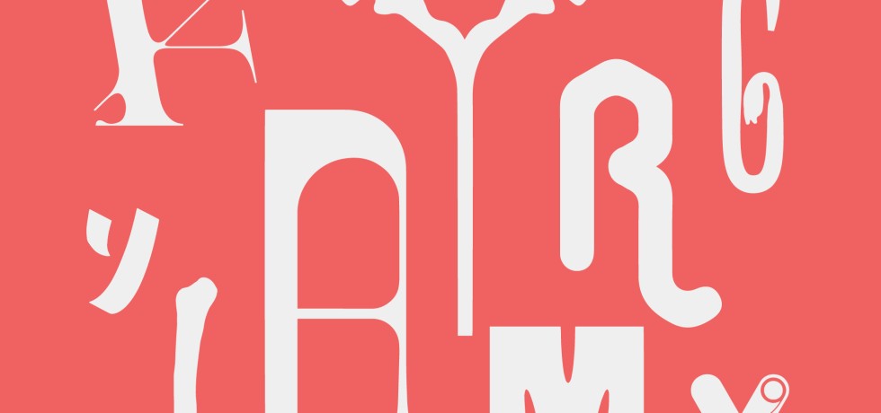
Reviving Vernacular Typography
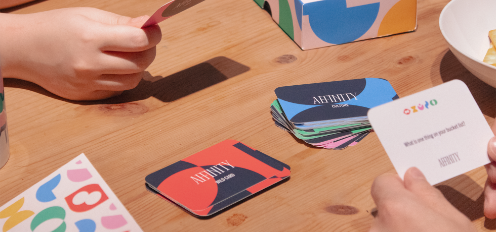
Affinity — A Card Game on How to Love and be Loved
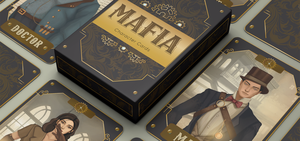
MAFIA — Trust No One, Betray Everyone
Paw’s Journey Home
Finding Type: A Novel Typographic Exercise
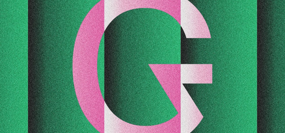
Voodoo Sans — A Quirky Geometric Sans Serif Typeface
One Normal Event—For the Cohort When Nothing Was Normal
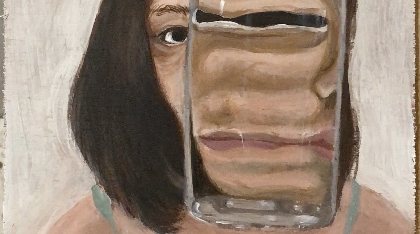
Who Am I?