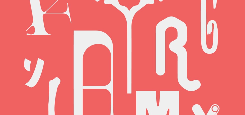
Skip to content
+

+

Your Regional Creative Source

  • Design
  • Visual Culture
  • Opinion
  • Arts
  • Education
  • Issues
  • About
News + Events

One Normal Event—For the Cohort When Nothing Was Normal
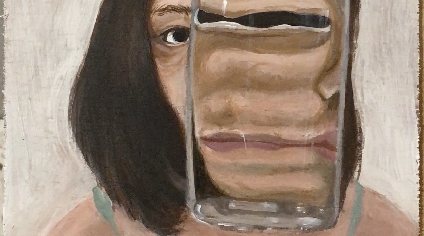
by Seerat TayyabJuly 20, 2023
Continue Reading
Drawing

Who Am I?

by Jinchi Yip-EganJuly 15, 2023September 18, 2023
Continue Reading
A person hiking up a hill in a grassy area below blue skies.
News + Events

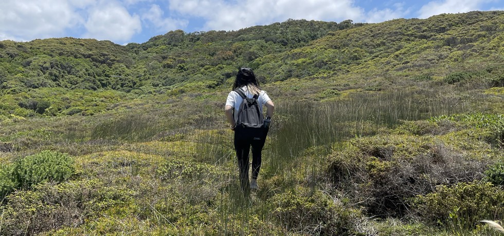
Discovering Diversity

by Seerat TayyabMay 24, 2023September 18, 2023
Continue Reading
Spatial Design

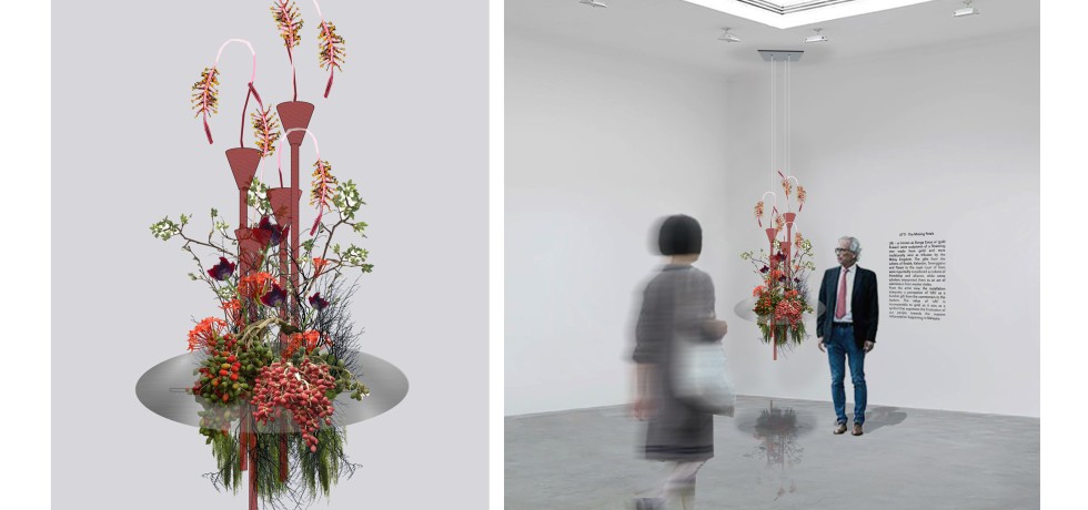
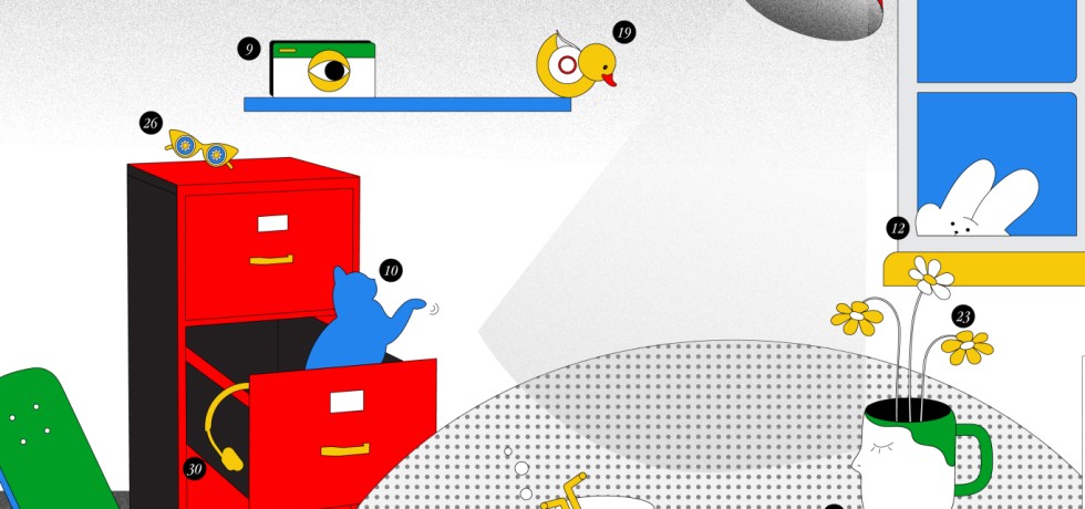
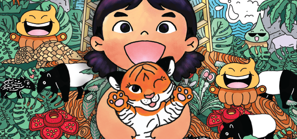
UFTI — The Missing Petals

by Siti Nur DiniMay 12, 2023August 6, 2023
Continue Reading
Social Design

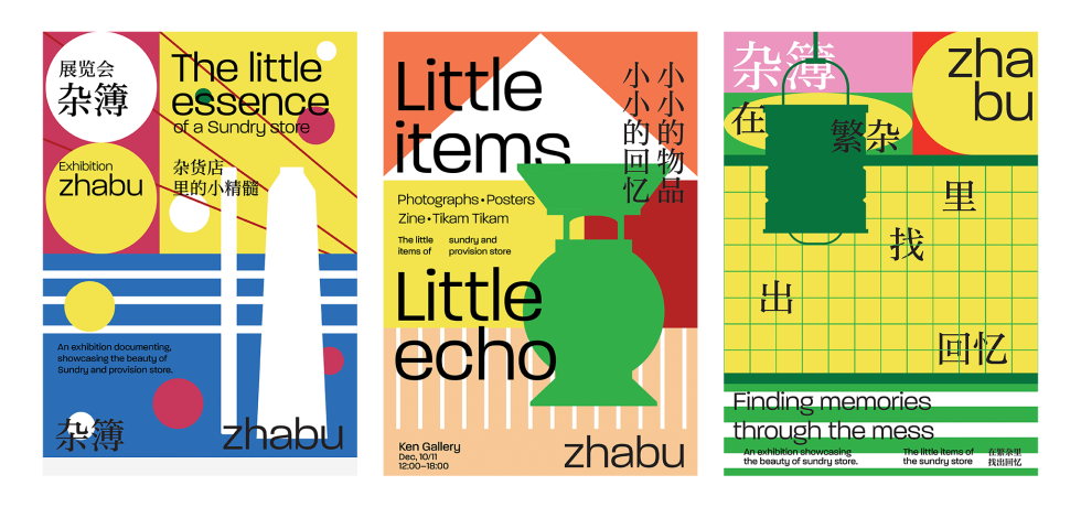
The Sundry Shop Inspired Project

by Sean LeeApril 20, 2023April 20, 2023
Continue Reading
XR

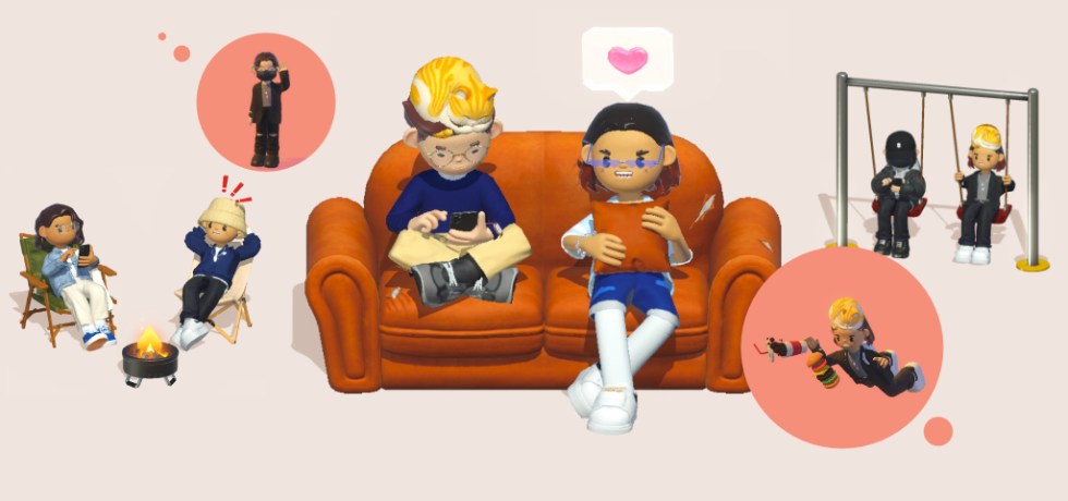
Bondee: The Social Metaverse We Actually Like

by Kyra HamzahMarch 27, 2023March 27, 2023
Continue Reading
Character Design Game Design Illustration

A WAHHH RECTANGLE!

by See Zi YiFebruary 28, 2023February 28, 2023
Continue Reading
Character Design Entertainment Design

FRAMED!

by Fazal AhmadFebruary 12, 2023February 12, 2023
Continue Reading
Social Design

Rusicade: An Algerian Typeface

by Mohamed Hammam ChebelJanuary 31, 2023May 12, 2023
Continue Reading
Graphic Social Design

Do You Know the Origins of Flags and of Your Flag?

by Vinod NairJanuary 15, 2023December 13, 2023
Continue Reading

Posts navigation

Older posts
Newer posts

kreatifbeats.com Follow

To share diverse views, local or regional knowledge related to creative disciplines and thought processes that are pertinent and pressing in SE Asia and S Asia.

kreatifbeats
kreatifbeats kreatifbeats.com @kreatifbeats ·
9 Feb

"NOMAD: Where Letters Find Their Own Way" by Nicole Ng

"I wanted to design a bold, fat typeface that screams “Look at me!” but in a polite way (if you get what I mean)."

Reply on Twitter 2020780034706026837 Retweet on Twitter 2020780034706026837 Like on Twitter 2020780034706026837 Twitter 2020780034706026837
kreatifbeats kreatifbeats.com @kreatifbeats ·
2 Feb

"Exploring Art Nouveau Through Experimental Typeface Design" by Caitlin Lung

"“I thought it was another letter.” Stylistic ambiguity w/out sacrificing readability was the goal ... so I had to make adjustments based on the feedback I received ..."

Reply on Twitter 2018314773319020803 Retweet on Twitter 2018314773319020803 Like on Twitter 2018314773319020803 Twitter 2018314773319020803
kreatifbeats kreatifbeats.com @kreatifbeats ·
27 Jan

"Blocky: Translating Handwritten Marker Strokes into Digital Type" by Tsen Ken Yee

"Even well-designed letterforms can appear unbalanced if spacing and kerning are not properly considered."

Reply on Twitter 2015973257409876124 Retweet on Twitter 2015973257409876124 Like on Twitter 2015973257409876124 Twitter 2015973257409876124
kreatifbeats kreatifbeats.com @kreatifbeats ·
16 Jan

"Letters in the Water: Designing Sünny" by Ahmed Saneeh

"I realized that the level of perfection I aimed to achieve required countless hours, days, and nights of careful refinements, many of which may appear insignificant at first glance."

Reply on Twitter 2012084757648310312 Retweet on Twitter 2012084757648310312 Like on Twitter 2012084757648310312 Twitter 2012084757648310312
Load More

+

Your Regional Creative Source

+

Copyright © 2021 Taylor’s University.
All rights reserved.

The Design School

The Design School
Taylor’s University

+

E-ISSN No. 2637-1111

+

Kreatif Beats

Troublemakers’ Assembly

Troublemakers' Assembly

The Design Asylum

Design Asylum

Mayamode

+

Supported by:

wRega

  • News + Events
  • About
  • Contact
  • KREATE
Proudly powered by WordPress | Theme: aquene by Themes Harbor.