Skip to content
+

+

Your Regional Creative Source

  • Design
  • Visual Culture
  • Opinion
  • Arts
  • Education
  • Issues
  • About

Tag: Font Design

Type

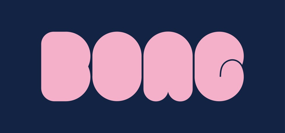
Bubble Pop: A Playful Minimalist Typeface

by Sue Zhiun BongOctober 4, 2024October 13, 2024
Continue Reading
Graphic Type

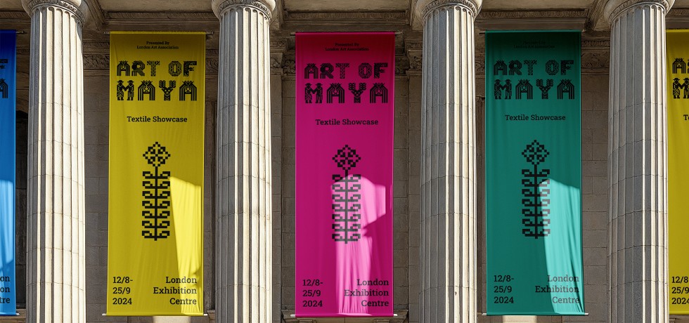
Creating A Mayan-Inspired Font

by Yu Tian TeuSeptember 20, 2024July 9, 2025
Continue Reading
Graphic Type

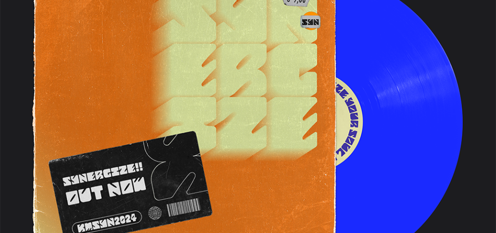
Synergize: Designing Harmony with Type

by Johanna KimAugust 29, 2024October 20, 2024
Continue Reading
Graphic Type

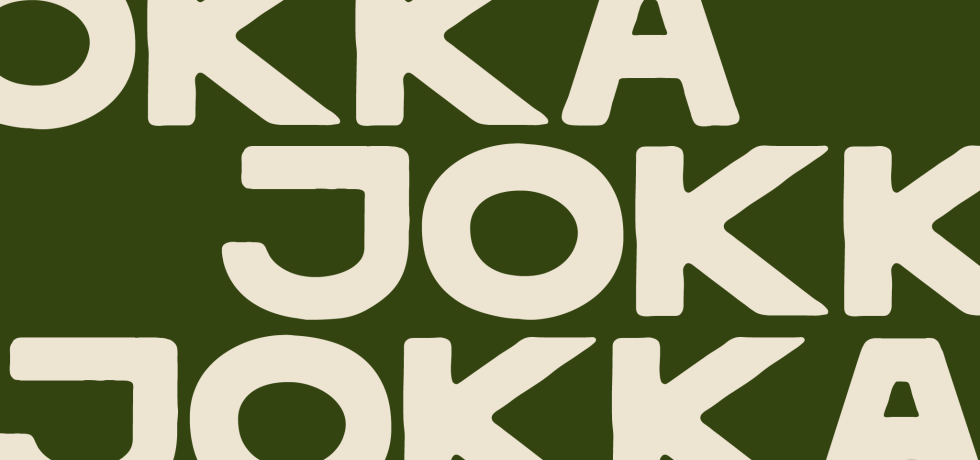
The Fun in Function: A Typeface for Travel Agencies

by Lizzie TanakaAugust 23, 2024October 20, 2024
Continue Reading
Graphic Type

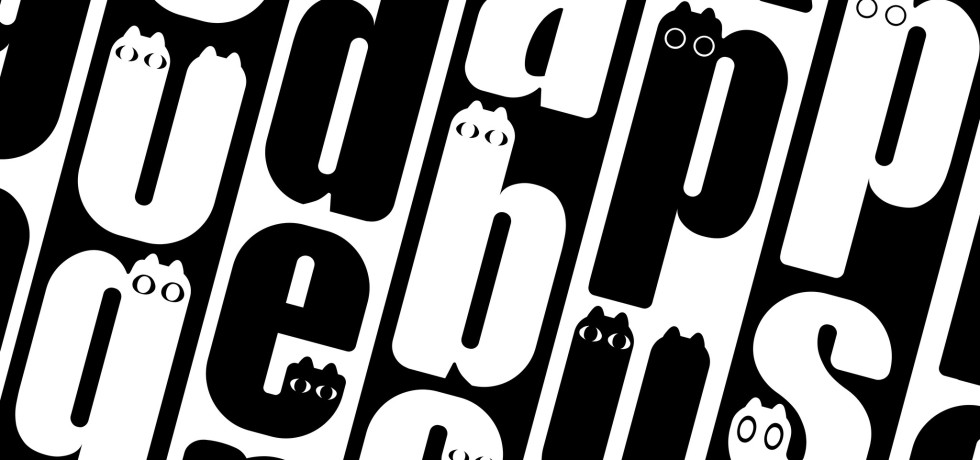
Crafting A Cat Typeface

by Chong Hui YiApril 16, 2024September 17, 2024
Continue Reading
Graphic Type

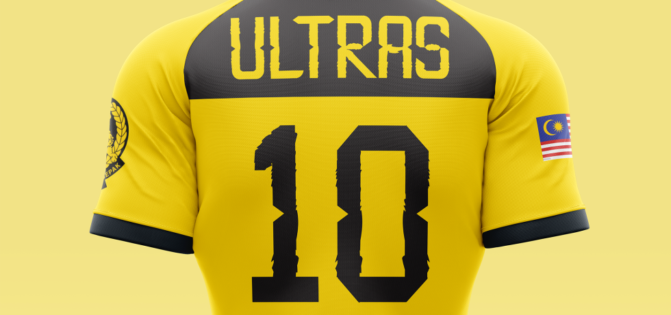
Type On Pitch: Typeface Design For Harimau Malaya

by Wan Qing ChanFebruary 21, 2024August 23, 2024
Continue Reading
Graphic Type

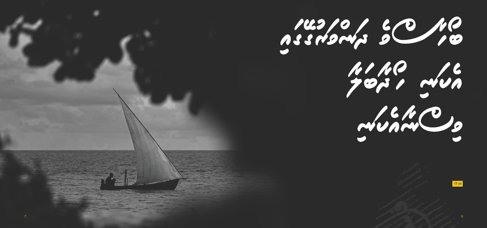
Crafting Roanu: A Maldivian Script Typeface

by Hussain WaheedJanuary 18, 2024August 23, 2024
Continue Reading
Type

Reviving Vernacular Typography

by Azriq AnwarOctober 15, 2023December 13, 2023
Continue Reading
Uncategorized

Just Be Chunky Like Chubbo

by Haruna HikawaSeptember 9, 2021October 3, 2021
Continue Reading

Posts navigation

Newer posts

kreatifbeats.com Follow

To share diverse views, local or regional knowledge related to creative disciplines and thought processes that are pertinent and pressing in SE Asia and S Asia.

kreatifbeats
kreatifbeats kreatifbeats.com @kreatifbeats ·
18h

"NOMAD: Where Letters Find Their Own Way" by Nicole Ng

"I wanted to design a bold, fat typeface that screams “Look at me!” but in a polite way (if you get what I mean)."

Reply on Twitter 2020780034706026837 Retweet on Twitter 2020780034706026837 Like on Twitter 2020780034706026837 Twitter 2020780034706026837
kreatifbeats kreatifbeats.com @kreatifbeats ·
2 Feb

"Exploring Art Nouveau Through Experimental Typeface Design" by Caitlin Lung

"“I thought it was another letter.” Stylistic ambiguity w/out sacrificing readability was the goal ... so I had to make adjustments based on the feedback I received ..."

Reply on Twitter 2018314773319020803 Retweet on Twitter 2018314773319020803 Like on Twitter 2018314773319020803 Twitter 2018314773319020803
kreatifbeats kreatifbeats.com @kreatifbeats ·
27 Jan

"Blocky: Translating Handwritten Marker Strokes into Digital Type" by Tsen Ken Yee

"Even well-designed letterforms can appear unbalanced if spacing and kerning are not properly considered."

Reply on Twitter 2015973257409876124 Retweet on Twitter 2015973257409876124 Like on Twitter 2015973257409876124 Twitter 2015973257409876124
kreatifbeats kreatifbeats.com @kreatifbeats ·
16 Jan

"Letters in the Water: Designing Sünny" by Ahmed Saneeh

"I realized that the level of perfection I aimed to achieve required countless hours, days, and nights of careful refinements, many of which may appear insignificant at first glance."

Reply on Twitter 2012084757648310312 Retweet on Twitter 2012084757648310312 Like on Twitter 2012084757648310312 Twitter 2012084757648310312
Load More

+

Your Regional Creative Source

+

Copyright © 2021 Taylor’s University.
All rights reserved.

The Design School

The Design School
Taylor’s University

+

E-ISSN No. 2637-1111

+

Kreatif Beats

Troublemakers’ Assembly

Troublemakers' Assembly

The Design Asylum

Design Asylum

Mayamode

+

Supported by:

wRega

  • News + Events
  • About
  • Contact
  • KREATE
Proudly powered by WordPress | Theme: aquene by Themes Harbor.